UI Design

Interfaces that are sharp, considered, and feel right

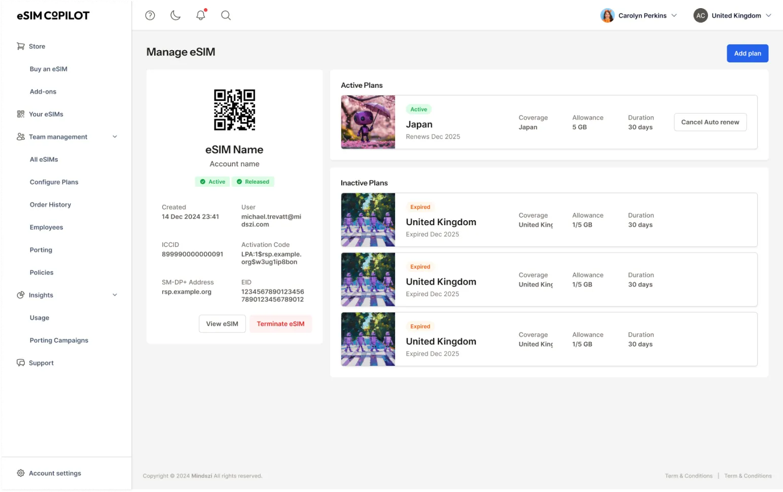
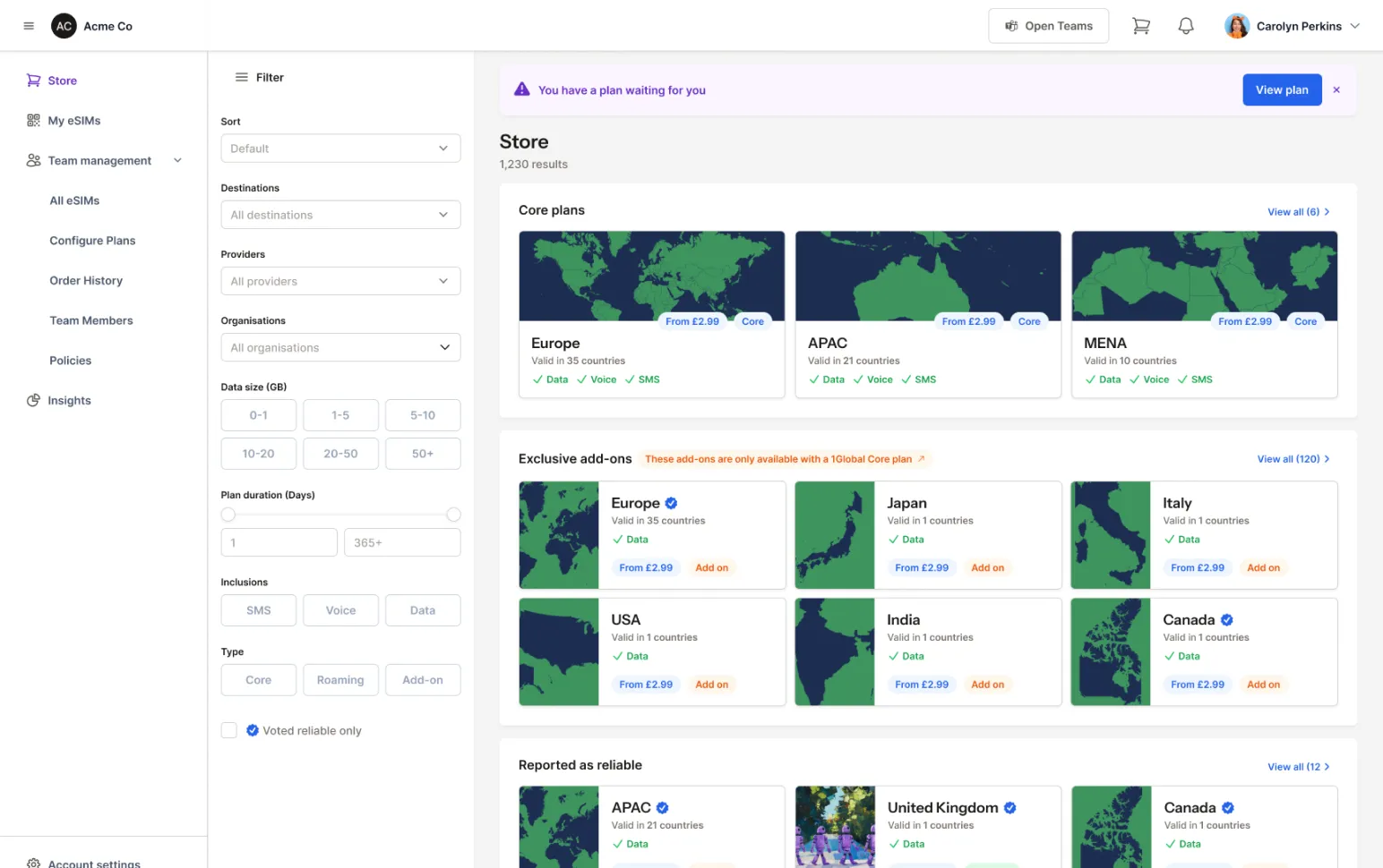
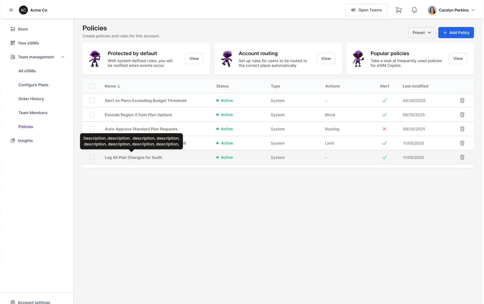
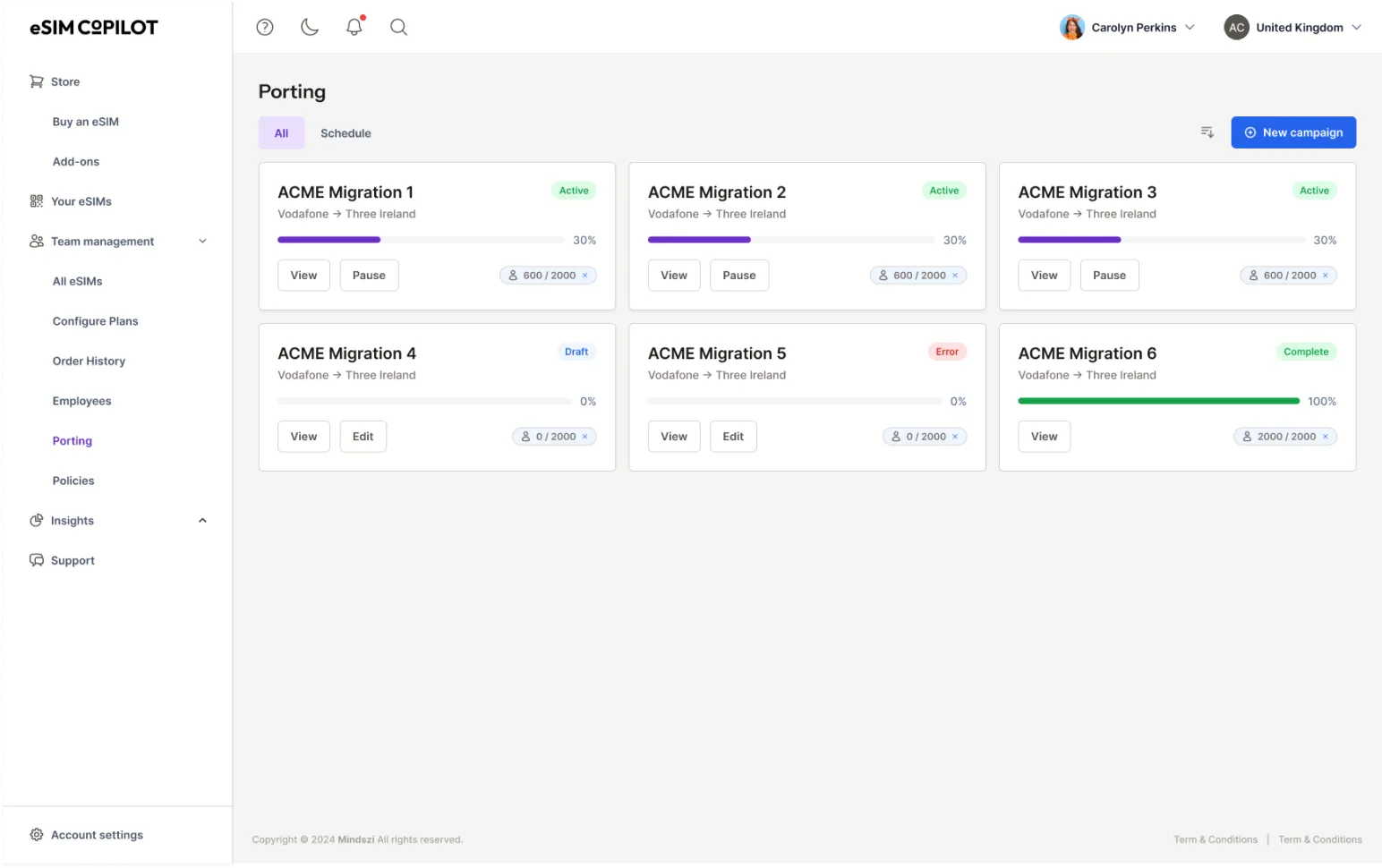
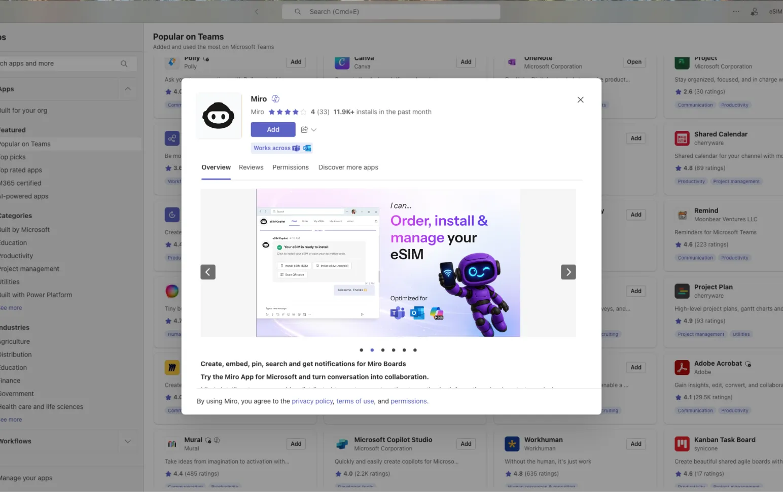
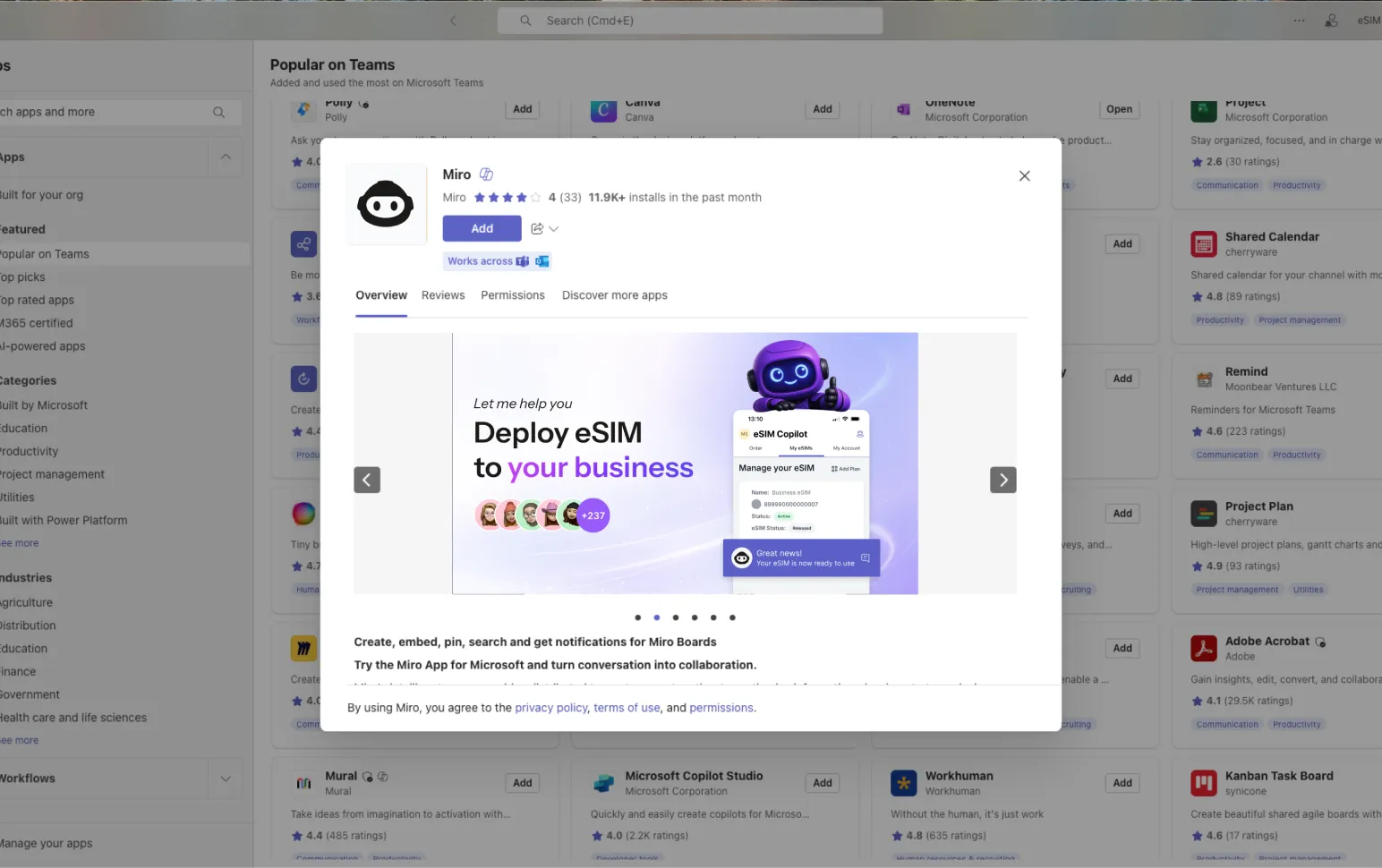
The eSIM Copilot dashboard showing the Manage eSIM screen with a QR code, plan details and active plans

Build components that scale

Built component-first so the product stays consistent at twenty screens or two hundred. Accessible by default, never a retrofit.

System-first

Components and tokens before screens. So the product stays coherent as it grows.

Accessible by default

WCAG AA baseline. Keyboard, screen reader, contrast and focus considered from the first sketch.


Responsive everywhere

Every screen designed for every breakpoint. Not desktop with a mobile afterthought.

Developer-ready

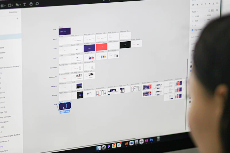
Annotated Figma files, documented components, exported tokens. A handoff that doesn't need translation.

  • 01

    Interface design

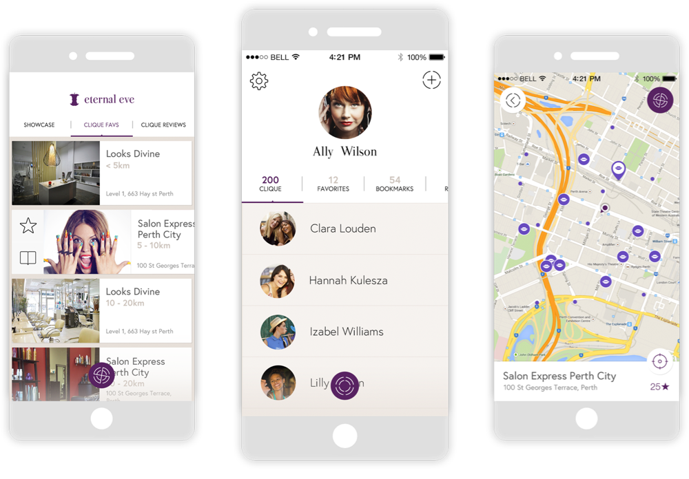
    Screen design, responsive layouts, component design, interaction design. The visual layer that brings wireframes to life.

  • 02

    Design systems

    Component libraries, design tokens, theming and dark mode, pattern documentation. A system that keeps your product consistent as it grows, across brands and contexts.
  • 03

    Interactions

    Micro-interactions, transitions, animation specifications, hover states. The details that make an interface feel responsive and alive.

  • 04

    Responsive

    Mobile-first approach, breakpoint strategy, adaptive layouts. Every screen designed to work at every size, not just shrink.

  • 05

    Accessibility

    WCAG compliance, contrast ratios, keyboard navigation, screen reader compatibility. Inclusive design as a default, not an afterthought.

  • 06

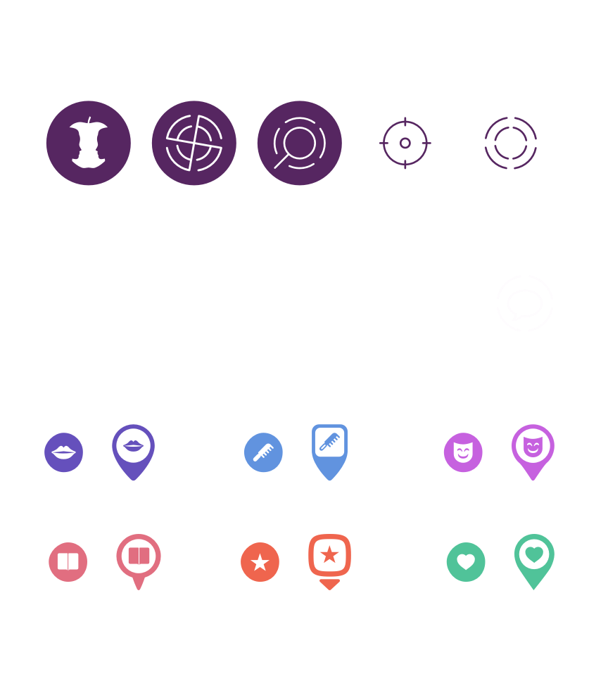
    Iconography

    Custom icon sets, spot illustrations, infographics. Visual elements that reinforce your brand within the interface.

Design systems that scale

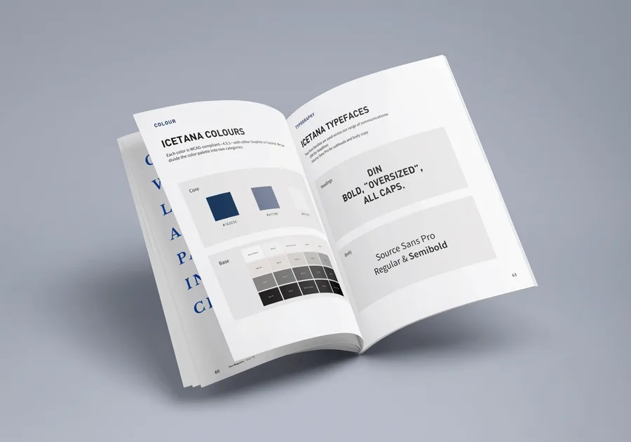
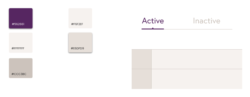
Component libraries, design tokens, pattern documentation, Figma libraries. A system that keeps your product consistent as it grows from one product to many.

Typography and visual language

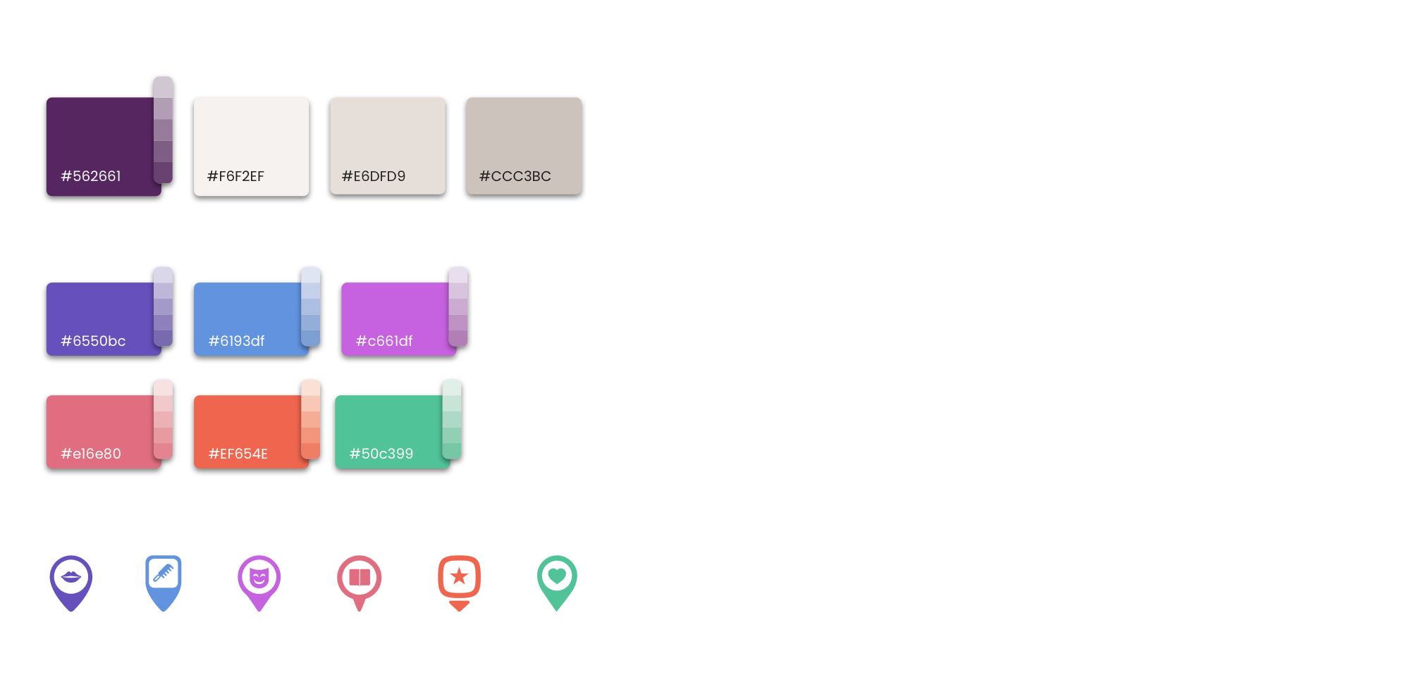
Type scales, colour systems, spacing rhythm, iconography. The visual layer designed as a coherent whole, not assembled from a Figma kit somebody else made.

Theming and adaptability

Dark mode, multi-brand theming, token-based architecture. The system bends to different products and contexts without losing its identity.

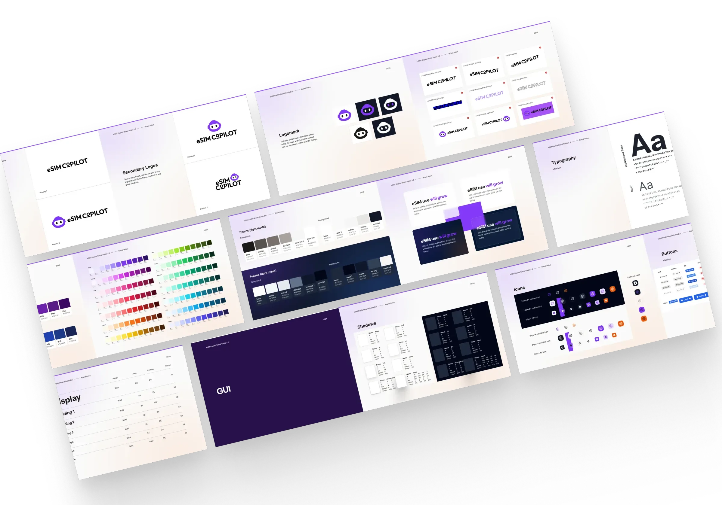
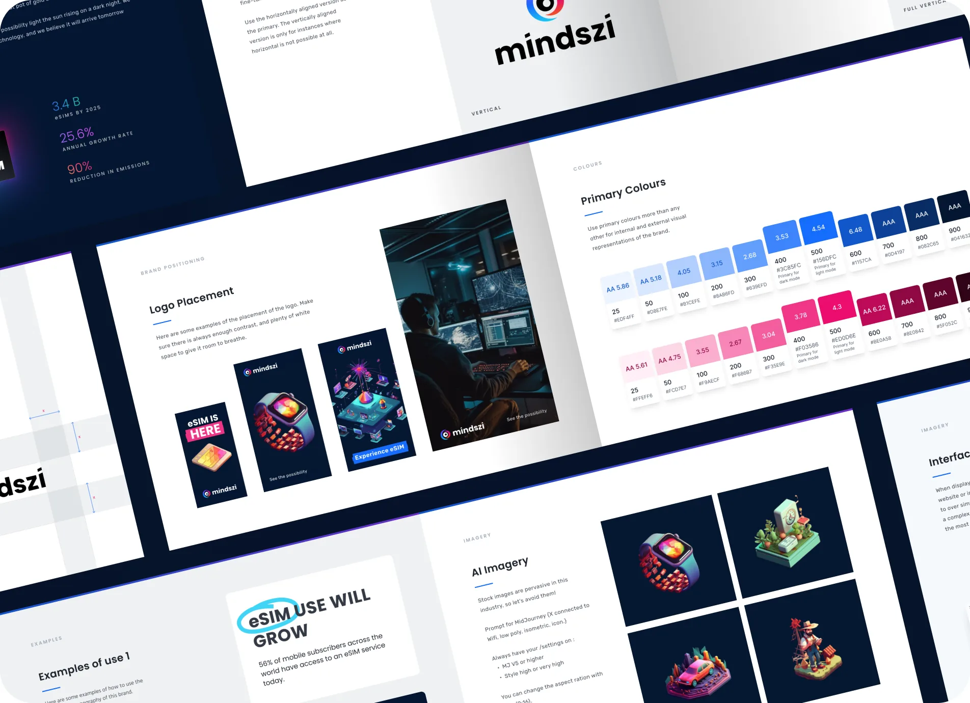
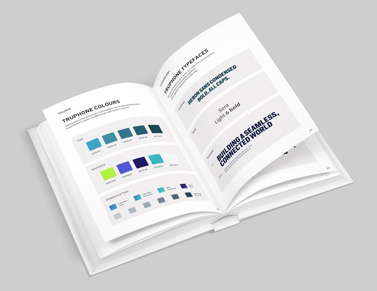
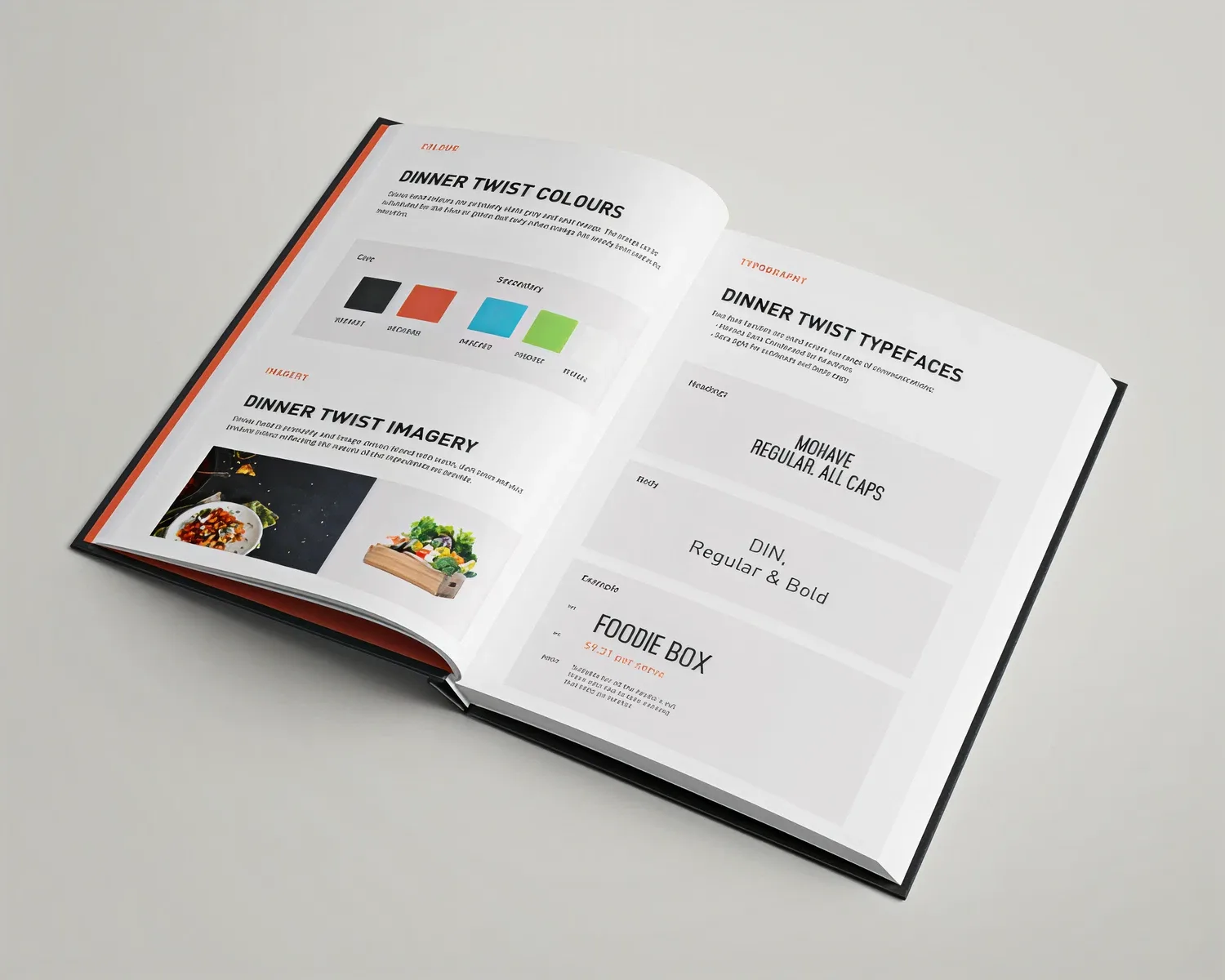
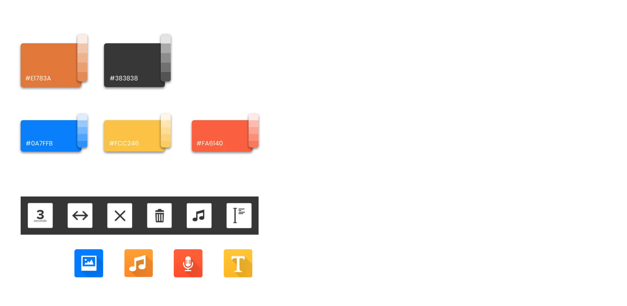
The eSIM Copilot design system laid out flat: colour palette, typography and interface components together
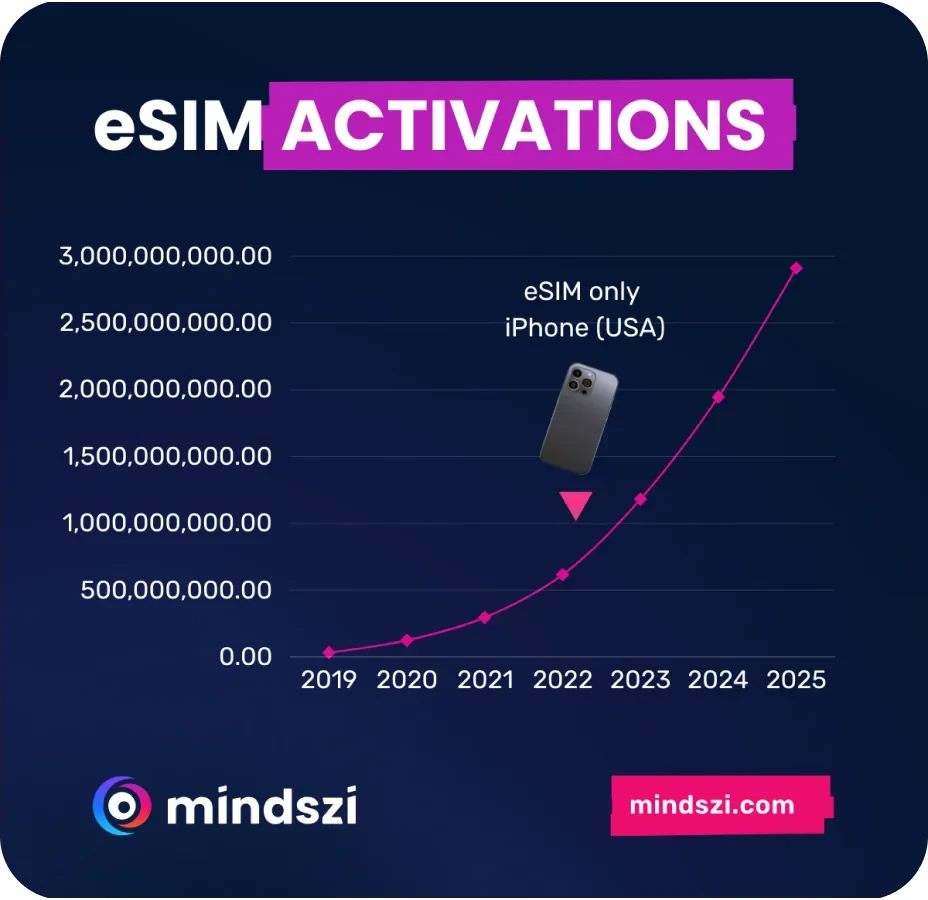
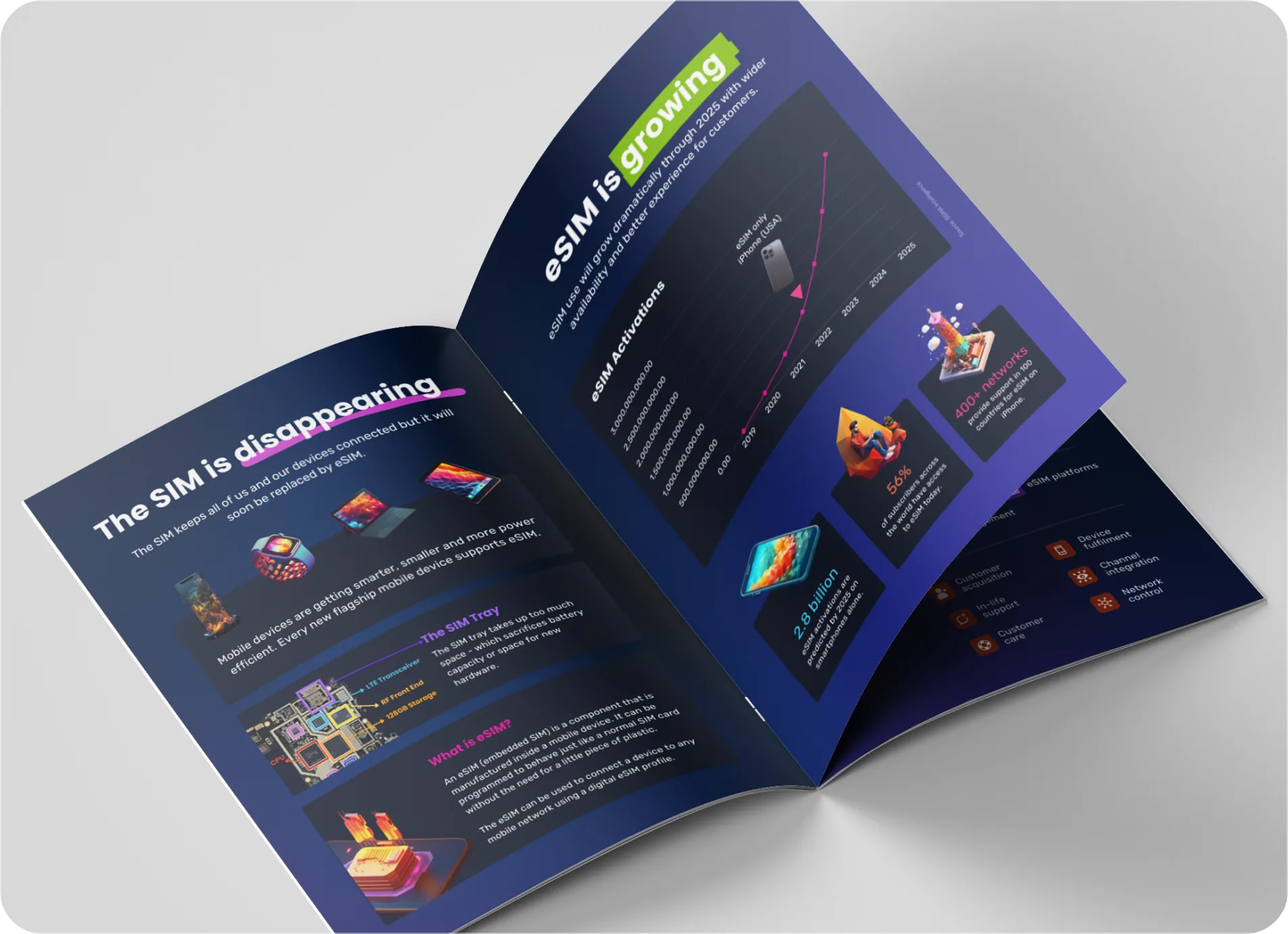
A bold Mindszi marketing panel with the headline eSIM is here set over a 3D smartwatch on deep navy
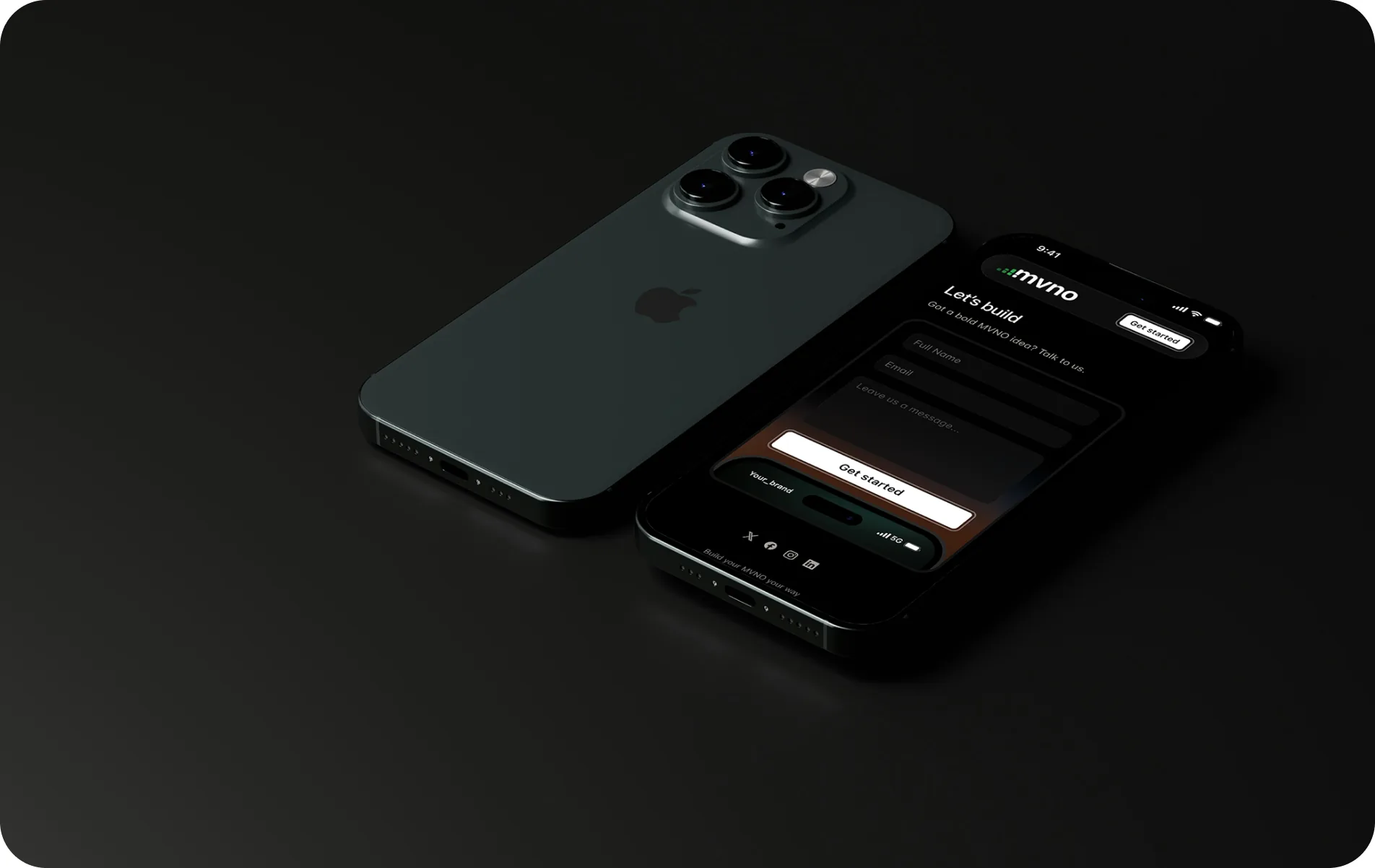
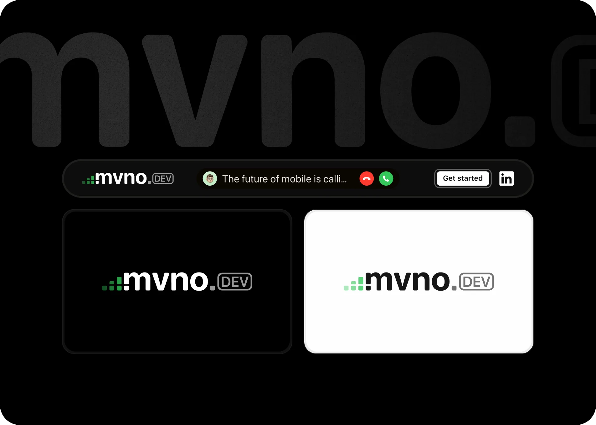
The MVNO.dev product shown in a dark theme across an iPhone onboarding screen and a desktop dashboard

Design systems that have outlived the projects, the teams, and the trends they were built for.

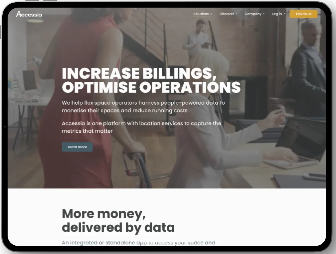
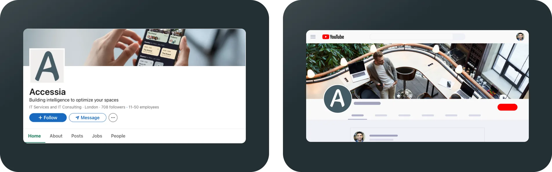
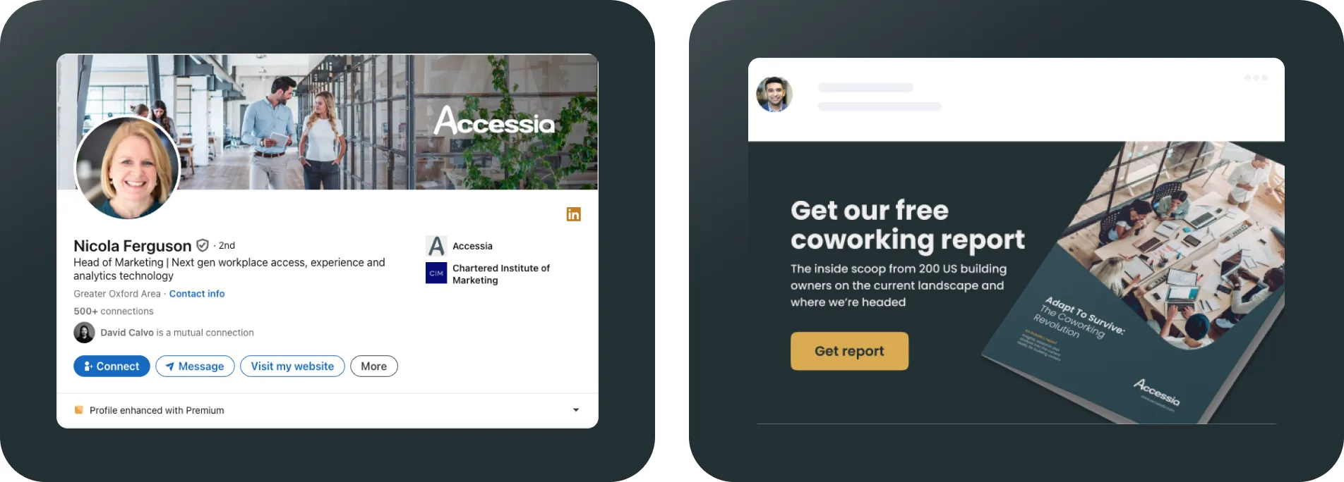
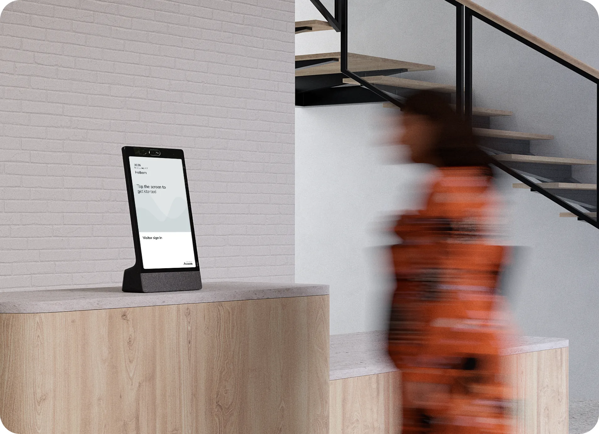
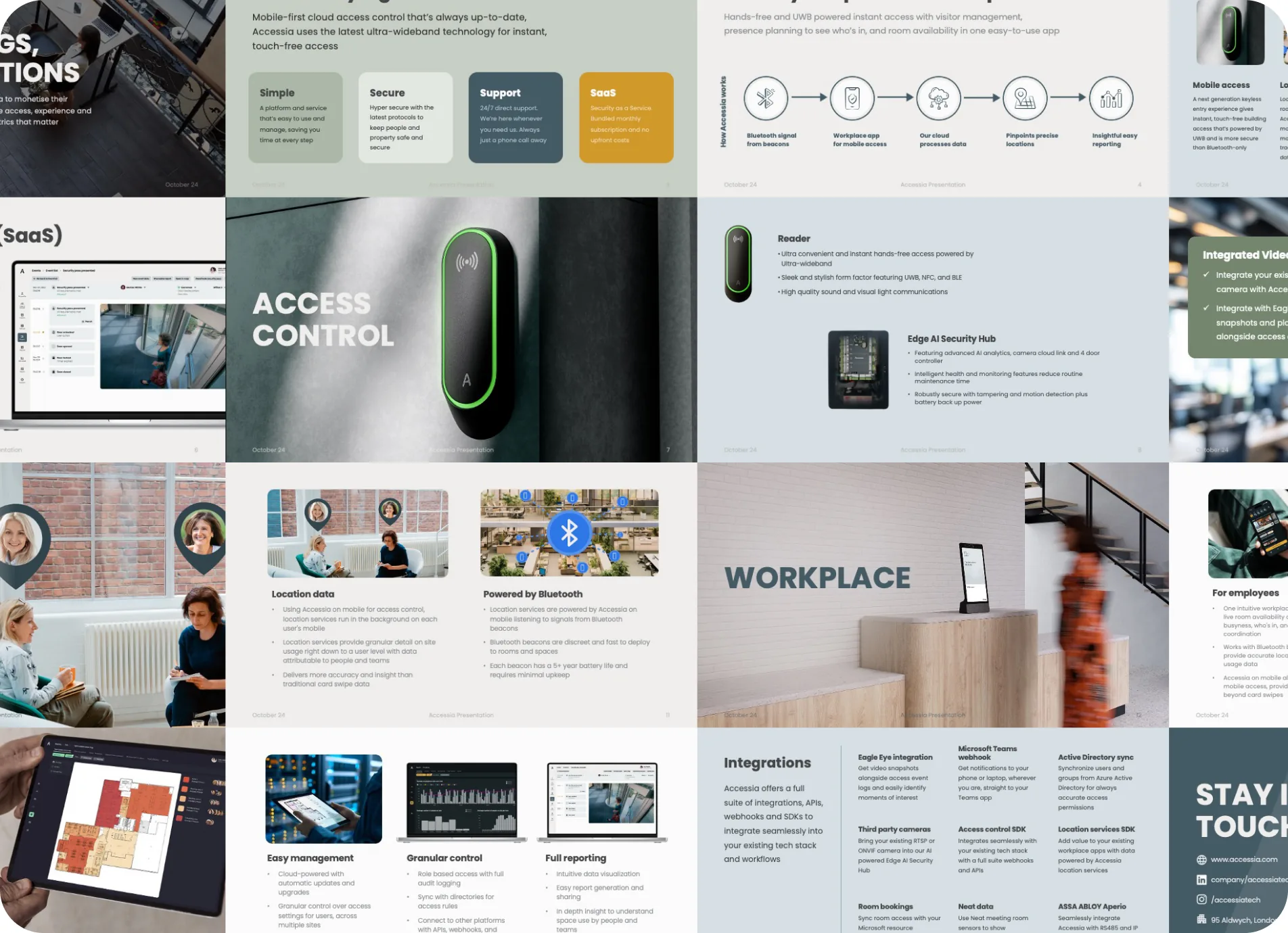
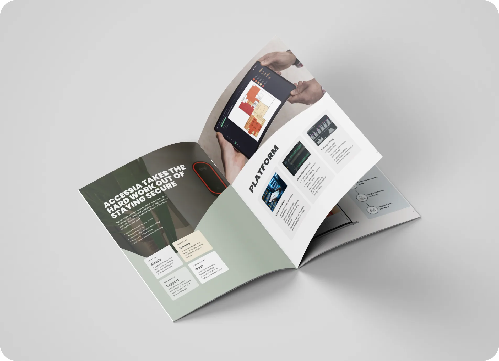
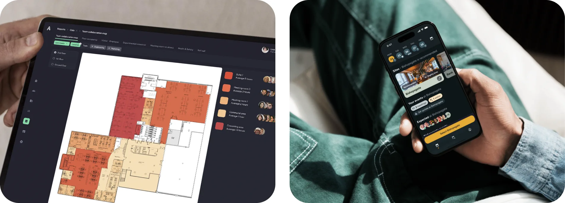
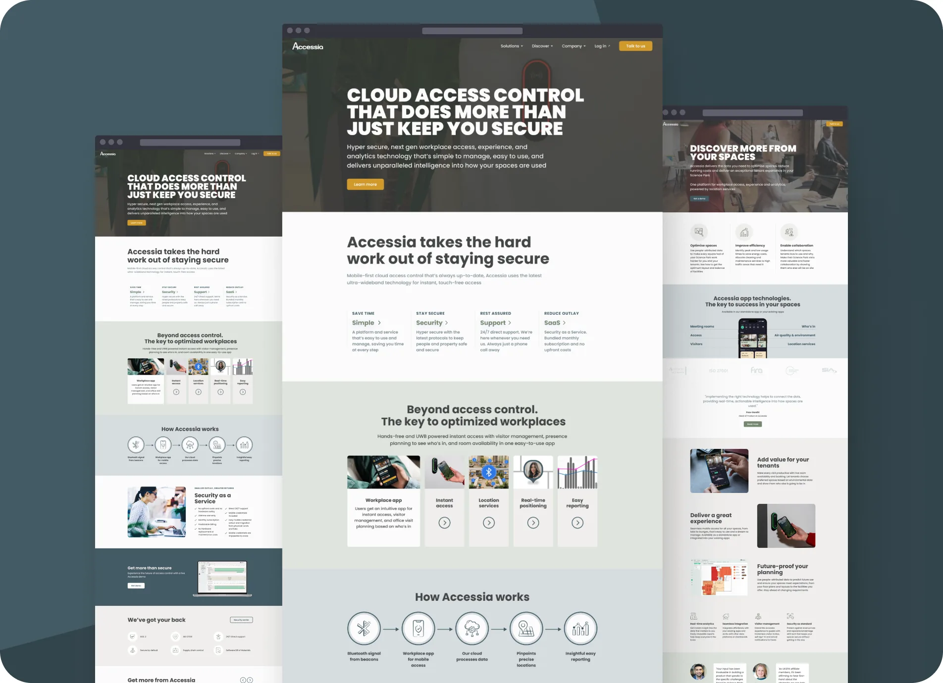
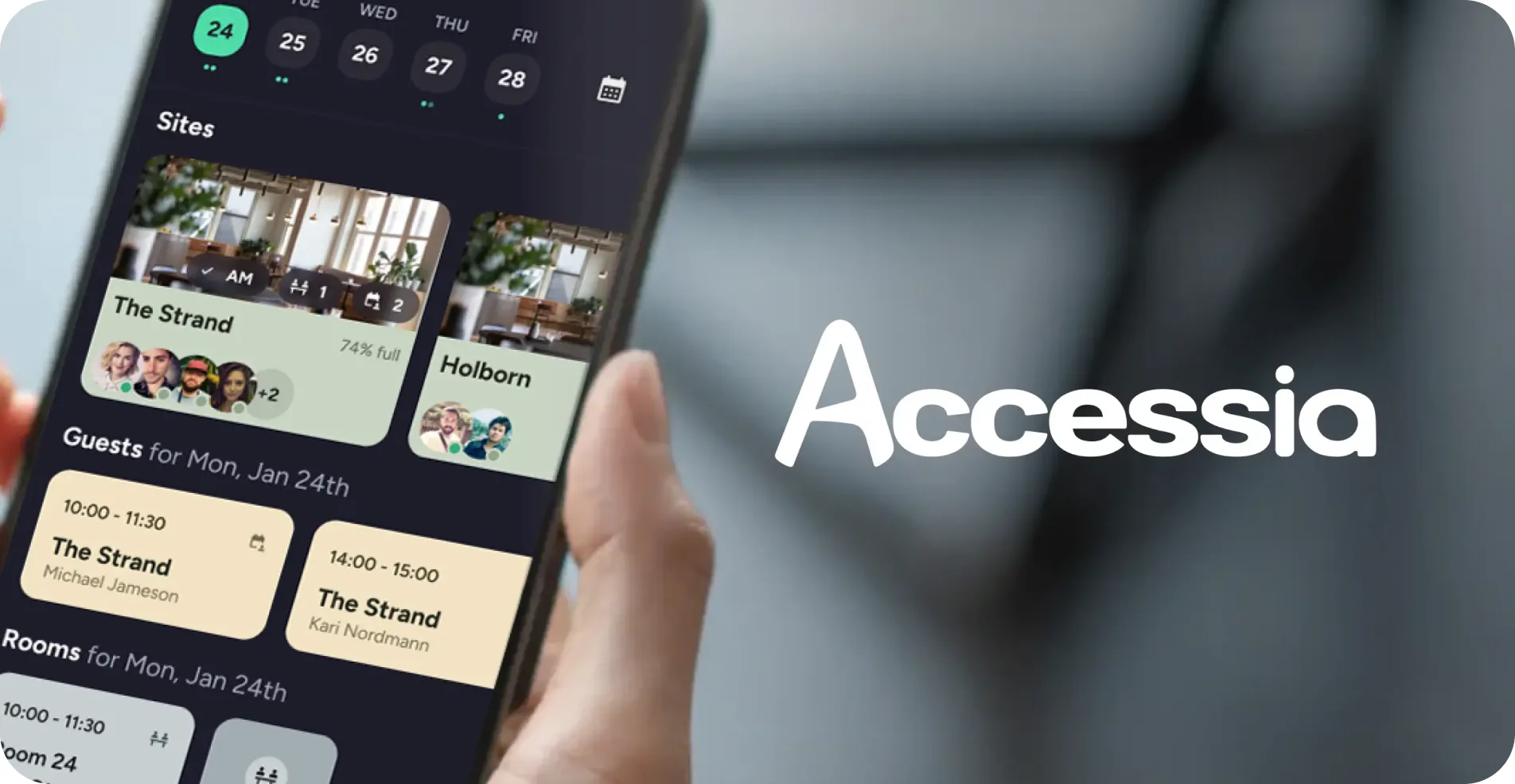
Accessia

Brand and product design for a coworking and workspace management platform. Billings, occupancy and members in one system.

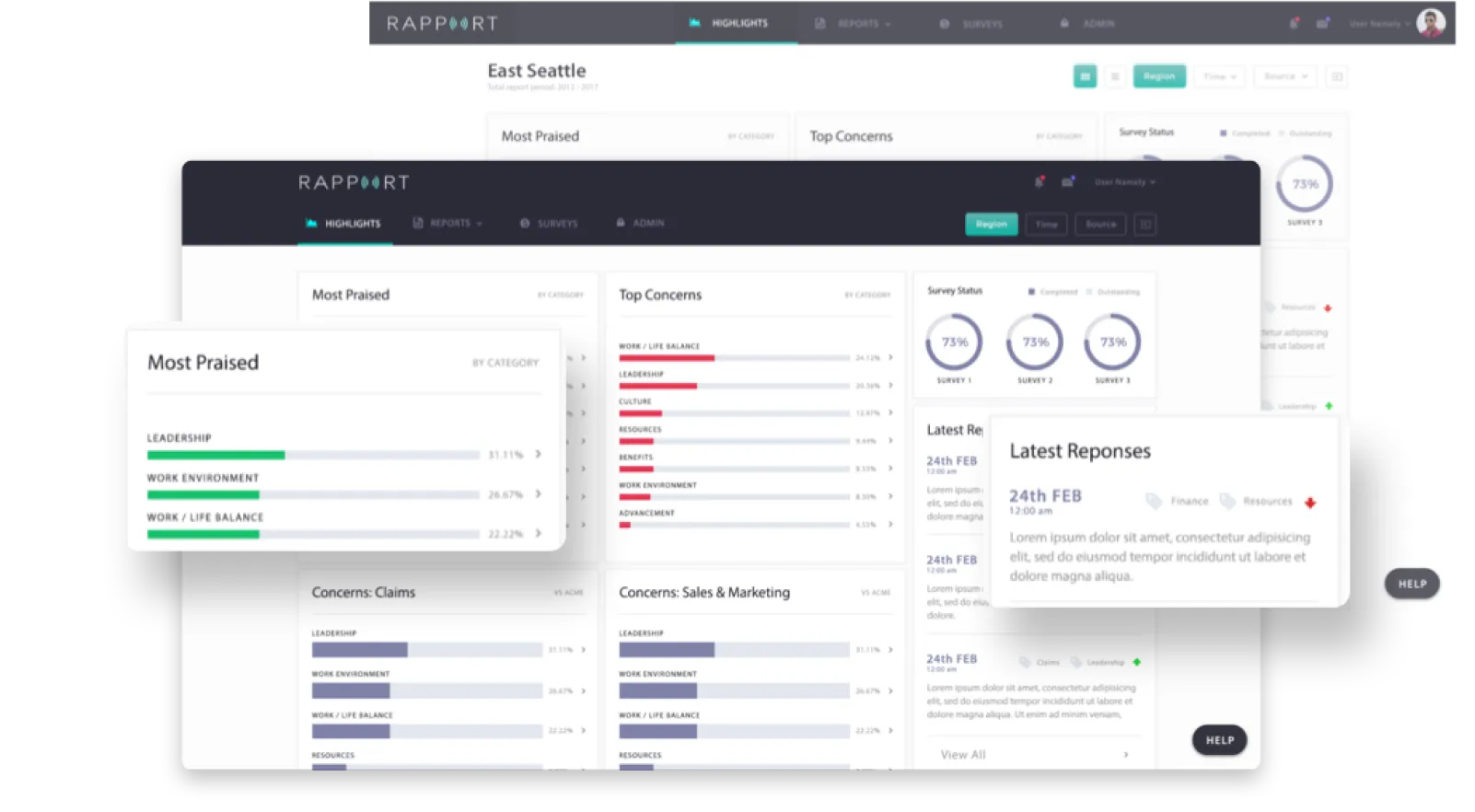
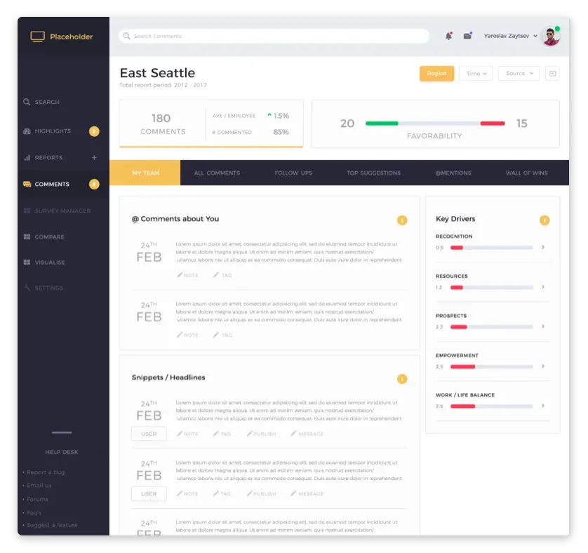
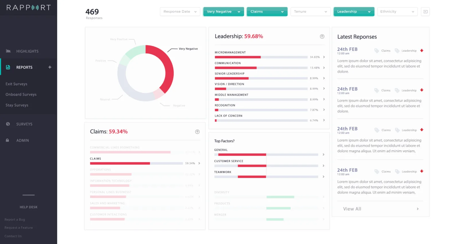
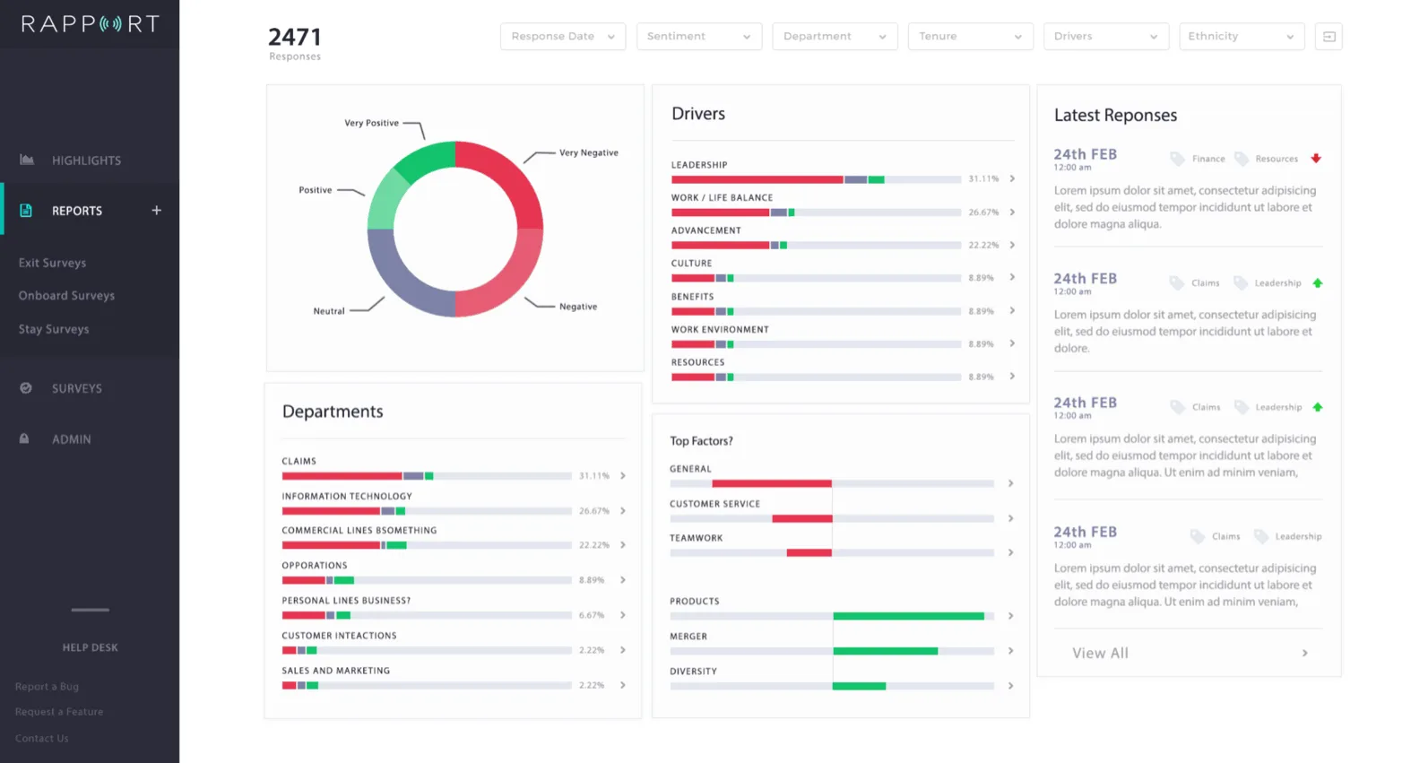
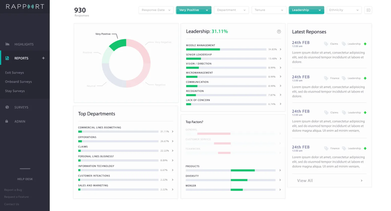
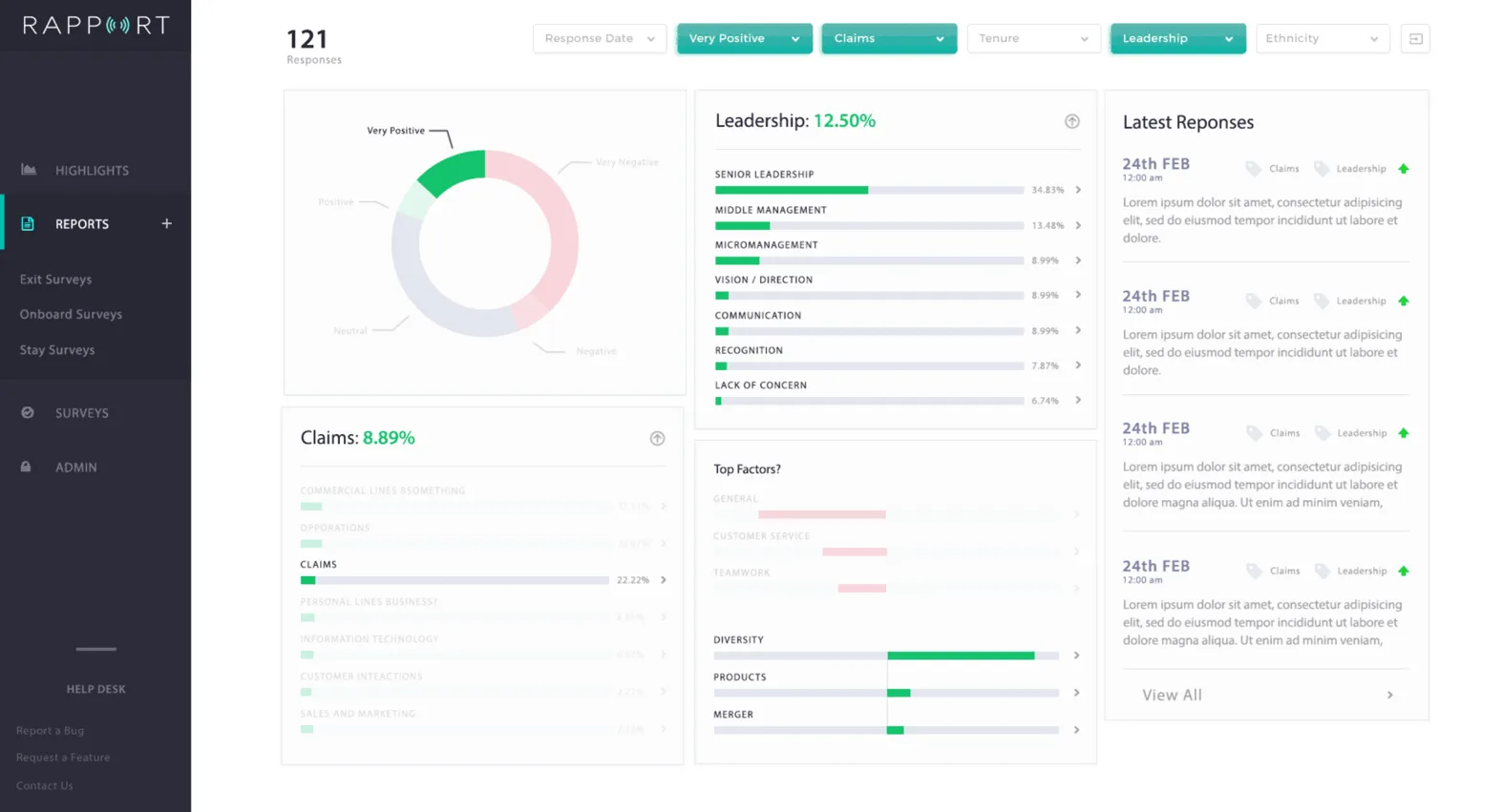
Rapport

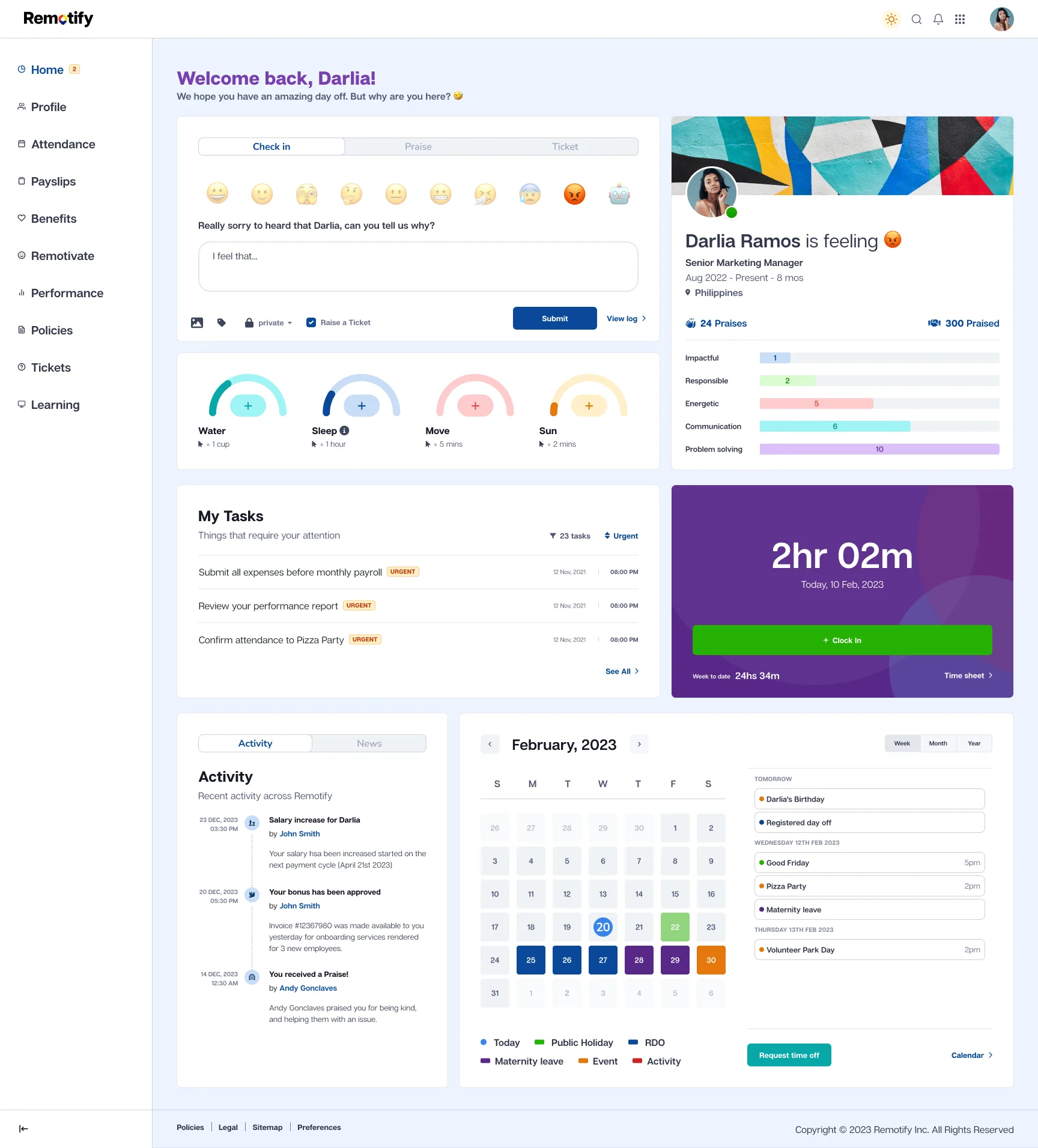
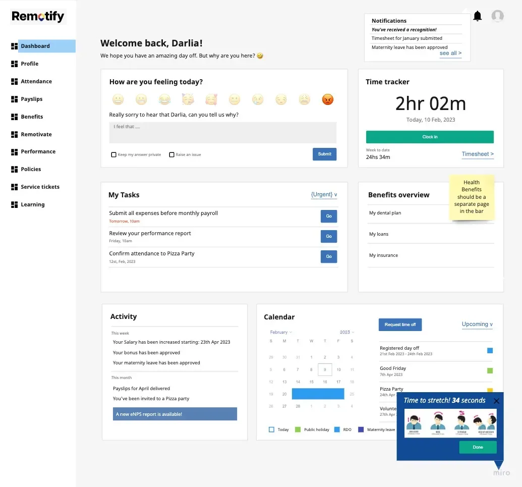
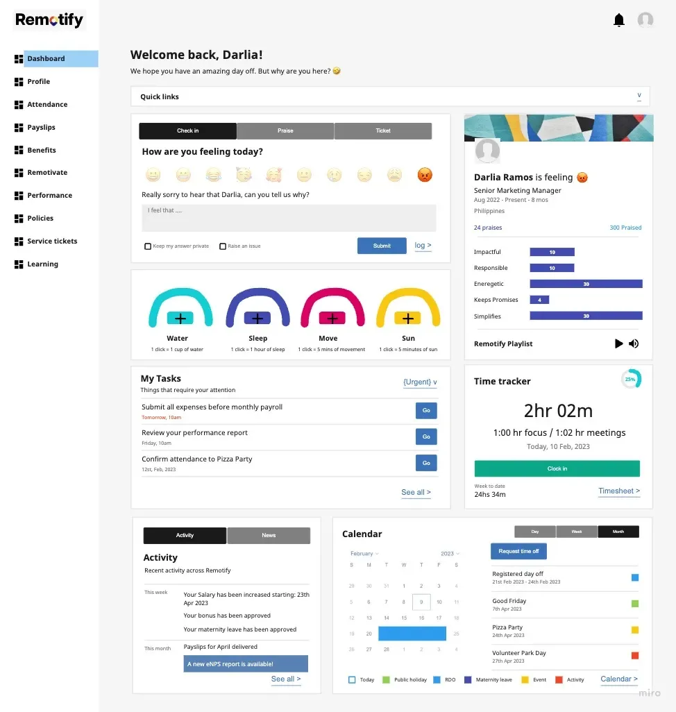
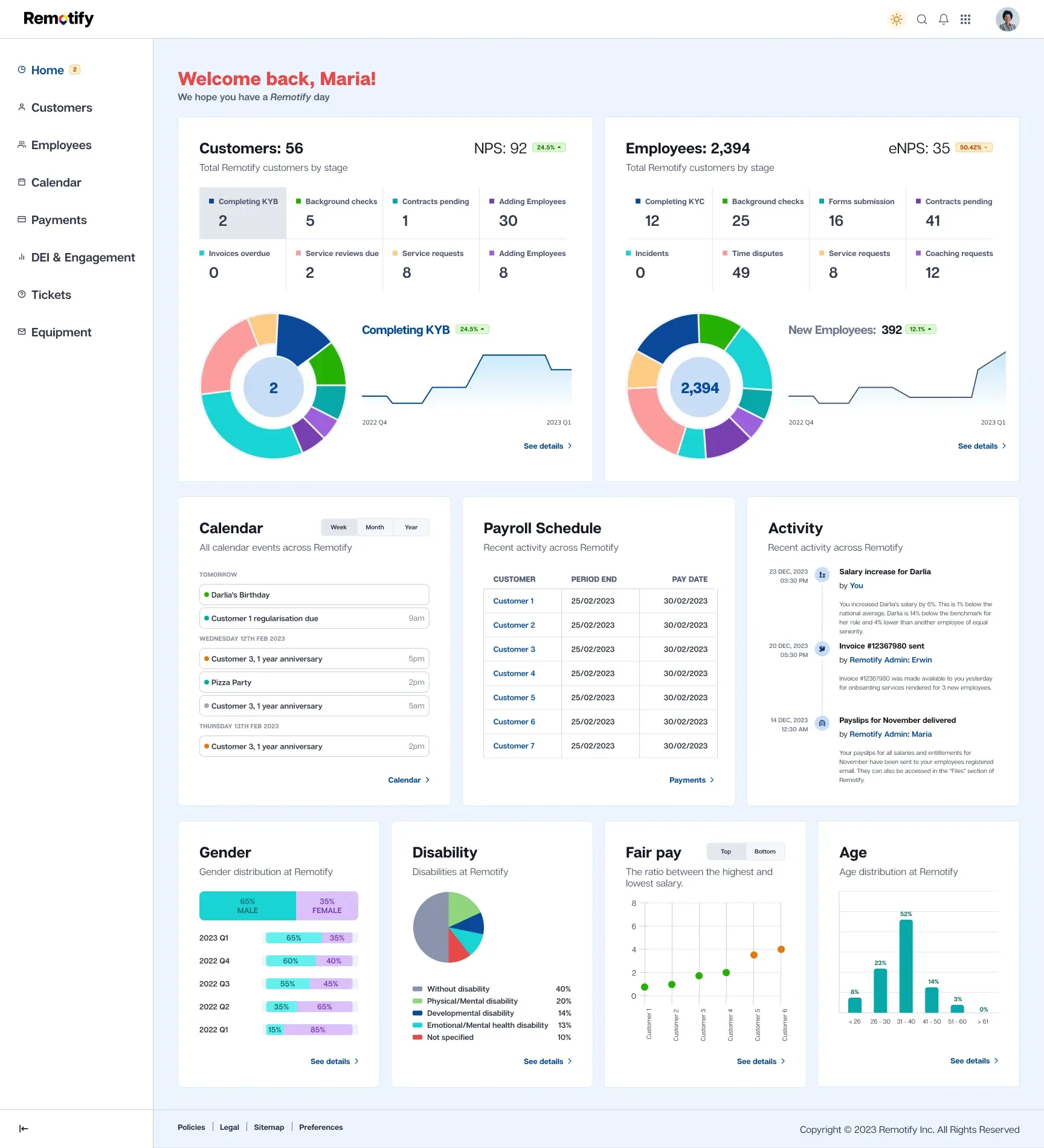
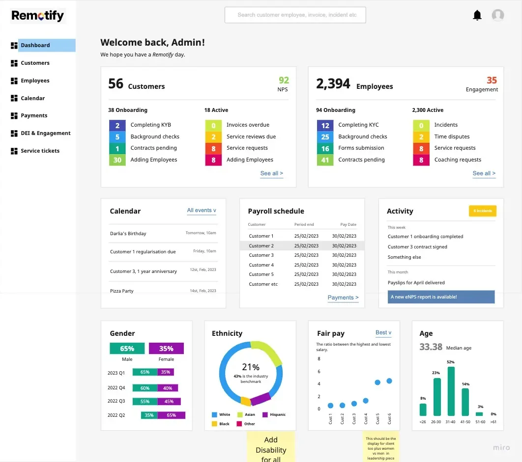
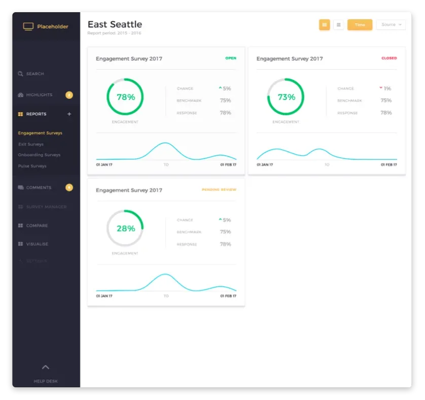
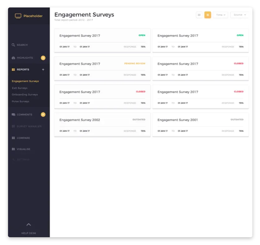
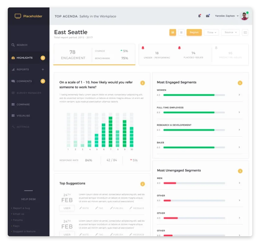
Employee engagement platform. UX and product design for internal communications and recognition tools.

Up next

Development

The designer who built the interface, builds the front end. No translation loss. Production-ready, accessible, fast.

Read more
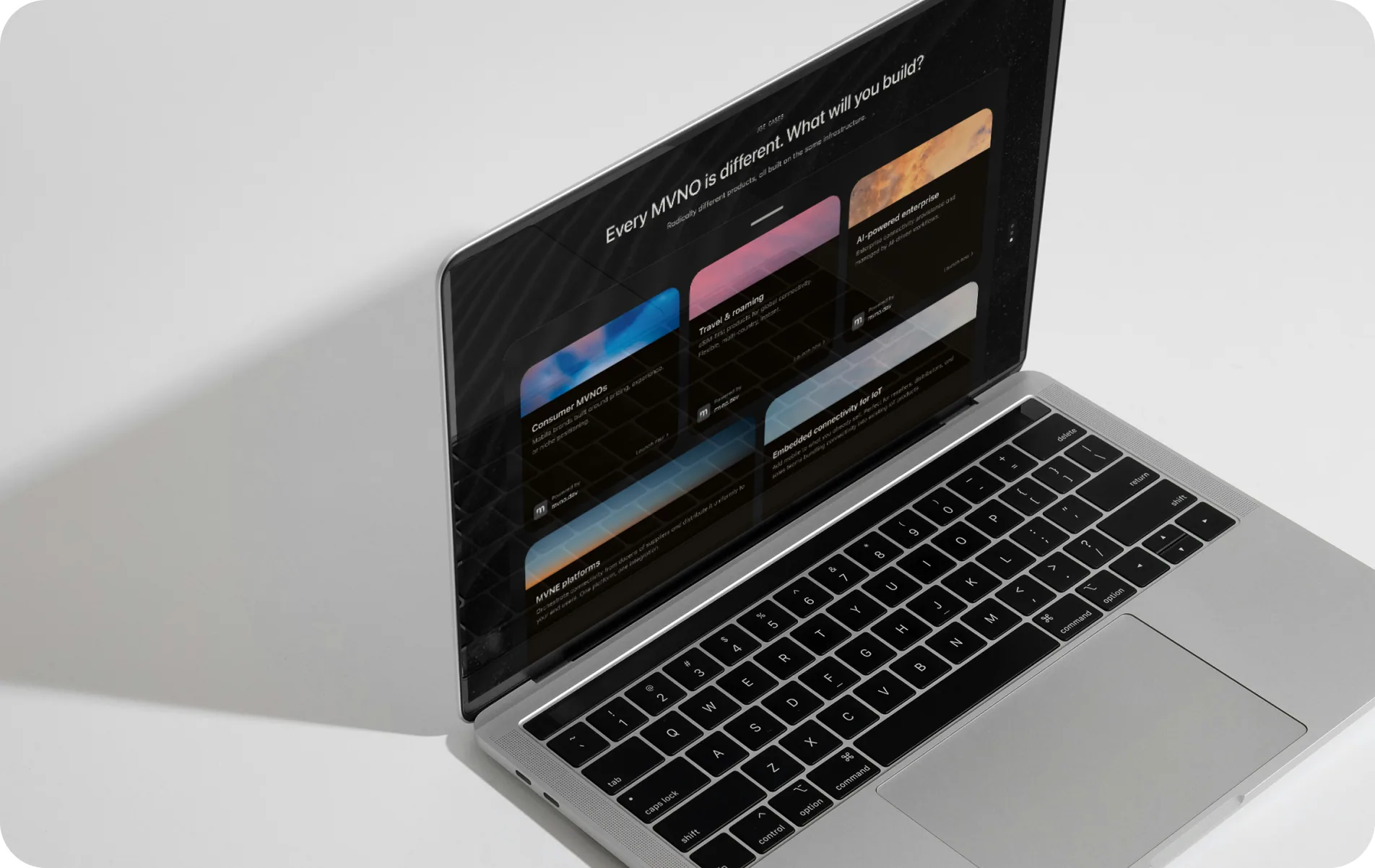
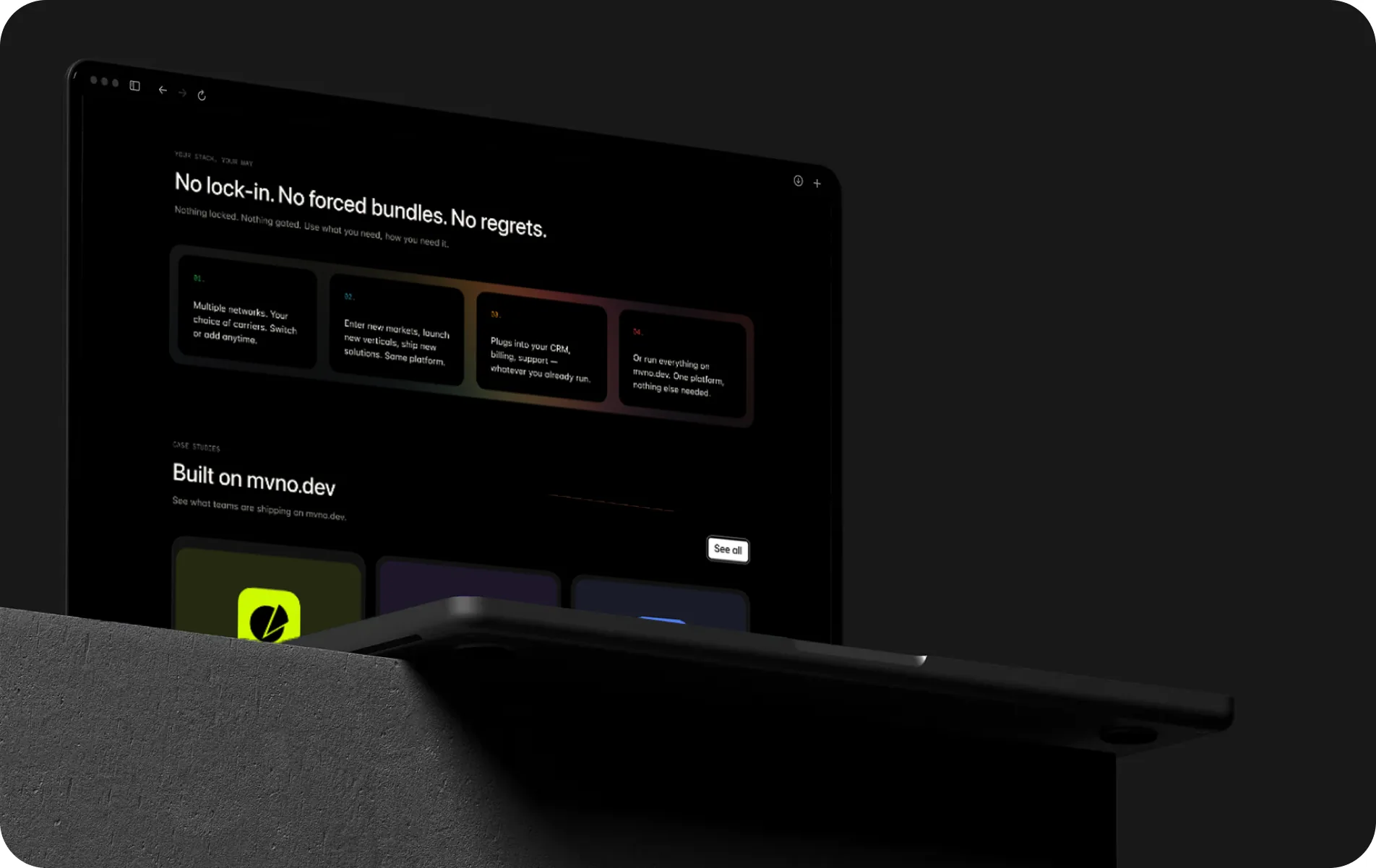
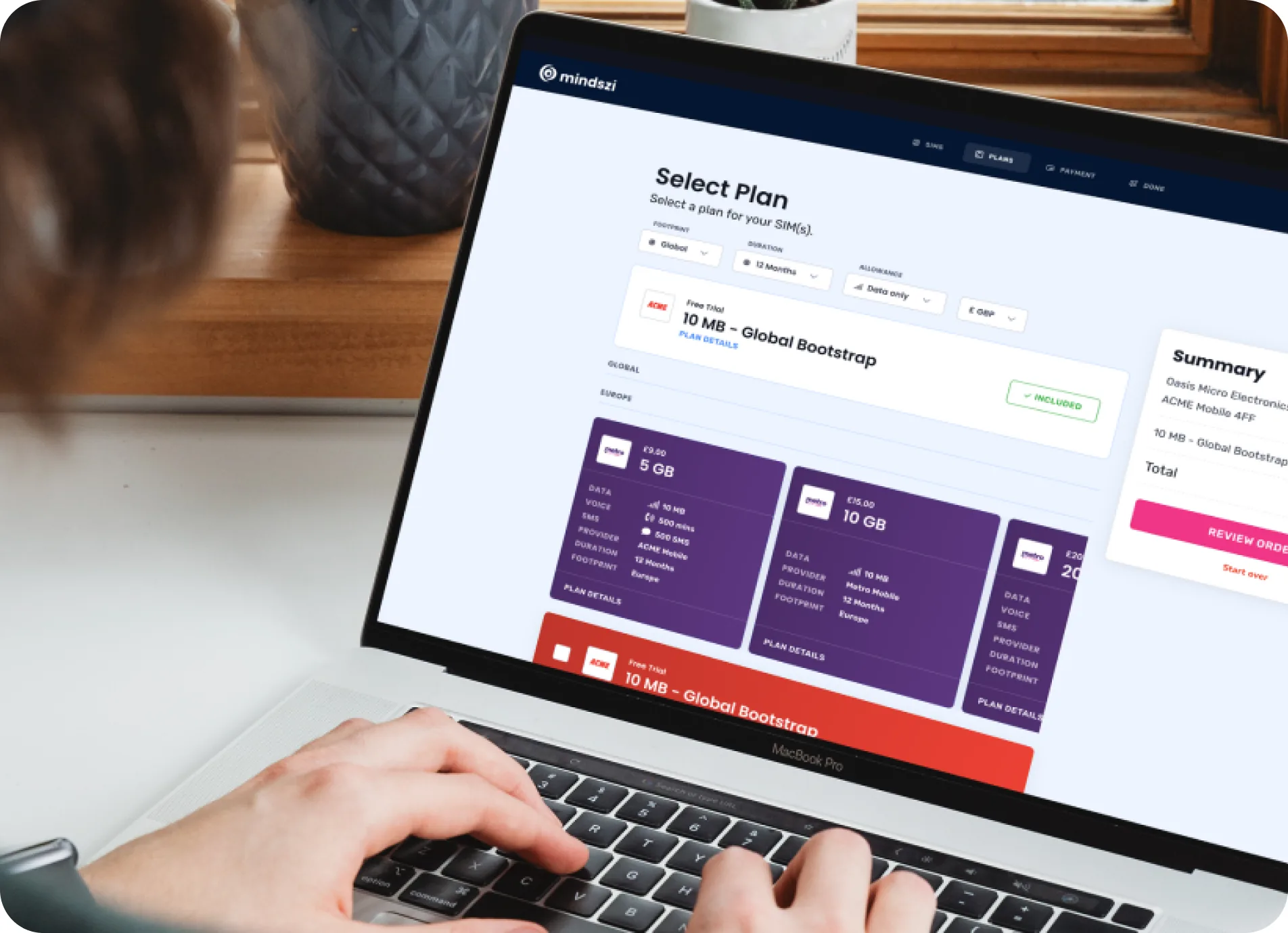
A laptop displaying the built MVNO.dev marketing site with its Every MVNO is different feature blocks
Do you design in Figma?

Yes, exclusively. Figma for all screen design, prototyping, and design system work. Everything is shared, collaborative, and version-controlled.

Can you build a design system for my product?

Yes. From component libraries and design tokens to documentation and governance. I build systems that scale with your product and keep your team consistent.

Do you hand off to developers?

Absolutely. I prepare developer-ready Figma files with clear specifications, component documentation, design tokens, and responsive breakpoint designs. I also work directly with developers during implementation to make sure nothing gets lost.

What's the difference between UX and UI?

UX is the structure and logic. UI is the visual layer. I do both, but they happen at different stages. UX comes first (how it works), UI follows (how it looks and feels).

Do you design for mobile and desktop?

Always. Every interface is designed responsive from the start, typically mobile-first. You get designs for all key breakpoints.

Got an interface that should feel sharper?

Send me what you're building and I'll help make it feel right.