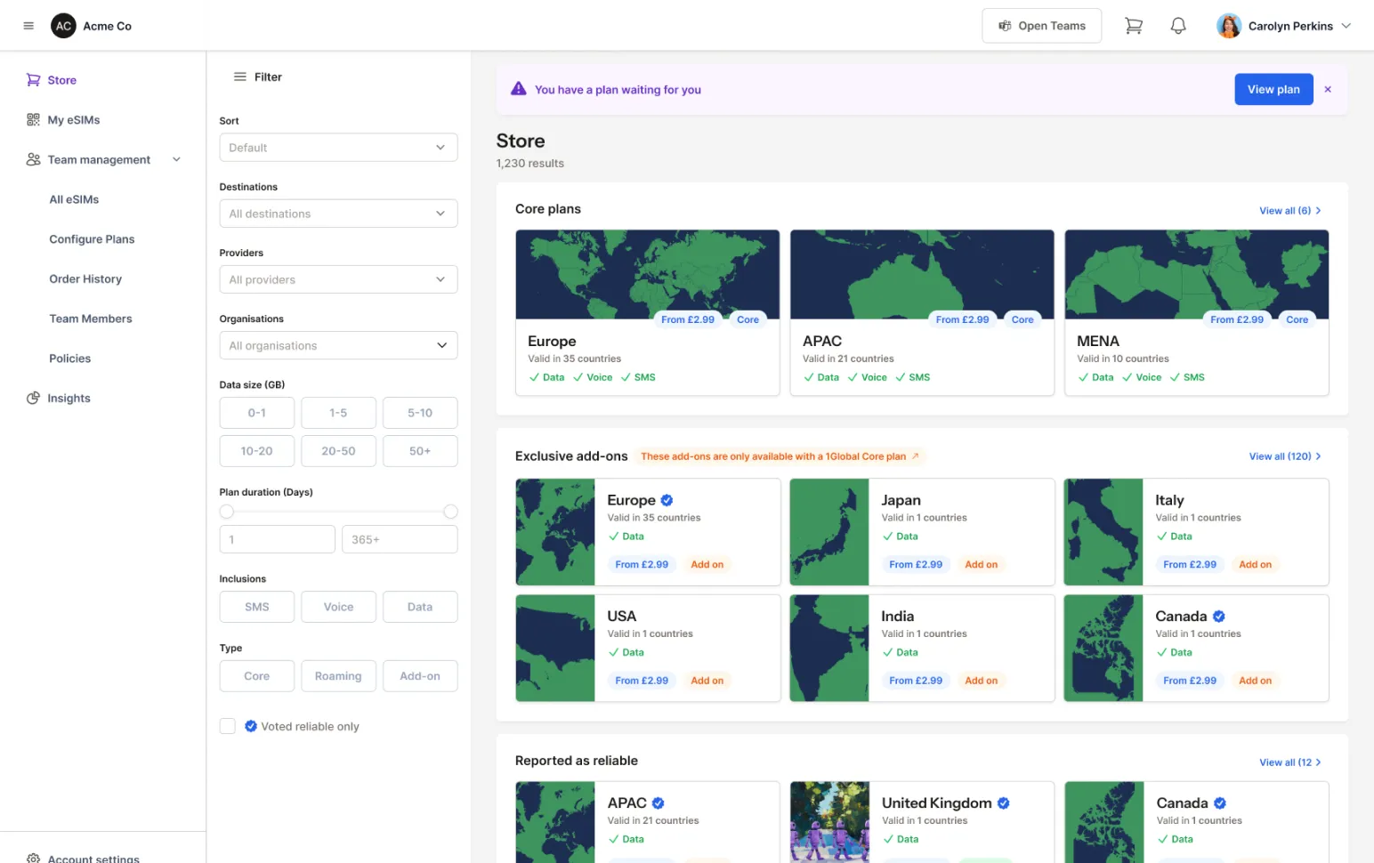
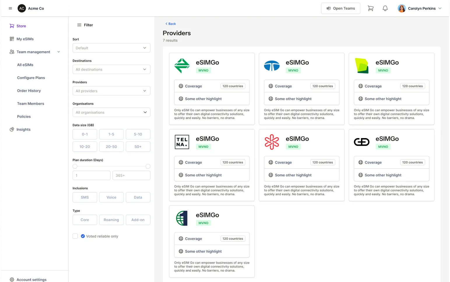
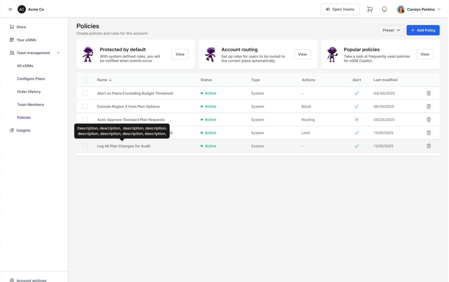
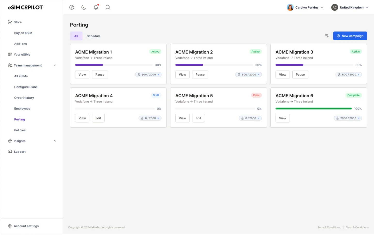
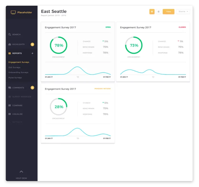
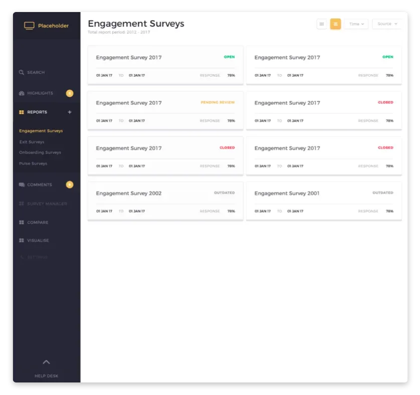
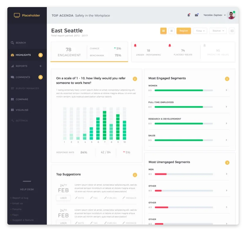
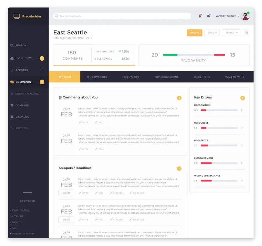
Understanding your users, your business goals, and the competitive landscape before designing.
02
User flows
Mapping every path through the app, from first launch to power-user workflows.
03
Wireframes
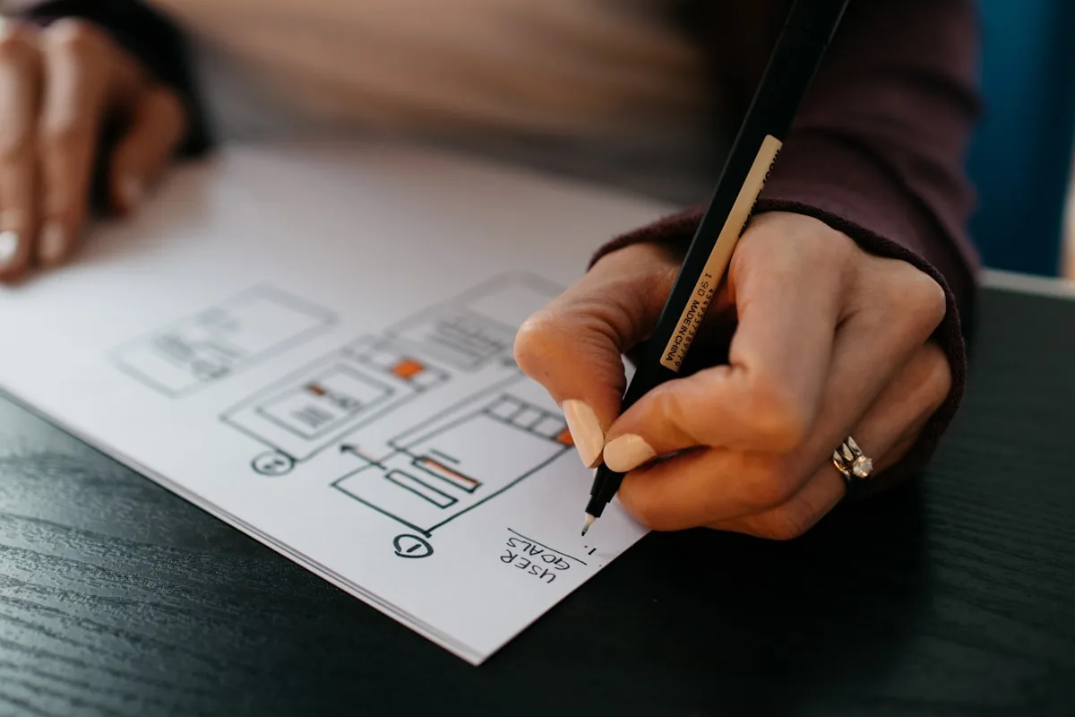
Structure first, then interactive prototypes for usability testing and stakeholder review.
04
UI design
Every screen, empty state, error state, loading state, and edge case. The bits other people skip.
05
Design system
Component library that scales with your app as features grow. Tokens, documentation, examples.
06
Prototype
Clickable Figma prototype for user testing, investor demos, or board reviews. Behaves like a real app.
07
Developer handoff
Specifications, tokens, assets, animation notes, and ongoing support during build.
“Michael is one of the best UI/UX professionals I've had the pleasure to work with. He brings not only an in-depth understanding of design and user experience to the table but is also able to adapt to the context and find pragmatic ways of implementing large complex visions. He was able to create a cohesive UI/UX vision spanning from B2C to B2B offers, across portals and mobile applications. I would love the idea of working with Michael again any day.”
“Michael’s designs exude mastery through simplicity. He is pragmatic, intelligent, and driven ultimately by purpose, value-add and end user experience. He is masterful at bringing visions to life through prototypes. The cherry on top is that he is a great human being.”
“Michael is an incredible asset to any team. He is absurdly knowledgeable in all aspects of design and UX, and his background as a teacher means he can disperse information to the team in a digestible and interesting way. Not only does he basically do the job of multiple people, but Michael is also fun and a great person to be around.”
“The reason that I always come back to Michael for design work is that he is the type of listener that forces me to describe exactly what I'm thinking and declare what it is I am trying to achieve. He always pragmatically researches the field I'm working in and comes back with consistently impressive designs.”
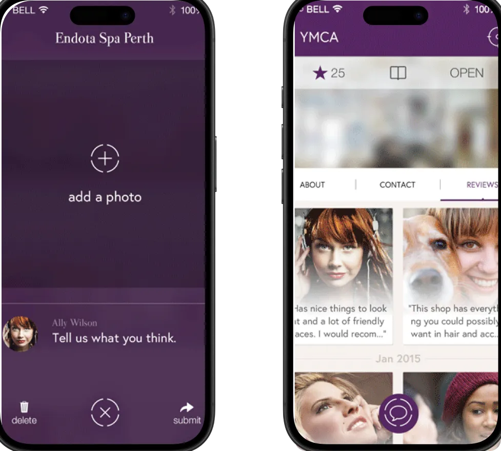
I design apps. For development, I work with trusted partners or hand off to your development team with comprehensive specifications, prototypes, and design system documentation.
Do you design for iOS and Android?
Yes. I design for both platforms, respecting their respective design conventions (Human Interface Guidelines for iOS, Material Design for Android) while maintaining your brand consistency.
Can you create a prototype for investor demos?
Absolutely. Interactive Figma prototypes that look and feel like a real app, perfect for demonstrating your concept to investors without building anything yet.
How do you hand off to developers?
Organised Figma files with component libraries, design tokens, interaction specifications, responsive guidelines, and asset exports. I also stay available during development for questions and QA.
Do you do user testing?
Yes. Interactive prototypes tested with real users, with findings documented and fed back into the design. Testing can be moderated or unmoderated depending on your needs.
Ready to build an app people keep?
Got an app in mind, or one that needs fixing? Let's talk it through.
Designing without research is guessing with confidence. Research is the cheapest way to find out you are wrong before it gets expensive.
User research is finding out who your users are, what they are trying to do, and where the current experience lets them down, before a single screen gets designed. It replaces opinion and the loudest voice in the room with evidence.
It comes back as findings you can act on, not a report that gets filed and forgotten. Each method below is a way of turning what people actually do into decisions the whole team can line up behind.
InterviewsOne-to-one conversations with real users, structured around the jobs they are trying to do and the moments things go wrong. Recorded, then written up as themes rather than a pile of quotes.
SurveysQuestions put to a wider group to size up what the interviews surface. Designed so the answers mean something, with the leading questions and the vague scales stripped out.
Usability testingWatching real people attempt real tasks on your product or a prototype. The fastest way to find the spots where they hesitate, backtrack or give up.
Analytics reviewA read of what your numbers already know: where people drop off, which paths they actually take, and which features nobody touches. Behaviour, not opinion.
Competitor analysisA look at how the alternatives solve the same problem, what they get right, and the gap they all leave open. So you learn from their spend instead of repeating it.
User flows
Pretty screens that do not join up are useless. Flows make sure the whole thing hangs together.
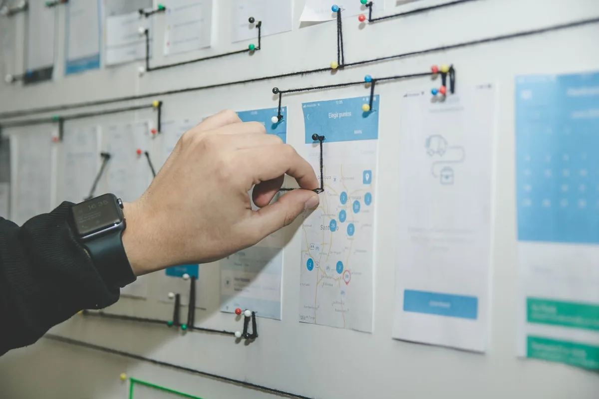
User flows map every path through the app, from first launch to the power-user routes. I chart the steps for each key task, find the dead ends and the detours, and design the shortest sensible route.
It is where everyone agrees how the app behaves before it gets built. Each piece below is part of that.
Every path mappedEach key task drawn out step by step, so the whole app is visible as a set of journeys rather than a pile of screens.
Routes for every userThe first-run path and the power-user shortcut both accounted for, so the app fits the beginner and the regular.
Dead ends foundThe places a flow stops, loops or strands someone, caught on paper where they cost nothing to fix.
The shortest sensible routeEvery task reduced to the fewest steps that still make sense, so nothing takes three taps that should take one.
Wireframes
It is far cheaper to move a box in a wireframe than to rebuild a finished screen.
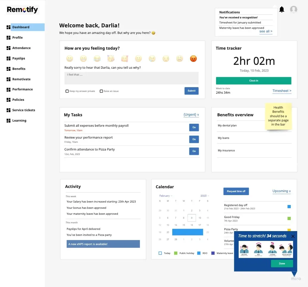
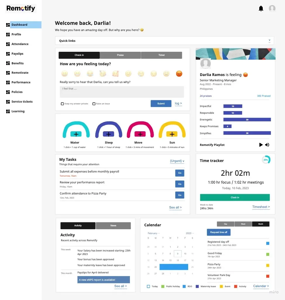
Wireframes are the structure of each screen worked out before any visual design: low-fidelity layouts that settle hierarchy and content, then the key ones turned into clickable prototypes for testing and review.
Structure first, surface second. Each piece below is part of that.
Low-fidelity layoutsPlain grey-box layouts that settle what goes where and what matters most, before colour and type enter the conversation.
Screen structureThe hierarchy and content of each core screen decided deliberately, so the important thing is the obvious thing.
Clickable prototypesThe key screens linked so the structure can be clicked through and tested, not just looked at.
Agreed before designWireframes everyone signs off on, so the visual stage starts from a structure that is already settled.
UI design
The gap between a demo and a real product is all the states nobody designed. This is where that gap closes.
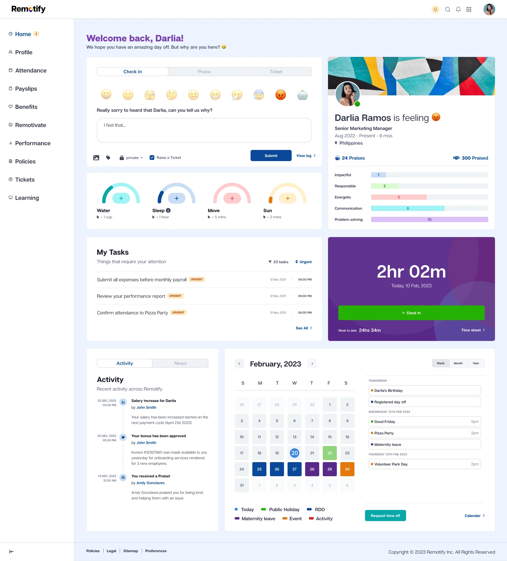
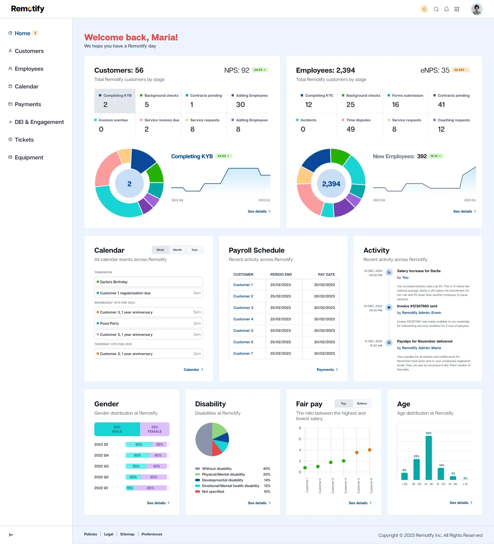
UI design is the full visual design of every screen, including the empty, error, loading and edge-case states most people skip. Production-ready screens, not a happy-path demo.
I design on a system from the start, so every screen is consistent and every awkward state is accounted for. Each piece below is part of that.
Every screenThe whole product designed, not just the headline screens, so there are no gaps left for the build to improvise.
The states people skipEmpty, loading, error and edge-case states designed on purpose, because that is what decides whether a product feels finished or flaky.
Visual designColour, type and layout applied to every screen so the product looks like one considered thing.
Built on a systemEvery screen drawn from a shared component set, so consistency is built in rather than chased afterwards.
Design system
Without a system, every new screen is a fresh negotiation and the product slowly drifts apart. A system holds the line.
A design system is a component library that grows with your product: tokens, documented components and real examples, built on a token foundation and kept lean enough to maintain.
It keeps the product consistent and speeds up every new feature. Each piece below is part of that.
Component libraryEvery reusable part built once and documented, so features get assembled from known pieces rather than redrawn each time.
Design tokensColour, type and spacing held as named values, so a brand change flows through the whole product at once.
DocumentationHow and when to use each component, written down, so the system guides the next person without me in the room.
Real examplesPatterns shown in context, so the system is something a team can copy from rather than interpret.
Prototype
People react to something they can use far more usefully than to a static picture. Prototypes get you honest feedback early.
A prototype is a clickable version that behaves like the real app, wired together in Figma without writing code, for user testing, investor demos or board reviews.
It de-risks the build before a line of code is written. Each piece below is part of that.
Clickable demoThe key flows linked so the app can be used rather than described, convincing enough to learn from.
User testingA prototype solid enough to put in front of real users, so problems show up while they are still cheap to fix.
Demos and reviewsSomething to show investors or a board that feels like the real product, not a deck of screenshots.
Realistic behaviourWired so it responds like the finished app, so the feedback is about the product rather than the gaps.
Handoff
Most quality is lost between design and build. Good handoff, and a designer who sticks around, is how you keep it.
Developer handoff is everything a developer needs to build the design accurately: specs, tokens, assets, animation notes and someone to ask. I prepare clean files and clear specs, then stay available through the build.
It is the bridge from design to a shipped product. Each piece below is part of that.
SpecsMeasurements, behaviour and states documented, so the build does not lose detail in translation.
Assets and tokensExported assets and the design tokens that match the code, so colours and spacing line up rather than drift.
CollaborationWorking alongside the developers through the build, not throwing a file over the wall and hoping.
Ongoing supportAvailable to answer questions and check the result as it gets built, so the shipped product matches the design.
Mobile App Design: Native vs Cross-Platform UX
Apps·7 min read
Native or cross-platform? The UX differences matter more than the technical ones.
Michael Trevatt
Most teams treat native versus cross-platform as a technical decision. It isn't.
The choice shapes what users actually see, tap and feel. That makes it a UX
decision dressed in engineering clothes.
What each approach actually means
Native. Built separately for each platform using the
platform's own tools. Swift or SwiftUI for iOS, Kotlin or Jetpack Compose for
Android. Two codebases, two release cycles, two teams.
Cross-platform. One codebase, both platforms. Flutter, React
Native and Kotlin Multiplatform lead the field in 2026. You write the app once
and ship it to iOS and Android together.
Hybrid. Web technologies wrapped in a native shell. Ionic and
Capacitor are the obvious examples. For most use cases a well-built
progressive web app is a cleaner choice.
Where native still wins
Platform conventions
iOS and Android speak different visual languages. iOS uses bottom tabs,
collapsing nav titles, and a specific gesture vocabulary. Android leans on
Material Design, with floating action buttons and its own motion patterns.
Users on each platform recognise these conventions without thinking. Breaking
them costs you trust before the first tap.
Native apps get this for free. Cross-platform builds face a choice: pick one
platform's conventions and feel foreign on the other, or invent a custom
language that feels native to neither. Flutter often takes the second route.
For some products that works. For others it lands as a tell that corners were
cut.
Performance in complex interfaces
Native still has the edge on heavy animation, real-time data, video
processing, and anything GPU-intensive. The gap has closed, but it isn't
gone. Apps built around complex gestures, camera work, AR or sensor-heavy
interactions earn their keep on native.
Accessibility
Platform components ship with accessibility built in. Screen readers, dynamic
type, reduced motion, high contrast: all work by default. Cross-platform
frameworks have improved a lot, but reaching parity still takes deliberate
work.
Where cross-platform wins
Consistency
When the brand matters more than the platform, cross-platform gives you
tighter control. The same interface on both devices, no divergence. Consumer
apps with a strong identity gain something real from this.
Single release cycle
One codebase ships to both stores at once. Bug fixes and improvements reach
every user on the same day. Native teams manage two releases, which often
means two slightly different experiences.
Shared design system
Components map one-to-one with code. You design it once and it gets built
once. The product that ships matches the design that was approved.
The 2026 state of play
The gap between native and cross-platform UX has narrowed sharply. Flutter's
rendering is smooth and consistent. React Native's new architecture (Fabric)
closed most of the performance gap. Kotlin Multiplatform lets teams share
business logic while keeping native UI on each platform.
For business apps, content apps, e-commerce and most utilities,
cross-platform now ships experiences users can't tell apart from native. The
honest answer in 2026 is that the technology choice rarely shows up in the
finished UX.
Where it still does: apps that lean hard on platform-specific hardware or
APIs. Health and fitness with deep sensor work. Camera-first apps. Real-time
collaboration. AR. If your product lives in that space, native still earns
its budget.
A decision framework
Choose native when
The app leans heavily on platform-specific hardware or APIs
The budget supports two teams or sustained dual development
The app is the product, not a companion to a web service
Platform-native UX patterns are central to user expectations
Choose cross-platform when
You need both platforms within a constrained budget
Speed to market matters more than platform purity
A consistent brand experience matters more than native conventions
The app is about content and interaction, not hardware integration
Consider a progressive web app when
The app mainly delivers content or a utility
You'd rather not deal with app stores
Budget is tight and reach matters more than gloss
The capabilities you need are already in the browser (which, in 2026, is most of them)
The questions that matter more than the stack
None of the above decides whether the app succeeds. These do:
Does onboarding get the user to value within the first minute?
Is the primary action, the reason the user opened the app, reachable in two taps or fewer?
Does the app respect the user's time, attention and data?
Does it work for users with disabilities?
Does it hold up on a slow connection and a four-year-old phone?
A native app that fails these questions is worse than a cross-platform app
that passes them. The platform is the canvas. The work is the painting.
Where to start
App planning starts with UX, not the stack. Get the experience right and the
technology choice almost makes itself. That's how I approach
app projects, with
UX design doing the thinking underneath.
Design Systems: Why Your Business Needs One
Insights·5 min read
A design system isn’t just for big tech companies. Here’s why it matters for businesses of any size and what it actually involves.
Michael Trevatt
A design system is a collection of reusable components, guidelines, and standards that define how your digital products look and behave. Think of it as a shared language between your designers, developers, and anyone else who builds or maintains your digital presence.
If that sounds like something only Google and Airbnb need, it’s not. Any business with more than one digital touchpoint benefits from a system. Here’s why.
The problem it solves
Without a design system, every new page, feature, or campaign starts from scratch. A designer creates a new button style because they didn’t know one already existed. A developer builds a card component that looks slightly different from the one on another page. The marketing team creates landing pages that don’t quite match the main site.
Over time, small inconsistencies accumulate. The product starts to feel fragmented. Updating the brand means hunting through dozens of files and pages to find every instance of the old style. Quality drops because there’s no shared standard.
This isn’t a theoretical problem. I see it on almost every site we audit. Buttons in three different sizes. Headings in four different weights. Spacing that varies randomly from page to page. Not because anyone made a bad decision, but because there was no system to make good decisions easy.
What a design system actually contains
At its simplest, a design system includes colour definitions (primary, secondary, accent, semantic colours for success/warning/error), typography (font families, sizes, weights, line heights for each heading level and body text), spacing (a consistent scale, usually based on multiples of 4 or 8 pixels), and a component library (buttons, forms, cards, navigation, modals, and any other UI element that appears more than once).
A more mature system also includes interaction patterns (how things behave on hover, focus, click), accessibility standards (contrast ratios, keyboard navigation, screen reader requirements), content guidelines (tone of voice, writing conventions, terminology), and documentation that explains when and how to use each component.
The business case
Design systems save time and money. That’s the bottom line.
When a developer needs a button, they use the existing button component. They don’t design a new one, get it approved, build it, and test it. The work has already been done once and done well.
When you rebrand or update your visual identity, you change the system once and the changes flow through to everything that uses it. Instead of updating 50 pages individually, you update the design tokens and the components inherit the changes.
When you hire new team members, the system is their onboarding. They don’t need to reverse-engineer the design decisions from existing pages. The decisions are documented and available.
When you add new features or pages, they feel consistent with the rest of the product from day one. No design review meetings to catch inconsistencies. No QA cycles to flag visual bugs.
You don’t need to build Spotify’s design system
The scale of your design system should match the scale of your business.
A startup with a 10-page marketing site doesn’t need a 200-component library with Storybook documentation and versioning. They need a clear set of colours, fonts, spacing values, and a handful of reusable components. That might fit in a single Figma file and a CSS stylesheet.
A SaaS company with a complex product interface needs something more structured. Documented components with usage guidelines, coded equivalents, and a governance process for adding new components.
The point is to start with what you need now and build from there. A small system that people actually use is infinitely more valuable than a comprehensive system that sits in a folder nobody opens.
Common objections
"We’re too small for a design system." If you have a website and any other digital touchpoint (email templates, social media graphics, presentations), you benefit from consistent design standards. You don’t need to call it a design system. Just define your colours, fonts, and key components in one place.
"It will slow us down." The opposite is true. It feels slower at the start because you’re investing time in building the system. But once it exists, every subsequent project is faster because you’re not redesigning from scratch.
"Our designers will feel restricted." A good design system isn’t a cage. It handles the boring, repetitive decisions (what shade of blue, how much padding, what font size) so designers can focus their energy on solving actual problems. Constraints breed creativity.
"We’ll build one when we have time." You won’t. The best time to start a design system is during a project that’s already happening. Build the system as part of the work, not as a separate initiative.
How to get started
Start with an audit. Look at your existing digital products and catalogue the inconsistencies. How many button styles exist? How many shades of grey? How many different heading treatments?
Then define the basics: colour palette, type scale, spacing scale, and your most common components. Document them in a shared location where designers and developers can both access them.
Use the system on your next project. Refine it based on what works and what doesn’t. Add new components as you need them.
The system is never finished. It evolves with your product. That’s the point.
What we do
When we build websites, we build systems. Every project gets a set of design tokens, a component library, and documentation proportional to its complexity. It means the site is consistent on launch and maintainable after we hand it over.
If your digital presence feels disjointed and you want to bring it together, let’s talk about it.
Branding vs Logo Design: What’s the Difference?
Insights·5 min read
A logo is not a brand. Here’s what the difference actually means and why it matters when you’re investing in either.
Michael Trevatt
People use "branding" and "logo design" interchangeably. They’re not the same thing. Understanding the difference will save you money, time, and a lot of frustration when you’re working with a designer.
A logo is a mark
A logo is a visual symbol that identifies your company. It’s the thing that goes on your business card, your website header, your invoices, and your social profiles. It needs to be distinctive, memorable, and versatile enough to work at every size and on every surface.
Good logo design is hard. Reducing a business to a single mark that communicates the right things to the right people takes skill and experience. But a logo on its own doesn’t mean much.
Think about the Nike swoosh. On its own, it’s just a curved line. What makes it powerful is everything that surrounds it: the advertising, the athletes, the products, the cultural associations built over decades. The swoosh is a container for meaning, not the meaning itself.
A brand is the whole picture
Your brand is how people experience your company. It includes the logo, yes. But it also includes your colour palette, typography, photography style, tone of voice, messaging, values, customer experience, packaging, and the feeling someone gets when they interact with your business.
A brand strategy defines who you are, who you’re for, what you stand for, and how you communicate. The visual identity (including the logo) is the expression of that strategy.
When someone says "I need a rebrand," they usually mean one of two things. Either they need a new visual identity (new logo, colours, typography), or they need to rethink their entire market position. These are very different projects with very different scopes and budgets.
Why it matters
If you hire a designer to create a logo without thinking about the broader brand, you’ll get a mark that looks nice in isolation but doesn’t connect to anything. It won’t guide how your website should look, what tone your copy should take, or how your product packaging should feel.
If you invest in brand strategy first, the logo becomes a natural output of a much richer process. It has meaning behind it. It connects to a visual system that works across every touchpoint.
This doesn’t mean you always need a full brand strategy before designing a logo. Startups and small businesses often can’t justify a £20,000 brand strategy project. But even a lightweight brand workshop that clarifies your audience, positioning, and personality will produce a much better logo than diving straight into sketches.
What a logo designer delivers
A logo design project typically produces a primary logo, variations (horizontal, stacked, icon-only), colour specifications, and basic usage guidelines. The timeline is usually 2 to 4 weeks for a professional result.
You’ll get a mark that identifies your business. You probably won’t get a colour palette, typography system, brand guidelines, messaging framework, or visual language.
Budget: £1,000 to £5,000 for a freelancer or small studio. More for established agencies.
What a branding project delivers
A brand project typically includes research and strategy (audience, positioning, competitors, values), visual identity design (logo, colour, type, imagery style), brand guidelines, messaging and tone of voice, and templates or examples of the brand applied across key touchpoints.
The timeline is 6 to 12 weeks for a thorough process.
Budget: £5,000 to £30,000+ depending on scope and complexity.
When to invest in which
Just a logo works when: you’re a new business testing an idea, you already have a clear sense of your brand and just need the visual mark, or your budget is tight and you need to start somewhere.
Full branding works when: you’re launching a business and want to get it right from the start, you’re repositioning an existing business, your current brand doesn’t reflect who you are anymore, or you’re entering a competitive market and need to stand out.
A rebrand works when: your business has outgrown its original identity, you’ve merged with or acquired another company, your industry has shifted and your brand feels dated, or your visual identity is inconsistent across touchpoints.
The common mistake
The most expensive mistake is treating a logo as a brand. Companies spend £3,000 on a logo, then another £2,000 on a website that doesn’t match, then another £1,000 on business cards with different colours, and then £5,000 on marketing materials that don’t feel connected to anything.
By the time they realise they need a coherent system, they’ve spent more than a proper branding project would have cost in the first place.
If you can afford to do it once, do it properly. If you can’t, start with a logo and a plan to build the brand out over time.
How we approach it
At Trevatt Design, we do both. We’ve created standalone logos for startups that needed a mark quickly, and we’ve run full brand strategy projects for established businesses. The approach depends on what you need, where you are in your journey, and what your budget allows.
Your portfolio is your best sales tool. Here’s what separates the ones that win work from the ones that get closed after three seconds.
Michael Trevatt
Your portfolio website has one job: convince the right people to hire you. Not impress other designers. Not win awards. Not show off every project you’ve ever touched. Convince the people who pay for your services that you can solve their problem.
I’ve been reviewing portfolios for years, both when hiring and when auditing competitors. The good ones all share a few things in common. The bad ones all make the same mistakes.
Show the work, but tell the story
Screenshots are not a portfolio. A grid of pretty images tells me you can make things look nice. It doesn’t tell me whether you can think.
Every project in your portfolio should answer three questions: what was the problem, what did you do, and what happened as a result?
The problem gives context. The process shows your thinking. The result proves you delivered. Without all three, your portfolio is just a gallery.
You don’t need to write a 3,000-word case study for every project. Even two or three sentences of context make a significant difference. "Redesigned the checkout flow, reducing cart abandonment by 22%" is more persuasive than a carousel of screens with no explanation.
Less is more
Five strong projects beat twenty average ones. Curate ruthlessly.
Every project in your portfolio should be one you’re genuinely proud of. If you’re including something because you need to fill space, take it out. A thin portfolio with great work is better than a packed one that dilutes your strongest pieces.
If you’re just starting out and don’t have five strong projects, that’s fine. Show three. Or two. Quality over quantity is not a cliche here. It’s the difference between looking like a professional and looking like you’ll take any job that comes along.
Speak to the client, not the designer
This is the mistake I see most often. Portfolios written for an audience of peers rather than an audience of buyers.
Your potential client doesn’t care about your design tools, your grid system, or your Figma workflow. They care about whether you understand their world and can help their business.
Use language they understand. Talk about business outcomes, not design processes. If you redesigned an e-commerce site, talk about the increase in sales, not the type scale you used.
Your About page should explain who you help and how, not recite your education and software skills.
Make it fast
A portfolio that takes five seconds to load is a portfolio that doesn’t get seen. Especially on mobile.
Optimise your images. Keep your code lean. Don’t load a 4MB hero video that autoplays on every page. Performance is a design decision, and a slow portfolio suggests you’ll build slow websites for your clients.
Aim for a Largest Contentful Paint under 2.5 seconds. Test it. If it’s slow, fix it before worrying about anything else.
Make it easy to get in touch
I’ve seen portfolios where the contact page is buried three levels deep, or the only way to get in touch is a generic contact form with fifteen fields. Make it simple.
Your email address or a short contact form should be accessible from every page. A clear call to action on your case study pages ("Like what you see? Let’s talk.") removes friction between someone being impressed and someone reaching out.
Don’t make people work to hire you.
Navigation should be invisible
If someone has to think about how to use your portfolio, you’ve failed the most basic UX test.
Keep the navigation simple. Projects, About, Contact. That’s the core. Add a blog or services page if you need to. Don’t build a clever navigation that sacrifices usability for creativity.
The same goes for project pages. Don’t make people click through a ten-step slideshow to see your work. Let them scroll. Scrolling is natural. Clicking through paginated images is annoying.
Show range, but stay focused
If you do brand identity, web design, and UX research, show projects that demonstrate each. But don’t try to be everything to everyone.
A portfolio that includes logo design, wedding photography, social media management, and web development says "I’ll do anything for money." A portfolio that shows five web design projects for B2B SaaS companies says "I’m the expert you need."
Specialisation is not limiting. It’s positioning.
Keep it current
If your most recent project is from 2022, your portfolio looks abandoned. If your design style has evolved but your portfolio hasn’t, you’re misrepresenting your current work.
Update your portfolio at least twice a year. Swap out old projects for new ones. Make sure the design of the portfolio itself still reflects your standards.
Your portfolio is a living document. Treat it like one.
The technical details matter
Responsive design, fast load times, clean URLs, proper metadata, alt text on images, working links. These are the basics. If your portfolio doesn’t meet them, you’re telling potential clients that you cut corners on the fundamentals.
If you’re a web designer or developer, your portfolio is the most scrutinised site you’ll ever build. It needs to be impeccable.
What we look for
When a potential client visits our site, we want them to understand three things quickly: what we do, who we do it for, and what it’s like to work with us. The case studies, the testimonials, the process: they all serve that goal.
If you’re building or rebuilding your portfolio and want a second opinion, reach out. Happy to take a look.
Website Redesign Checklist
Insights·6 min read
Everything you need to think about before, during, and after a website redesign. A practical checklist from someone who does this for a living.
Michael Trevatt
A website redesign is one of those projects that always takes longer and costs more than people expect. Not because it’s inherently difficult, but because most teams start without a clear picture of what’s involved.
This is the checklist I use when planning a redesign, whether it’s for a client or when reviewing someone else’s plan. It’s not exhaustive for every possible scenario, but it covers the things that get missed most often.
Before you start
Define why you’re redesigning. "It looks dated" is a reason, but it’s not a strategy. What isn’t working? Are users dropping off? Is the conversion rate poor? Has your business changed and the site hasn’t kept up? The reason for the redesign should shape every decision that follows.
Audit what you have. Before building something new, understand what exists. Run a content audit: what pages do you have, what’s performing, what’s redundant? Check your analytics. Identify your top-performing pages, your highest-traffic entry points, and your most common user journeys. A redesign that accidentally kills your best-performing content is a disaster.
Set measurable goals. "A better website" is not a goal. "Increase enquiry form submissions by 30% within six months" is. "Reduce bounce rate on the services page from 70% to 45%" is. Goals give you something to measure against after launch.
Document your SEO baseline. Record your current rankings, organic traffic, indexed pages, and backlink profile before you change anything. Redesigns regularly destroy SEO performance because nobody planned the URL migration properly.
Define your audience. Who is this site for? If the answer is "everyone", you need to be more specific. Different audiences need different messaging, different content, and sometimes different user journeys.
Planning and strategy
Create a sitemap. Map out every page the new site needs. Compare it to what exists. Identify pages that are being removed, merged, or created from scratch. This is also where you plan your URL structure.
Plan your URL redirects. If any URL is changing, you need a 301 redirect map. Every old URL should point to the most relevant new URL. This is non-negotiable for SEO. Missing redirects mean lost rankings and broken links across the web.
Define your content needs. What content needs to be written, rewritten, or migrated? Who’s responsible for it? What’s the deadline? Content is almost always the bottleneck in a redesign. Plan for it early.
Choose your technology. CMS, hosting, framework, plugins. Make these decisions based on your actual needs, not on what’s trendy. WordPress still powers a massive chunk of the web for good reason. But if your needs are simpler, a static site or a headless CMS might be a better fit.
Set a realistic timeline. A typical redesign for a 20 to 30 page site takes 8 to 14 weeks from kickoff to launch. Larger sites take longer. Factor in time for content creation, feedback rounds, testing, and the inevitable delays.
Design and development
Start with wireframes. Get the layout and structure right before adding visual design. This saves time and reduces the risk of major changes late in the process.
Design mobile-first. More than half of web traffic is mobile. If your site doesn’t work well on a phone, it doesn’t work well.
Build a component system. Don’t design every page from scratch. Build a set of reusable components (headings, cards, CTAs, forms, content blocks) that can be combined in different ways. This makes the site easier to build, easier to maintain, and more consistent.
Optimise for performance. Set a performance budget. Compress images. Minimise scripts. Lazy load below-the-fold content. Test Core Web Vitals throughout development, not just at the end.
Implement structured data. Schema markup for your business type, articles, reviews, FAQs, and breadcrumbs. This helps search engines understand your content and can improve how your pages appear in search results.
Test across browsers and devices. Chrome on a MacBook is not the only way people will see your site. Test on Safari, Firefox, Edge. Test on iOS and Android. Test on older devices. Test with screen readers.
Content migration
Migrate content carefully. Don’t just copy and paste. Review every piece of content during migration. Update anything that’s outdated. Improve anything that’s weak. Remove anything that’s redundant.
Preserve your metadata. Page titles, meta descriptions, Open Graph tags, alt text. These need to be migrated or rewritten for every page. Losing your metadata during a redesign is losing months or years of SEO work.
Check your internal links. After migration, every internal link should point to a valid page. Broken internal links are bad for users and bad for SEO.
Pre-launch
Run a full technical audit. Check for broken links, missing alt text, duplicate titles, missing meta descriptions, orphaned pages, redirect chains, and missing schema markup.
Test all forms and integrations. Contact forms, newsletter signups, CRM integrations, analytics tracking, conversion pixels. Test every one of them. Then test them again.
Set up analytics and tracking. Make sure Google Analytics 4 (or your preferred analytics platform) is properly configured. Set up conversion tracking for your key goals. Verify Search Console is connected.
Get stakeholder sign-off. Before you launch, make sure everyone who needs to approve the site has seen it and agreed. Last-minute changes on launch day are stressful and avoidable.
Post-launch
Monitor everything for the first two weeks. Watch your analytics. Check Search Console for crawl errors. Monitor your rankings. Look for 404 errors. Keep an eye on page load times.
Verify all redirects are working. Spot check your redirect map. Use a crawler to check for broken links and redirect chains.
Submit your updated sitemap. Tell Search Console about your new sitemap so Google can crawl and index your new pages.
Gather user feedback. Ask real users what they think. Not your team, not your friends. People who match your target audience. Their feedback will reveal things you missed.
Plan for ongoing optimisation. The redesign is a starting point, not a destination. Set a cadence for reviewing performance data and making improvements. The best websites are the ones that keep getting better.
The one thing people always underestimate
Content. Every time. The design gets done. The development gets done. And then the project stalls for weeks because nobody wrote the copy for the new About page, or the case studies haven’t been photographed, or the team bios are still sitting in someone’s drafts folder.
If you take one thing from this checklist: start your content early. Start it before the design phase if you can. It’s the single biggest factor in whether a redesign launches on time.
The UX design process from research to launch. How it actually works in practice, not just in textbooks.
Michael Trevatt
The UX design process gets talked about a lot in theory. Empathise, define, ideate, prototype, test. Five neat steps in a diamond shape. Very tidy.
In practice, it’s messier than that. Projects have budgets. Clients have opinions. Users do unexpected things. The real skill isn’t following the framework. It’s knowing when to adapt it.
Here’s how UX design actually works when you’re building real products for real businesses.
1. Discovery and research
Every project starts with questions. Who are we designing for? What problem are we solving? What does success look like? What already exists and why isn’t it working?
This phase involves talking to stakeholders, reviewing analytics (if available), looking at competitors, and understanding the business context. If there are existing users, we talk to them too.
The goal isn’t to produce a 60-page research document. The goal is to understand the problem well enough to make good design decisions. Sometimes that takes a week. Sometimes it takes a day. The depth of research should match the complexity and risk of the project.
What you get out of this: a clear understanding of who the users are, what they need, what the business needs, and where the gaps are.
2. Information architecture
Before anyone opens a design tool, we need to work out the structure. What pages does the site need? How do they relate to each other? What’s the hierarchy?
Information architecture is the skeleton of the product. Get it wrong and no amount of visual polish will fix the confusion.
This usually involves sitemaps, content audits (if it’s a redesign), and card sorting or tree testing if the structure is complex enough to warrant it.
For simpler projects, this might be a 30-minute conversation and a quick sitemap sketch. For complex platforms, it can take weeks.
3. Wireframing
Wireframes are the blueprint. They show layout, content hierarchy, and user flow without the distraction of colours, fonts, and images.
I use wireframes to get alignment on structure before investing time in visual design. It’s much cheaper to move a box on a wireframe than to redesign a fully styled page because the layout doesn’t work.
Wireframes should be rough enough that nobody mistakes them for the final design, but detailed enough that you can see how the page will function. The sweet spot is somewhere between a napkin sketch and a polished mockup.
Clients sometimes want to skip wireframes and go straight to "the real design." I push back on that. It’s like asking a builder to skip the architectural drawings and just start laying bricks. You can do it, but you’ll spend more time and money fixing problems later.
4. Visual design
This is where the thing starts to look like a real product. Typography, colour, imagery, spacing, motion. All the visual decisions that shape how the product feels.
Good visual design isn’t about making things look pretty. It’s about making information clear, actions obvious, and the experience feel appropriate for the audience. A fintech app and a children’s learning platform need very different visual approaches, even if the underlying UX patterns are similar.
I design in the browser or in Figma, depending on the project. The key is that every visual decision should have a reason behind it. If you can’t explain why something is that colour or that size, it’s decoration, not design.
5. Prototyping
A prototype is a clickable version of the design that lets you test the experience before building it. You can test navigation flows, form interactions, and key user journeys without writing a line of production code.
The fidelity of the prototype depends on what you’re testing. Testing whether users can find the checkout button? A simple clickable prototype is fine. Testing whether a complex configuration tool feels intuitive? You might need something more interactive.
Prototyping catches problems early. I’ve seen entire features scrapped at the prototype stage because user testing revealed that the concept didn’t work. That’s a good outcome. Better to learn that before development starts than after launch.
6. User testing
You can make assumptions about how people will use your product, or you can watch them actually use it. I’d recommend the second option.
User testing doesn’t need to be expensive or complicated. Five users testing a prototype for 20 minutes each will uncover most of the major usability issues. You don’t need a lab, a one-way mirror, or a sample size of 200.
What matters is that you’re testing with people who match your actual audience. And that you’re watching what they do, not just listening to what they say. People will tell you a design is "nice" and then struggle to complete a basic task. Their behaviour is the truth.
7. Iteration
Testing reveals problems. Iteration fixes them. Then you test again.
This is the part of the process that gets squeezed when budgets are tight. But it’s where the quality comes from. First drafts are never the best version. The difference between a good product and a great one is usually two or three rounds of refinement based on real feedback.
8. Development handoff
Designers and developers need to communicate clearly. That means detailed specifications, annotated designs, a shared understanding of responsive behaviour, and an accessible design system or component library if the project is large enough.
The worst outcomes happen when a designer throws a static image over the wall and expects the developer to figure out every edge case. The best outcomes happen when designers and developers work together throughout the process.
9. Launch and learn
Launching is not the end. It’s the first time your product meets the full audience. Analytics, heatmaps, user feedback, and support tickets will all tell you things that research and testing couldn’t.
The best products are the ones that keep improving after launch. Build a feedback loop. Review the data. Make changes. Repeat.
Common mistakes
Skipping research because "we already know our users." You don’t. Or at least, you don’t know them as well as you think. Even a small amount of research will challenge assumptions.
Designing for stakeholders instead of users. The CEO’s favourite colour is not a UX decision. Internal politics should not drive information architecture.
Treating UX as a phase rather than a mindset. UX isn’t something you do once and tick off. It’s a way of thinking about every decision throughout the project.
Over-designing. Adding features, content, and interactions because you can, not because users need them. Simplicity is harder to achieve than complexity, and it almost always performs better.
How we approach it
At Trevatt Design, UX is the foundation of everything we build. The process adapts to the project: a startup MVP gets a leaner version than a platform redesign. But the principles stay the same. Understand the problem. Design for the user. Test. Refine.
Accessibility isn’t a nice-to-have. It’s good design, good business, and increasingly, a legal requirement.
Michael Trevatt
Web accessibility means building websites and apps that people with disabilities can use. That includes people with visual impairments, hearing loss, motor difficulties, cognitive differences, and temporary disabilities like a broken arm or a migraine.
Most businesses treat accessibility as a compliance checkbox. Something to worry about after the design is done, if at all. That’s the wrong way to think about it.
The numbers
Around 16% of the global population has a significant disability. In the UK, that’s roughly 14.1 million people. In the US, 61 million adults.
These are not small numbers. They represent a significant portion of your potential audience. If your website is inaccessible, you are actively excluding them.
Beyond permanent disabilities, consider situational and temporary ones. Someone using their phone in bright sunlight. Someone with their arm in a cast. Someone watching a video in a noisy environment. Someone experiencing eye strain after a long day. Accessibility features help all of these people.
The legal landscape
The legal pressure is real and increasing.
In the UK, the Equality Act 2010 requires organisations to make reasonable adjustments for people with disabilities. Websites are included. The Public Sector Bodies Accessibility Regulations 2018 made WCAG 2.1 AA compliance mandatory for public sector websites.
In the EU, the European Accessibility Act comes into full effect in June 2025, requiring digital products and services to meet accessibility standards.
In the US, ADA lawsuits related to website accessibility have been rising steadily. In 2023, over 4,000 digital accessibility lawsuits were filed. Domino’s, Beyonce’s Parkwood Entertainment, and thousands of smaller businesses have all been taken to court over inaccessible websites.
This isn’t theoretical risk. It’s happening.
The business case
Set aside the legal and moral arguments for a moment. Accessibility is good for business.
Larger audience. An accessible website can be used by more people. More people means more potential customers.
Better SEO. Many accessibility practices directly improve SEO. Alt text on images helps search engines understand your content. Proper heading hierarchy improves page structure. Descriptive link text helps both screen reader users and search crawlers. Fast page loads and clean code benefit everyone.
Better UX for everyone. Captions on videos help people in noisy environments and people who speak English as a second language. High contrast text is easier to read for everyone, not just people with low vision. Clear navigation benefits everyone, not just people using screen readers.
Brand reputation. Consumers increasingly expect companies to be inclusive. An inaccessible website signals that you haven’t thought about a significant portion of your audience.
What accessibility actually looks like
WCAG (Web Content Accessibility Guidelines) is the international standard. Version 2.2 is the current benchmark. There are three levels: A, AA, and AAA. Most organisations aim for AA, which is the level required by most regulations.
Here’s what AA compliance involves in practical terms:
Perceivable. All content can be perceived by all users. Images have alt text. Videos have captions. Colour is not the only way information is conveyed (e.g., error messages don’t rely solely on red text). Text has sufficient contrast against its background (4.5:1 for normal text, 3:1 for large text).
Operable. All functionality can be used with a keyboard. Focus states are visible. Users can navigate with a screen reader. Nothing flashes more than three times per second. Users have enough time to read and interact with content.
Understandable. Language is clear. Navigation is consistent. Forms provide clear labels and helpful error messages. The site behaves predictably.
Robust. The site works with assistive technologies. HTML is valid and semantic. ARIA attributes are used correctly where native HTML isn’t sufficient.
Where most sites fail
Based on audits I’ve done, the most common accessibility failures are predictable:
Insufficient colour contrast. Designers choose light grey text on white backgrounds because it looks clean. It’s also unreadable for many people.
Missing alt text on images. Either no alt text at all, or unhelpful alt text like “image1.jpg” or “photo.”
Missing form labels. Placeholder text is not a label. When a user clicks into a field and the placeholder disappears, they can’t see what the field is for.
No keyboard navigation. Interactive elements that only work with a mouse. Dropdown menus that trap keyboard focus. Modal windows that can’t be closed with the Escape key.
Missing heading hierarchy. Skipping from H1 to H4, or using heading tags for styling rather than structure.
No skip navigation link. Screen reader users have to listen to the entire header and navigation on every page before reaching the content.
How to get started
You don’t need to fix everything at once. Start with the highest-impact changes.
Run an automated audit using tools like axe, WAVE, or Lighthouse. These will catch the obvious issues: contrast failures, missing alt text, missing labels.
Then do a manual check. Navigate your entire site using only a keyboard. Can you reach every link, button, and form field? Can you see where the focus is? Can you open and close menus?
Test with a screen reader. VoiceOver on Mac, NVDA on Windows, or TalkBack on Android. Listen to how your site sounds. Is the content structure logical? Are images described? Are forms navigable?
Fix the issues you find. Then build accessibility into your design and development process so new content and features meet the standard from the start.
Our approach
Accessibility is part of how we design and build. It’s not a separate phase or an add-on service. Colour contrast is checked during design. Semantic HTML is used during development. Keyboard navigation is tested before launch.
We don’t claim perfection. Accessibility is an ongoing practice, not a one-time achievement. But we take it seriously because it produces better products for everyone.
If you want to understand where your site stands and what to prioritise, get in touch.
How UX Design Improves Conversion Rates
Insights·5 min read
The connection between UX and conversions isn’t magic. It’s removing friction. Here’s how it works in practice.
Michael Trevatt
Most websites don’t have a traffic problem. They have a conversion problem. People arrive, look around, and leave without doing the thing you wanted them to do.
The fix is rarely more marketing spend. It’s usually better UX.
What we’re actually talking about
A conversion is any action you want a visitor to take. Filling in a contact form. Signing up for a trial. Making a purchase. Downloading a guide. Booking a call.
Conversion rate is the percentage of visitors who complete that action. If 1,000 people visit your site and 20 fill in the enquiry form, your conversion rate is 2%.
UX design improves conversion rates by making it easier, clearer, and more compelling for people to take that action. There’s no trick to it. You remove the things that get in the way, and more people follow through.
Clarity beats cleverness
The single biggest conversion killer is confusion. If someone lands on your page and can’t immediately understand what you offer and what they should do next, they leave.
This happens more often than you’d think. I’ve audited sites where the homepage headline was a vague inspirational statement, the navigation had twelve items, and the call to action was hidden below three scroll-lengths of content.
The fix is simple: say what you do, say who it’s for, and make the next step obvious. Above the fold. In plain language.
A clear value proposition and a visible call to action will do more for your conversion rate than any design trend.
Reduce friction in forms
Every field in a form is a reason for someone to abandon it. Ask only for what you genuinely need.
If you’re running a contact form, you need a name, an email, and a message. Maybe a phone number. You don’t need their company size, industry, budget range, how they heard about you, and their preferred contact time. Not at first contact, anyway.
I’ve seen form completion rates double just by reducing the number of fields from eight to four. That’s not a UX theory. That’s maths.
Other form improvements that work: inline validation (telling people about errors as they type, not after they submit), clear labels above each field (not placeholder text that disappears), and a submit button that says what it does ("Send your message" not "Submit").
Page speed is a UX decision
A page that takes four seconds to load will lose roughly 25% of visitors before they see anything. On mobile, where connections are less reliable, it’s worse.
Google’s own data shows that the probability of bounce increases 32% as page load time goes from one second to three seconds. By five seconds, the probability has increased by 90%.
You can have the best design in the world. If it takes too long to load, nobody will see it.
Compress images. Minimise JavaScript. Use a CDN. Lazy load content below the fold. These are not optional extras. They’re baseline requirements.
Trust signals matter
People don’t buy from businesses they don’t trust. On the web, trust is built through design quality, social proof, and transparency.
Client logos, testimonials, case studies, reviews, certifications, and awards all contribute to trust. But only if they’re genuine and relevant to your audience.
Placement matters too. A testimonial on your pricing page is more effective than one buried on a separate testimonials page nobody visits. A client logo near your call to action reassures at the moment of decision.
Mobile is where you’re losing people
More than half of web traffic is mobile. If your conversion flow doesn’t work well on a phone, you’re losing the majority of your potential customers.
Common mobile UX failures: buttons too small to tap, forms that are painful to fill in on a small screen, pop-ups that cover the entire viewport, and text that’s too small to read without zooming.
Test your key conversion pages on a real phone. Not a browser resized to look like a phone. An actual phone. Go through the entire flow, from landing page to thank-you page. Every point of friction you experience, your customers are experiencing too.
Visual hierarchy guides attention
Good visual design isn’t decoration. It’s communication. The size, colour, position, and contrast of elements on a page tell people where to look and what to do.
Your primary call to action should be the most visually prominent element on the page. If it’s the same size and colour as everything else, it’s invisible.
White space around important elements draws attention to them. Contrast between the CTA button and the background makes it stand out. Consistent visual patterns help people scan and understand the page structure quickly.
None of this is subtle. It’s the basic mechanics of how people process visual information.
The compound effect
No single UX change will transform your conversion rate overnight. But each improvement compounds.
Clearer headline: 5% more people understand what you do. Faster load time: 10% fewer people bounce. Simpler form: 15% more people complete it. Better mobile experience: 20% more mobile visitors convert.
Stack those improvements together and you’re looking at a meaningfully different result from the same traffic.
How to start
If you want to improve your conversion rate through better UX, start with data. Look at your analytics. Where are people dropping off? Which pages have high bounce rates? Where in the funnel are you losing people?
Then prioritise. Fix the biggest leaks first. A small improvement on a high-traffic page has more impact than a big improvement on a page nobody visits.
If you want help identifying where the opportunities are, get in touch. We do exactly this kind of work.
How to Choose a Web Design Agency
Insights·5 min read
What to look for, what to avoid, and how to tell if an agency actually knows what they’re doing before you sign anything.
Michael Trevatt
Choosing a web design agency is one of those decisions that feels harder than it should be. Everyone’s portfolio looks good. Everyone says they’re strategic. Everyone claims to put the user first. So how do you actually tell who’s worth your money?
I’ve been running Trevatt Design since 2010. I’ve seen agencies from both sides: as someone pitching for work, and as someone who inherits the mess when a client’s previous agency didn’t deliver. Here’s what I’d tell a friend if they asked me how to choose.
Look at the work, then look deeper
Every agency has a portfolio. The question isn’t whether the sites look nice. The question is whether they work.
Pick two or three sites from the portfolio and actually use them. Load them on your phone. Try to find the contact page. Try to understand what the company does within five seconds. Check if the site loads quickly. See if the navigation makes sense.
A portfolio full of pretty screenshots tells you the agency can design. A portfolio full of sites that are fast, clear, and easy to use tells you the agency understands the job.
Ask about process, not just outcomes
Any agency can show you a finished product. What matters is how they get there.
Ask them what their process looks like. Do they start with research? Do they create wireframes before visual design? Do they involve you in feedback rounds? How do they handle revisions?
If the answer is vague ("we’ll figure it out as we go"), that’s a red flag. A good agency has a clear process because they’ve refined it over years of projects.
Check if they understand your business
This is the one that separates the good from the great. Before they talk about colours and layouts, do they ask about your customers? Your competitors? Your business goals?
A website that looks fantastic but doesn’t speak to your audience is a vanity project. The agency should be asking who you’re trying to reach, what action you want visitors to take, and how the website fits into your broader business strategy.
If the first conversation is all about design trends and technology choices, they’re solving the wrong problem first.
Understand what you’re paying for
Get the scope in writing before you commit. This should cover design, development, content (if included), SEO setup, CMS training, browser and device testing, hosting configuration, and post-launch support.
The most common source of frustration I hear from clients who come to us after a bad experience is "we didn’t realise that wasn’t included." That’s partly on the client for not asking. But it’s mostly on the agency for not being clear.
A good agency will give you a detailed proposal that breaks down what’s in scope and what’s not. If the quote is a single number with no explanation, push back.
Watch out for these signs
They don’t have a website themselves. Or their site is slow, outdated, or broken. If they can’t look after their own presence, what makes you think they’ll look after yours?
They guarantee first-page Google rankings. Nobody can guarantee that. If they claim they can, they’re either lying or using tactics that will get your site penalised.
They build on proprietary platforms. If you can only edit your site through their system, and you have to keep paying them monthly to maintain it, you don’t own your website. You’re renting it.
They outsource everything. Some agencies are essentially project managers who subcontract the design and development to freelancers or offshore teams. That’s not inherently bad, but you should know about it. Ask who will actually be doing the work.
They haven’t asked you a single question. If they jump straight to a quote without understanding what you need, they’re guessing. And you’ll be paying for those guesses.
Size matters, but not the way you think
A bigger agency isn’t automatically better. A freelancer isn’t automatically worse. What matters is whether their setup matches your project.
If you need a simple 5-page site and you hire a 50-person agency, you’ll be their lowest-priority client and you’ll pay for overhead that doesn’t benefit you.
If you need a complex platform with integrations and multi-market rollout, a solo freelancer probably isn’t the right fit, no matter how talented they are.
Match the scale of the team to the scale of the project.
Ask for references
Not testimonials on their website. Actual references. Ask to speak to a previous client. Ask what went well. Ask what didn’t. Ask if they’d hire the agency again.
Most agencies won’t volunteer this. The ones who do are confident in their track record.
Trust your instincts
After all the research, the proposals, and the reference checks, there’s a gut feeling that matters. Did they listen to you? Did they explain things clearly? Do you feel like they understood what you’re trying to achieve?
You’re going to be working with these people for weeks or months. If the communication feels off during the sales process, it won’t get better once they have your money.
Where we fit
We’re a small London agency. We’ve been doing this since 2010. We handle strategy, UX, design, and development in-house, and we don’t take on more projects than we can give proper attention to.
If you’re weighing up your options and want a straight conversation about whether we’re the right fit, drop us a line. We’re happy to talk even if you end up going elsewhere.
Sales Is Not About Selling – It’s About Helping Your Customers Get What They Want
Insights·5 min read
Learn how to sell like crazy without being pushy or salesy. Follow these five steps: serve, ask, listen, empathize, and summarize to build genuine and meaningful rapport with your…
Michael Trevatt
As a digital designer and branding expert, I’ve had to learn how to sell my services without coming across as too pushy or salesy. In this article, I want to share my insights and tips on how to sell like crazy while still remaining true to your values and beliefs.
What does it mean to sell?
Before we get started, let’s redefine what it means to sell. Selling is not about pitching or convincing someone to do something. The goal of sales is to inspire the prospect to make a decision. You do this by helping them think through their challenges and needs. You don’t tell them what to do; you ask questions, listen empathetically, and summarize their needs.
Let’s take a look at the five steps to selling without being salesy.
Step 1: Serve
The first step in selling is to serve. It’s important to prepare yourself to think about sales in a different way. Selling is not about what you get but what you give. It’s about showing up to help others without expectations. You do this by acting in the best interest of others and being selfless. Another way of thinking about this is to act like a fiduciary that you’re taking care of somebody else’s money in business and you have their best interests at heart.
Let’s say you’re a financial advisor, and a potential client comes to you seeking advice on how to save for retirement. Instead of immediately pitching your services, take a step back and focus on serving the client’s needs. Ask questions to understand their current financial situation, their goals for retirement, and any challenges they may face in reaching those goals. Then, provide advice that is tailored to their specific needs, even if it means recommending services that you don’t offer.
Step 2: Ask
Don’t give advice. Instead, ask questions. The goal is to surface the real challenges and needs of the prospect. The more you ask, the more you will learn about their challenges, goals, and aspirations. By asking questions, you can build rapport and show that you care about their needs.
Continuing with the financial advisor example, instead of telling the client what they need to do to save for retirement, ask them questions about their current financial situation. Some possible questions could be: What is your current retirement savings? How much are you currently saving each month? Do you have any outstanding debts that could impact your ability to save for retirement?
Step 3: Listen
The third step in selling is to listen. Really listen. Put your phone away, turn off your notifications, and focus on the conversation. Listening is not just hearing; it’s about understanding what the prospect is saying, and why they are saying it. When you listen, you can empathize with their needs and develop a solution that addresses their challenges.
While the client is answering your questions, focus on really listening to what they have to say. Pay attention to both the words they use and the emotions they convey. If they express concern about not having enough saved for retirement, for example, you can respond by saying “I understand how stressful that can be, and I’m here to help you develop a plan to address that challenge.”
Step 4: Empathize
When you empathize with the prospect, you can connect with them on a deeper level. This helps build trust, which is critical in any sales process. You can show empathy by acknowledging their challenges and showing that you understand their situation.
After listening to the client’s concerns, show empathy by acknowledging their feelings. For example, you might say “It sounds like you’re worried about not being able to retire comfortably. I can understand why that would be a concern.” This shows that you care about their situation and are committed to helping them find a solution.
Step 5: Summarize
The final step in selling is to summarize. Summarizing is not just repeating what the prospect said. It’s about taking their challenges, needs, and goals, and summarizing them in a way that shows you understand their situation. Summarizing helps build rapport, shows that you were listening, and sets the stage for the next step in the sales process.
Once you have a good understanding of the client’s needs, summarize their situation to make sure you’re on the same page. You might say something like “Based on what you’ve told me, it seems like your top priority is to save enough for retirement to maintain your current standard of living. Is that accurate?” This shows that you’ve been actively listening and can help move the conversation forward towards developing a solution.
Conclusion
Selling doesn’t have to be slimy or salesy. Remember to serve, ask, listen, empathize, and summarize. Selling is not about pushing your products or services on someone; it’s about helping them find a solution to their challenges. By following these steps, you can build genuine and meaningful rapport with your customers and increase your success rate.
Contact us today to learn more about how we can help you improve your brand and take your business to the next level.
Understanding the Power of Price and Value
Insights·6 min read
Discover the importance of value in shaping consumer behaviour. Learn how companies like Disney and Apple use value-based pricing to command higher prices for their products or…
Michael Trevatt
Pricing is one of the most important aspects of business. It can determine whether a company succeeds or fails. But what makes people buy? Is it the price or the value? In this article, we will explore the power of price and value in shaping consumer behaviour.
The Importance of Value
Providing value to customers has become increasingly important in today’s competitive business environment. It helps companies differentiate themselves from their competitors and command higher prices for their products or services.
One notable example of a company that prioritizes value is Disney. They charge more for their theme parks compared to their nearby competitors like SeaWorld and Universal Studios. However, they have managed to maintain their high prices and continued growth due to their unwavering commitment to delivering value to their customers.
To illustrate, here are some ways Disney provides value to their customers:
1. Unique customer experience:
Disney creates a unique customer experience through their themed lands, immersive attractions, and iconic characters. They are known for their exceptional attention to detail, which helps to create a magical experience for their customers.
2. Exceptional customer service:
Disney cast members are trained to deliver exceptional customer service, which includes personalized interactions, attentive listening, and problem-solving skills.
3. Innovative technologies:
Disney uses innovative technologies to enhance the customer experience. For example, their MagicBands allow customers to access their hotel room, park tickets, and fast passes, all with a simple tap.
4. Family-friendly environment:
Disney provides a family-friendly environment with attractions and activities suitable for all ages. They have also created quiet areas and baby care centres for parents with young children.
By delivering value to its customers in these ways, Disney has managed to build a loyal customer base that is willing to pay a premium for its products and services.
The Fallacy of Cost-Plus Pricing
The fallacy of cost-plus pricing is a pricing strategy that many businesses use to determine the selling price of their products or services. Cost-plus pricing is the process of adding a markup to the cost of a product or service to determine the selling price. The problem with this approach is that it doesn’t take into account the value that the product or service provides to the customer.
For example, let’s say a company produces a widget that costs $10 to manufacture. They add a 20% markup to the cost, bringing the selling price to $12. This approach assumes that the customer is willing to pay $12 for the widget because that’s what it costs to produce. However, if a competitor produces a similar widget that provides more value to the customer, the customer is likely to choose the competitor’s product, even if it’s priced higher than $12.
A better approach to pricing is value-based pricing. Value-based pricing is a pricing strategy that takes into account the value that the product or service provides to the customer. This approach focuses on the benefits that the customer receives from using the product or service, rather than the cost of production.
For example, Apple is known for using value-based pricing. Their products are priced higher than their competitors, but they provide more value to the customer in terms of design, user experience, and functionality. Customers are willing to pay a premium for Apple’s products because they believe they provide more value.
The value of a good or service is not determined by its inherent characteristics or cost of production, but rather by the subjective preferences of individual consumers.
One of the most well-known proponents of this theory was Austrian economist Carl Menger, who argued that the value of a good or service is determined by its utility to the consumer. This means that the value of a product is not based on the amount of labour or resources that went into producing it, but rather on how much the consumer is willing to pay for it based on their own individual needs and preferences.
Understanding the subjective theory of value can be helpful for businesses when it comes to pricing their products and services. Rather than focusing solely on the cost of production or the perceived value of the product, businesses can focus on delivering a unique and valuable experience to the customer. This can involve creating products that meet specific customer needs or desires or providing high-quality customer service that enhances the overall experience.
The Power of Branding
Branding is an essential aspect of business that can have a significant impact on a company’s success. A strong brand helps build customer loyalty, creates a memorable impression, and can command higher prices.
Example 1
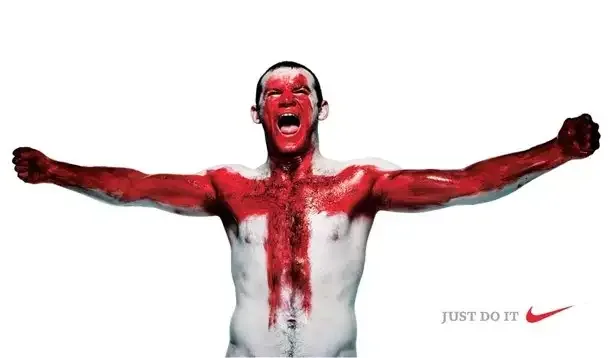
Nike is a sports apparel brand that has become synonymous with quality and innovation. Their “swoosh” logo and “Just Do It” slogan are instantly recognizable around the world. Nike products are generally priced higher than their competitors, but customers are willing to pay for the quality and the association with the brand.
Example 2
Coca-Cola is a well-established brand that has been around for over a century. Their logo and packaging have remained consistent throughout the years, creating a sense of familiarity and trust in consumers. Despite being priced higher than generic or store-brand sodas, Coca-Cola continues to command a significant market share due to their strong brand recognition.
For small businesses, branding can be just as important. Creating a unique brand identity can help small businesses stand out from their competitors and build customer loyalty. Social media platforms like Instagram, Facebook, and Twitter can be powerful tools for building a brand and engaging with customers.
It’s essential to avoid taking advantage of customers by charging them excessively or manipulating them through deceptive pricing strategies. Companies that prioritize ethical pricing build long-term trust with their customers and maintain a positive reputation.
The traditional way to ensure ethical pricing is to adopt a cost-based pricing approach, which considers the cost of production, overheads, and other expenses before determining a reasonable profit margin.
As mentioned before, you can also value-based pricing, which considers the perceived value of the product or service to the customer. This approach ensures that the price is fair and reasonable based on the value that the customer receives.
Overall, ethical pricing is about being transparent, fair, and honest with your customers. Here are some useful resources on the ethics of pricing:
In conclusion, pricing is a complex subject that requires a deep understanding of the customer’s needs and desires. The power of price and value is inextricably linked, and businesses that focus on providing value to the customer tend to command higher prices.
Understanding the subjective theory of value, the importance of branding, and the ethics of pricing are all critical to success in the marketplace. By approaching pricing with a customer-centric mindset, businesses can create value for both themselves and their customers.
3 Ways to Reclaim your Creativity and Productivity
Insights·5 min read
As a creative professional, it’s essential to overcome challenges such as distractions, innovation, and AI by embracing constraints, practising mindfulness, and collaborating with…
Michael Trevatt
Are you a creative professional who feels stuck or stagnant in your work? Are you struggling to keep up with the rapidly changing landscape of technology and innovation?
I am a designer with over 14 years of experience in digital design, branding, website design, app design, and user experience and I know the feeling very well. Let me share with you three ways I’ve reclaimed my creativity.
The Challenges We Face
The world of design and creativity is changing faster than ever before, and it’s important to first recognise and understand the challenges we face in order to overcome them.
The Robots Are Coming
AI is being used to create iterations of designs quickly and easily, which can make it difficult for human designers to keep up. To overcome this challenge, designers need to focus on their unique ability to dream up bold, unexpected, and human-centred ideas. They need to think creatively, make connections between seemingly unrelated things, and express emotions in their designs.
For example, a graphic designer working on a logo design might use AI to create multiple variations of the design quickly. However, they still need to use their creative imagination to choose the best design, one that is not only visually appealing but also communicates the intended message effectively.
AI can be a great tool for breaking a creative block. Embrace technology or be surpassed by it. Customers don’t buy your work, they buy the expertise you’ve gained from the time you’ve spent learning in your area and then benefit from the output.
Iterating Instead of Innovating
Many businesses and organisations are focused on making incremental improvements to existing products or services, rather than taking risks and pursuing massive change. Designers need to be expansive thinkers and practice growing their imaginations to prepare for disruption in the industry. This means being open to failure, taking risks, and exploring all possibilities.
ALL The Distractions
We live in a world of constant distraction, and it’s affecting our productivity and creativity. Our phones buzz, emails pop up, and notifications distract us from our work. We need to find ways to stay focused and present in the moment.
The challenge of distraction is a major obstacle to creativity and productivity in today’s world. With the constant influx of information and notifications from our devices, it can be difficult to concentrate and stay focused on the task at hand. This is particularly problematic for designers and creatives, who need a clear mind and the ability to focus in order to produce their best work.
3 Ways to Reclaim Your Creativity and Productivity
Now that we understand the challenges we face, it’s time to explore how to reclaim your creativity and productivity.
1. Embrace Constraints
Constraints can actually be a powerful tool for creativity. When we have limitations, we are forced to think outside the box and come up with innovative solutions.
Constraints can come in various forms, such as limited resources, time constraints, or specific design requirements. Instead of viewing constraints as a limitation, we can view them as a challenge to inspire creativity.
For example, designing a building with a limited budget or a small space can lead to innovative solutions. In graphic design, working with a limited colour palette or font choices can lead to unique and impactful designs.
2. Practice Mindfulness
Mindfulness is the practice of being present and fully engaged in the moment. It’s a powerful tool for reducing stress and increasing focus and creativity.
Mindfulness can help us stay focused and present in the moment, which can improve our productivity and creativity. Mindfulness practices can include meditation, deep breathing, or simply taking a break to focus on the present moment. By being mindful, we can reduce stress and distractions and improve our ability to concentrate on the task at hand.
3. Collaborate
Collaboration is essential in the world of design and creativity. When we work with others, we are exposed to new ideas, perspectives, and approaches.
Collaboration can help us generate new ideas and expand our creative potential. Working with others allows us to bounce ideas off one another, gain fresh perspectives, and learn new skills.
Collaboration can happen in various forms, such as working with a team on a project, participating in design communities, attending design conferences or workshops, or seeking feedback from clients or colleagues. By collaborating, we can open ourselves up to new experiences, gain inspiration, and improve our creative output.
Conclusion
As a creative professional, it’s important to stay up to date with the latest trends and technologies in the industry. However, it’s equally important to recognise the challenges we face and find ways to overcome them. By embracing constraints, practising mindfulness, and collaborating with others, we can reclaim our creativity and productivity and thrive in this rapidly changing world. Remember, the future is not something to fear, but something to embrace with open arms.
Contact us today to learn more about how we can help you improve your brand and take your business to the next level.
5 Simple Ways to Improve the User Experience on Your Website
Insights·5 min read
If you’ve ever wondered what UX design is, you’re not alone. UX, or user experience design, is a complex field that encompasses everything from research to development.
Michael Trevatt
User experience (UX) is a fundamental part of website design. It refers to how easy and enjoyable it is for users to interact with a website. A good user experience can lead to increased engagement, conversions, and customer satisfaction. On the other hand, a poor user experience can cause users to leave a website and never return.
In this post, we will discuss 5 simple ways to improve the user experience on your website.
1. Make Navigation Simple and Intuitive
One of the most important elements of a website is its navigation. Navigation is how users find their way around a website. It should be simple, intuitive, and consistent throughout the website. When designing navigation, it’s important to consider the structure of your website and the types of content it will contain.
A common mistake is to try to cram too many links and categories into the navigation menu. This can be overwhelming for users and make it difficult for them to find what they’re looking for. Instead, keep the navigation menu simple and organised. Use clear and descriptive labels for links and categories, and group related items together.
A clean and simple design can greatly improve the user experience on your website. A cluttered and busy design can be overwhelming for users and make it difficult for them to focus on the content. A clean and simple design, on the other hand, can help users to focus on the most important information and make it easy for them to find what they’re looking for.
When designing a website, it’s important to use a consistent layout and typography. This will help to create a sense of order and make it easy for users to understand the structure of the website. Avoid using too many different font styles and sizes, as this can create a cluttered and disorganised look.
More and more people are accessing the internet on their mobile devices. In fact, mobile internet usage has surpassed desktop usage. It is essential that your website is optimised for mobile devices. A mobile-optimised website will ensure that users have a good experience when accessing your website on their smartphones or tablets.
When optimising your website for mobile devices, it’s important to consider the size of the screen, the resolution, and the orientation. Make sure that your website is designed to adjust to different screen sizes and that it is easy to use on a small screen.
Images and videos can greatly enhance the user experience on your website. They can help to break up text and make a website more visually interesting. However, it is important to use high-quality images and videos that are relevant to the content of your website.
Using low-quality images or videos can have a negative effect on the user experience. They can make a website look unprofessional and distract users from the content. When using images and videos on your website, make sure they are of high resolution and that they load quickly.
Website speed is an important factor in the user experience. A website that takes too long to load can be frustrating for users and can cause them to leave the website. In fact, studies have shown that a website that takes more than 2 seconds to load can result in a significant drop in engagement.
To improve website speed, it’s important to optimise images, videos, and other media. Use a content delivery network (CDN) to distribute your content across multiple servers, which will help to speed up the loading time for users. Also, use a caching plugin for your website. This will store a copy of your website on the user’s device, which will help to speed up the loading times.
Improving the user experience on your website can have a significant impact on your business’s success. By following the five simple tips we’ve discussed, you can create a website that is easy to navigate, visually appealing, mobile-friendly, and fast-loading.
At Trevatt Design, we understand the importance of creating a website that meets the needs of both the business and its users. Our team of expert designers can help you create a website that not only looks great but also provides a seamless user experience.
Contact us today to learn more about how we can help you improve your website’s user experience and take your business to the next level.
What is UX Design? A Beginner’s Guide to Understanding User Experience Design
Insights·8 min read
If you’ve ever wondered what UX design is, you’re not alone. UX, or user experience design, is a complex field that encompasses everything from research to development.
Michael Trevatt
If you’ve ever wondered what UX design is, you’re not alone. UX, or user experience design, is a complex field that encompasses everything from research to development. In this article, we’ll define what UX design is, explain the process of creating a user experience, and provide some tips on how to improve your own UX design skills.
What is UX Design?
At its core, UX design is the process of designing digital experiences for users. These experiences can take many forms, from websites to apps to software programs. UX design involves understanding user needs, researching their behaviours and preferences, and designing interfaces that meet those needs in a way that is intuitive and easy to use.
One way to think of UX design is to use the metaphor of a film. When you say “film,” people think of the end product, the moving pictures with music and dialogue that elicits an emotional response. But when you say “filmmaking,” you’re talking about all the components that go into creating that end product, cinematography, set design, the script, casting, art direction, production design, storyboards, and more. All of these elements collectively make up the process of filmmaking.
Similarly, UX design describes a collection of activities that you do in order to create primarily digital experiences for users. These activities can include research, defining the problem, customer profiles, UI design, visual design, user testing, and development. All of these components come together to create a seamless and enjoyable experience for the user.
The Process of UX Design
The process of UX design can be broken down into several key stages, each of which is essential for creating a successful user experience. Here’s a quick overview of those stages:
1. Research
Research is a critical component of UX design because it helps you understand your users and their needs. This stage involves several tasks, including:
Conducting user interviews: Interviews allow you to gather information directly from users about their goals, pain points, and preferences.
Running surveys: Surveys are a useful way to gather large amounts of data quickly. You can use surveys to get a better understanding of your users’ demographics, behaviour, and needs.
Analysing competitors: Looking at what your competitors are doing can help you identify opportunities to differentiate your product and provide unique value to your users.
Identifying market trends: Understanding market trends can help you ensure that your design is up-to-date and relevant to your users.
2. Define
Once you’ve completed your research, it’s time to define your project. This stage involves several key tasks, including:
Creating user personas: User personas are fictional representations of your ideal users. They help you understand your users’ goals, motivations, and pain points.
Establishing design goals: Your design goals should align with your business goals and help you create a user experience that meets your users’ needs.
Determining features and functionality: Based on your research and design goals, you can determine what features and functionality your product will have.
3. Ideation
Ideation is the stage where you start to come up with design ideas. This stage involves several key tasks, including:
Creating wireframes: Wireframes are basic sketches of your product’s layout and functionality. They help you visualize your design and test different layout options.
Building mockups: Mockups are more detailed versions of your wireframes that show how your product will look and feel.
Developing prototypes: Prototypes are fully-functional versions of your product that allow you to test how well your design meets user needs.
4. Design
The design stage is where you start to bring your ideas to life. This stage involves several key tasks, including:
Choosing colour schemes and typography: Colour schemes and typography can have a big impact on how users perceive your product.
Designing user interfaces: User interfaces should be intuitive, easy to navigate, and visually appealing.
Developing visual elements: Visual elements, such as icons and images, can help enhance the user experience and make your product more engaging.
5. Testing
Testing is a vital part of the UX design process because it allows you to identify and fix any issues before your product goes live. This stage involves several key tasks, including:
Conducting user testing: User testing involves giving your product to users and asking them to perform specific tasks. This can help you identify usability issues and other problems.
Identifying and fixing bugs: Bugs can be frustrating for users and can impact the overall user experience. Identifying and fixing bugs is critical to ensuring a successful product launch.
6. Launch
The final stage of the UX design process is the launch. This stage involves several key tasks, including:
Making your product available to users: Once your product is ready, it’s time to make it available to your users.
Gathering feedback: Gathering feedback from users can help you identify areas for improvement and continue to refine your product.
Continuing to iterate: UX design is an ongoing process. Even after your product has launched, it’s important to continue gathering feedback and making improvements to ensure a great user experience.
Applying UX design to a real-world example
Let’s take the example of redesigning a school’s website to illustrate how the UX design process can be applied in a real-world scenario. Suppose the school wants to improve its website to better communicate its offerings and attract more students.
Research
The first step in the UX design process for the school’s website redesign is to conduct research. This includes identifying the school’s target audience, their needs and behaviours, and their expectations from a school’s website. The designer can use several research methods, such as user interviews, surveys, and data analysis, to gather this information.
For instance, the designer could interview current and prospective students, parents, and teachers to understand what information they are looking for on the school’s website, what problems they have encountered while using the existing website, and what features they would like to see on the new website. The designer could also analyse website analytics data to identify the most frequently visited pages and the user flow on the website.
Definition
Based on the research insights, the designer can create user personas, which are fictional representations of the target audience. User personas are helpful in guiding the design process by representing a specific user’s goals, needs, behaviours, and pain points. For instance, the designer could create personas for a high school student who is interested in the school’s extracurricular activities and wants to learn more about the admission process, or for a parent who is looking for information about tuition fees and scholarship programs.
Ideation
The ideation stage is where the designer generates ideas for the UI design based on the user personas and the research insights. The designer can create wireframes and prototypes to test with users and get feedback on the design concepts. For example, the designer could create different designs for the homepage, navigation menu, and individual pages of the website.
The designer can also brainstorm ideas for interactive features, such as virtual tours of the school, online applications for admission, and chatbots for answering user queries. The designer should keep in mind the user personas and their goals while creating these design concepts.
Design
In the design stage, the designer creates the final design based on the feedback received from users in the previous stage. This includes creating the visual design and choosing the colour palette, typography, and images. The designer should also ensure that the website is accessible and follows web design best practices.
For example, the designer can create a clean and modern design with easy-to-read typography, vibrant images, and a colour scheme that reflects the school’s branding. The designer can also create a responsive design that works well on desktop and mobile devices.
Testing
Testing is a critical part of the UX design process, and it involves testing the final design with users to ensure that it meets their needs and is easy to use. This stage can include usability testing, A/B testing, and user feedback. For instance, the designer could ask users to navigate the website and complete certain tasks to gauge their satisfaction with the design.
The designer can also use analytics tools to track user behaviour on the website, such as bounce rate, time on page, and click-through rate, to identify areas of improvement. The designer should iterate on the design based on the testing feedback until the website meets the user’s needs and expectations.
Tips for Improving Your UX Design Skills
If you’re interested in improving your UX design skills, here are a few tips to get you started:
Learn the basics: Start by learning the basics of UX design, including user research, wireframing, and prototyping. There are plenty of online resources available to help you get started.
Practice: Like any skill, UX design requires practice. Try creating your own design projects to build your skills and experiment with different design concepts.
Get feedback: User feedback is essential for improving your UX design skills. Be open to criticism and seek out feedback from users to help identify areas for improvement.
Stay up-to-date: Finally, stay up-to-date with the latest UX design trends and technologies. Attend industry events, read blogs anything you can find to stay up to date with the latest standards and ways of thinking.
UX design is an essential part of creating digital experiences that users love. By understanding the user’s needs and behaviours, defining the problem, ideating and designing the UI, and testing the final design, UX designers can create seamless experiences that meet the user’s needs and exceed their expectations.
Contact us today to learn more about how we can help you improve your brand and take your business to the next level.
You Are Your Name
Insights·4 min read
You are not in control of your life, dear reader; your name is. There is soo much power in a name. Would you switch names with your parents? What about another gender. . . Monika?…
Michael Trevatt
Hi, my name is…what?
The idea that your name controls your life is ridiculous, but if you feel uncomfortable with the idea of changing it, maybe it’s time to look a little deeper. We use labels every day and they have power, the power of meaning.
What’s my name again?
Originally, your first name was just a label to distinguish you from someone else. In the 11th century, surnames denoted a profession like Baker or Smith, locations like Hill, Green or status like Agassiz or Brickdale. Surnames are patronymic, being passed through generations, along with latent connotations.
As language evolved, names became laden with meaning especially from religion (side note: in religious and other fictional texts, to know the true name of a thing grants you control over it). Over a long period of time, names compounded to become simple labels with complex meanings.
Yours is not mine
Labels have been used throughout history for good and bad. Let me describe a symbol to you:
“I am a symbol of peace, sacred, lucky and auspicious. I denote “One” that is self-existent, unborn and directly originating from eternity since time eternal. I am a guardian of the world”
This is the symbol I am describing:
This shows the power and weakness of labels. The Nazis claimed an existing label, the Swastika, and skewed its original “world guardian” meaning to represent racial purity (the Aryan race). This exerted their dominion over it and as a result, very few people are aware of the original connotations.
“But!” I hear you say, “to me, this symbol means hate, evil deeds and war.” Herein lies the frustrating truth. No matter the initial meaning, it is the interpretation that ultimately defines the label.
Just say what you mean!
Today, we navigate the myriad of labels seamlessly with little conscious thought for the immense nuance that lies below. Figurative language like personification, metaphor, and hyperbole adds another layer of complexity and has existed for centuries. The rate of new words has increased from 800 per year to 4,000 per year, largely due to technology. Our capacity to communicate has increased and so has our ability. But is this a symptom of a bigger problem? Are we struggling with inadequacies of communication?
Junoesque
You experienced it, the struggle to put something into words. Think about a song that makes your skin tingle. It’s so good it gives you shivers. Got it? Good. Now try to describe it to me.
Whatever description you could give will always fall short of capturing the real sensation, of fully conveying the experience. Even if I replicated your experience, it wouldn’t mean the same to me. In most cases labels are “good enough,” but they never convey meaning perfectly.
You get a name! and you get a name!
This seems fairly benign, right? But not having a name for something can make it feel less real, to others. For example, there is no name to describe an attraction to transgender people. Does this make their attraction any less valid than traditional hetero or homo? Factually no. But culturally, without a name, it’s hard to garner validity or authenticity. This diminishes the power of the concept and by extension the people involved, framing the conversation around it.
I know what you mean
But labels can be useful by giving form to abstract concepts like equality or egalitarianism. These names represent concepts greater than we can experience personally. In this instance, the culmination of values and meaning over time, give rise to a collective understanding.
Without a term for equality, this complex issue would be hard to describe, hard to use in conversation, and hard to portray visually. Labels can be tools to elicit even greater impact than experience.
Are you rich?
A collective or homogenous understanding has its risks too. Imagine you grew up with the collective “Disney” understanding of love;
“a damsel in distress, with a white knight who comes to save the day.”
If you then experienced love in real life, the chances are it wouldn’t meet these pre-conceived expectations. Would then believe you hadn’t really experienced love?
You don’t know me at all
The ramifications of labels are far-reaching once you really look. We can use words passively, relying on culture and context to guide us. But if we consider labels more objectively, they become our tools, they can bend to our will.
But what do you think? When have you experienced this in your life? Write to me about what you think and let’s discuss it!
Your Frame of Reference
Insights·6 min read
Change is inevitable and yet it appears to happen by accident. Our ability to affect change is limited by our capacity to imagine and our will to act. So what is the best way to…
Michael Trevatt
We long for the past and fear the future. This is a primal reaction to the linear nature of time and our limited influence of it. The past is unchanging, certain and free from the compulsion to act. Our inability to influence the past is a sanctuary from accountability.
We often imbue our past with romanticised qualities like simplicity, quality and authenticity.
Modern brands have taken advantage of this in recent times by using the visual signifiers of recent history to convey/personify these qualities.
Accountability of the present
By contrast the action of the present demand. It’s the period of time in which we experience.
“Is the present an infinitesimally small period of time or simply an arbitrary bracket of time between one memorable event to the next?”
While the present is the most elusive we believe it to be the most “real.” The present is the point at which all the infinite possibilities collapse into a single outcome. It’s the moment when one thing is and everything else isn’t. The present is a black hole for the future.
Weaving a thread
The experiencing self & the remembering self You perceive the past differently than you experience the present. A series of pleasant experiences can be marred by the memory of a single bad event. That bad event will stand out in your memory and govern your perspective. This is an important separation when understanding how you create a sense of self and a set of values. Your values are formed by your memory of the past and not your experience of the present.
Collective learning Individually our behaviour is shaped by our memories but we also mimic the actions of others. You do this to garner social capital and fit within the norms of reciprocity. This creates a type of collective or communal learning.
Values and beliefs are built up over time and spread virally to receptive individuals. This culmination of prevailing values is our social narrative and represents the driving force of large-scale change.
The “low fat” myth started in the 80s. It was started by misleading research and propagated by media and social circles. Thus, for better or worse, began the age of selective eating.
Side note: phantom memories
Your memories shape your behaviour; cause and effect. Why then do we share values with others often without experiencing the “cause” of that value? At the individual level, it would seem we create phantom memories; a sort of vicarious past. This transmission of experience through shared values is rapid and one of our greatest strengths as a species. However, this passive transmission makes it inherently flawed.
Consumer behaviour What you buy is governed by your cognitive consonance i.e. your internal consistency. This running calculator is inextricably tied to your perception of self and understanding of where you fit relative to others. This is incredibly important to understand as successful brands will act as a conduit for their consumers to develop purchasing habits that align with their sense of self.
The passive future On an individual level, our anxiety about the future comes from our ability to influence it. Decisions require energy and thought and make you accountable for their outcome.
“There is a fork in the road. If you don’t know where you want to go, then the choice doesn’t matter.” Lewis Carroll, Alice in Wonderland
It’s much easier to let the future come as it is, to be less in control, only steering to avoid icebergs. Taking a considered action is much more difficult than repeating a habituated routine. The inevitability of change is omnipresent, but the roadmap is a series of blurry lines in the rearview mirror.
A new pattern
Social narrative: the driving force of change Our perception of the future shapes our actions and is governed by the prevailing social narrative. In a sense, it’s a self-fulfilled prophecy. We develop a rough idea of what we expect the future to be and make decisions in the present based on that belief. This allows the individual once again, to make decisions passively, within the realm of perceived possibility. But the future doesn’t exist. It is unknowable, intangible.
Instigators of change We remember significant changes by a protagonist, an instigator. This echoes the Remembered Self. Any event in history can be marked, and symbolised by a single thing. e.g. The moon landing: Neil Armstrong or the collapse of communism: The Berlin Wall. These icons mark a significant shift in the prevailing cultural narrative. In our memory, that icon is imbued with the nuance and values surrounding that shift in narrative.
Brands as instigators Successful brands can be icons of change, both a reflection and an instigator. After WWII brands played a role in changing the social narrative. High art conveyed mourning and reflection whereas commercial art was optimistic portraying a lifestyle of opportunity. Disregarding morality, for better or worse began the consumer culture we know today.
Disruptive innovators Our perception of the future shapes our behaviour and a clear vision of the future is essential to a successful brand. They are iconic of change and they know why. In recent times, brands like Airbnb, Alibaba, Spotify, Uber and more are all successful because they challenged the prevailing norms of behaviour and offer to the consumer an alternate view of the future. Note that these aren’t just arbitrary progressions, it’s not just the service that makes it popular it’s the change in lifestyle.
Beacons of change We perceive our history through icons and we can perceive our future in the same way. Love or hate it Apple represents a significant shift in the cultural mindset. More than anything Apple makes technology accessible. Usability is always a premium, reducing the learning barrier required to interface and access a wealth of information. Skype is a free international video service, and yet it is a commercial business same to Wikipedia and many more. These companies offer the individual a rallying point and a way to support the future they want to see.
Crafting the future
Thinking about the sort of future you want to live in will shape your every action in the present. The future is shaped by both our actions and our perceptions, it affects your decisions, your habits and your influence. Progressive brands offer a way for you to support these ideas and extend your influence beyond conventional reach. A new vision of the future can permeate society and shift the global cultural narrative. Is it any wonder that we have so many innovative companies emerging?
Elegant Solutions
Insights·4 min read
Most of us stick to the standard way of doing things, then every now and then someone discovers a new way that’s soo simple it seems like we should have done it that way all along.
Michael Trevatt
Making something simple is hard. Anyone that’s tried it is nodding their head right now. If you throw in agendas, multiple opinions, user expectations, feasibility, and a sprinkling of compatibility issues it becomes Mission Impossible (the first one).
This is something we do for a living. And for fun!
What is it?
Designing an elegant solution is the best part of my job. It can be applied to any project, even the ones that at first seem mundane.
An elegant solution is anything that leverages opportunities not previously considered for a new or existing problem. The problem can be mechanical/functional or more esoteric like user experience or branding.
Consider the humble hamburger menu. Animating the parallel bars into an X that closes the window provides context, requires no extra “learning” and is an efficient use of space.
I also found a website that, upon clicking an item changed the cursor into an X (viable in this use case because that was the single available option in that state) giving the sensation that your cursor absorbed the button.
To make something simple but also engaging you must leverage all available elements. That’s not to say add more things to your design, quite the contrary. It’s about using what you have more effectively, or creatively. The end result will be a truly engaging experience for the user.
At its core
The elegant solution method applies to all aspects of design. At the core of an elegant solution is the abolishment of preconceived notions. Things such as “all clickable links must be blue and underlined” or “scrolling down is the best way to navigate a website.” Conventions are the death of innovation.
An elegant solution can be measured by its objective. The “pull to refresh” feature on mobile, was an elegant solution. It was a naturalised extension of an existing “learned” gesture with the objective: I want to see more. The feed or list responds to the new state by “sticking to the top,” and releasing draws new content. The action is connected to the objective and is very intuitive.
From a technical perspective, the pull-to-refresh feature has been made obsolete. Faster internet speeds allow many apps to simply auto-update. However, the feature has prevailed, why?
Well, the transition will eventually be made but having the feature there gives the user certainty; confirmation that they are viewing the latest information. This is very important for the target user. In the meantime, UI designers have taken advantage of the feature and added some novel animations that are both functional and engaging.
In an out-of-character move for Facebook (being innovative), they introduced their own adaptation of the gesture. When inside an image or video scrolling up will exit/close it.
This is an elegant solution as it is ergonomic for the user, the action is tied to the objective, and plays to the scrolling/feed nature of the app.
Introducing new conventions
I applaud Google for its innovations in UI with its material design. Each execution is driven by a set of governing principles that define not just WHY but HOW.
Above this is the willingness to take risks and try something new. The evolution of the “pull to refresh” feature in their app was a response to new larger mobile devices (I suspect). It could also be an extension of the thoughts behind the single objective button. (The action changes based on the content) see below:
I’m sure a lot of you have not used (or even seen) this feature. Similar to the “shake to undo” feature Apple tried to introduce, it may not catch on or it could come to redefine the user’s understanding of this gesture forever.
Esoteric elegant solution
One of my favourite new toys is dynamic branding. Brands that are agile, that can evolve, be more engaging and more memorable that any static logo. They are an elegant solution to applying a brand to a multitude of instances without becoming sterile and bland. They are very good for brands that are creative or innovative.
“The standard” is not enough
Elegant solutions first and foremost break from conventions. A perfectly adequate solution is not elegant. It is about rethinking the standard and approaching problems from a new (or revised) angle. Whether you take into account new technologies, new trends, or just your own creativity.
The Bauhaus believed there was no distinction between form and function. I would revise this to be; form and function must both work towards creating an engaging experience for the user.
Coming into Being
Insights·4 min read
How do things emerge into existence? This existential article looks at how we are shaped by our environment and how it, in turn, shapes us.
Michael Trevatt
Genesis
DNA has been seen as the defining point that life began. It was the result of an increasingly complex environment, creating the right conditions for it to evolve. Contrary to some belief, it was produced by a chain of events. DNA actually had a precursor called RNA. RNA is still a part of the process of cell replication today but was formed prior to DNA and contributed to its existence.
That made me consider something I’ve always felt subconsciously: that nothing simply sparks into existence.
(This concept also applies to our universe as a whole- look at Lawrence Krauss’s “A Universe from Nothing” where he describes what was before the big bang.)
The evolution of evolution
The next milestone after DNA was consciousness (like animals, dinosaurs etc), things that could rationalise and make decisions. We have evolved physically to match our increasingly complex environment, developing a symbiotic relationship (it shapes us, and in turn we shape it). Consciousness had a huge impact on the evolution, shortening the cycle of learning by moving it from physical to mental.
The next stage was sentience, found only in humans (so far). We are self-aware. Our brains are still very “hard-wired” though. The single driving force of our brains is to seek/produce order, in chaos. We innately strive to enforce a sense of order in a world that is inherently chaotic.
This is a survival thing; the more we control, the more we can predict, and the more risks we can avoid. This is why most people find symmetrical, balanced or proportionate things aesthetically pleasing, even in nature. Again, this is a product of our environment. We are reacting to the things around us, making decisions, and acting upon them. One doesn’t exist without the other.
The final environmental condition is metaphysical; things like culture, religion, social structure and belief. Our view of the world shapes our understanding of it. For our collective survival, it is advantageous for us to believe the same things. So ideas spread and replicate (also like DNA).
If you live in a capitalist society your thoughts probably sound like this: “What can I do? What can I aspire to be? How can I progress and thrive? Should I eat that 3rd TimTam?” (a delicious chocolate biscuit from Australia).
Your internal monologue colours your reality. It is the rudder to your boat, your cypher to decrypt the world. The people around you in this society, their internal monologue is saying things in a similar voice. They’re probably not thinking “how can I better serve the Fatherland” right?
This collective mindset creates a climate, or “environment of thought,” that is just as real as the real world.
So now you understand that people have internal motivations and environmental influences, but they are actually just different sides of the same coin. Although there are milestones, they are inevitable when you view things in a broader context.
Through the ages
When the mp3 player came out the ability to play music portably was not a new idea. Trace the idea back and of course, you find CD players, Walkmans etc, each one an incremental progression. Technology had also advanced and was relatively ubiquitous: evidenced by the simultaneous release of multiple mp3 players.
The start, or genesis, of “personal, portable music” was probably when hip, black guys carried around their stereos on their shoulders. Their music reflected their personality, as they swaggered down the street. Everyone knew what they were listening to, and that’s the way they liked it.
Return now to the progression, and you can see it’s been coloured by Capitalism. Valuing individual experience, and individual success funnelled development towards this end. Our “personal, portable music device” is just that, personal. There are a thousand other influences I can list, as well as why the iPod reigned supreme, but you get my point.
To sum up
Nothing simply comes into existence. Everything is a product of the conditions surrounding it. “New ideas” often connect two seemingly unrelated things or looks at something familiar with a fresh perspective.
Don’t Appeal to Everyone
Insights·4 min read
The most comment trap I find clients falling in to is trying to appeal to everyone ages 0 to 100. This is a mistake.
Michael Trevatt
The scope of appeal
The vast majority of the design is about making decisions. Big or small, a designer makes upwards of a hundred tiny decisions a day, and they make them on behalf of someone else.
I once debated with someone (an art professor no less) about the opportunity cost of the appeal. He argued; “why don’t they make a book cover that just appeals to everyone? That way you’re not missing out on anything.”
You can see his perspective, right? If you made a book cover that appealed to everyone, then that would increase the chance of more people buying it.
So let’s give it a crack.
Finding coveralls
Before getting started here’s our list of mandatories:. Universally understood (across language & literacy barriers).. Universally accessible (think blind or disabled).. Allude to the content (make you open the book).
The important factor though is the appeal. To appeal to someone you have to acknowledge their values and interests. To do this for everyone you have to find something that appeals to everyone but at the same time does not marginalise anyone.
Your first instinct would be something like kittens, babies, or Justin Beiber. Although these things have mass appeal there are countercultures for each of them.
Well, what about music, food or sex? The problem here is preference. Although you could almost say that everyone likes food, there is no single food that everyone likes, or would engage everyone.
How about something physical like blinking, or sleep, or just . . . staying alive? Now we are getting somewhere. These are not only physical things that we all share, but they are even involuntary. Staying alive though, how do you put that on a book cover? Do you install a gun on the front holding the viewer hostage? I can think of a few clients that would love this idea.
Each of these things risks marginalising certain groups of people or being lost in translation.
My best shot
I had to go primal for this, bare with me.
To be in control is to survive. The human condition is to enforce or seek out order where there is only chaos. We flail through an existence that bombards us constantly with new or conflicting information and we grip on to things we know for sure.
This is how we can see beauty in nature, in patterns, in numbers, in music, in language, and in any form of visual communication.
A square cover is symmetry and compliments the central squares. They are both 90% black on 90% white because absolutes don’t exist in nature. Although a triangle would be better as it is a simpler shape, the negative space would become more complex as a result, especially with two.
The reason for the two squares is confirmation and similarity. “I know the square exists because there is another. They are both the same, and not different” It is also the smallest prime number, giving it an intrinsic mathematical beauty.
There are no words to avoid communication barriers. The two squares are both raised for accessibility reasons, have no colour for colour blindness and are big enough for poor eyesight.
Finally, there are mechanisms in our brain that compel us to seek. For a lot of people, the ambiguity of the cover would call them to investigate further.
Why it doesn’t work?
Besides the fact that there’s a strong anarchy culture, there is an important reason why this doesn’t work as a cover, and that’s scope. This cover “appeals” to everyone by mitigating risk, finding common ground, and avoiding misinterpretation. But it appeals to no one effectively.
Imagine the level of engagement a Beiber fan would have with this book cover compared to a naked photo of Bieber:
It comes down to opportunity cost. The more broadly you cast your net, the weaker that net is. This opportunity cost is what we as designers consider when making hundreds of tiny decisions. We make the net as strong as possible and, if need be, as big as possible.
So next time you consider your target audience remember, “Males and females 0, 100” is not a good demographic. Not because it’s hard to do, but because it’s a bad idea.
What is Visual Literacy?
Insights·6 min read
Literacy; normally reserved for reading also applies to visuals and, depending on your audience, there are different levels both conscious and unconscious.
Michael Trevatt
The term visual literacy refers to our ability to interpret and make meaning from information presented in the form of an image. It is an extension of literacy that describes our ability to interpret letters (characters) into language and meaning. Visual literacy in conjunction with the semiotic model:
As you can see visual literacy takes into account the way in which the meaning is conveyed; the medium and the way that medium is used.
What’s the big secret?
Very often I see people looking over the shoulder of a designer and marvelling at how they can immediately pick out the flaws in a design, or make an entire design come together and feel resolved. Of course, this is due to experience, but a big part of that experience is visual literacy.
Just as a copywriter is concerned with the syntax and rhythm of a sentence, the designer is concerned with balance, symmetry, proximity etc. Each one excels at communicating the idea or message. They are considering the way in which it is communicated.
Actually, the model above can be slightly deceptive in that it implies the final stage (Signified) has no influence on the creation of the message when it is one of the most important to consider.
Conventions
Correlations can be drawn directly between written and visual literacy. Let’s compare a poet and a graphic designer.
A Poet uses words
A Designer uses shape, line, colour, and texture
A Poet crafts words into a sentence that has structure
A Designer constructs a visual that has a viewing order and hierarchy
A sonnet consists of fourteen decasyllabic lines
A poster has a heading, a primary visual, and body copy.
These things exist apart from the message. Each discipline has a set of guidelines, some explicit but mostly implicit. The same message can be conveyed in both mediums, they just use different methods.
Visual literacy of the user
Now consider the user. What level of visual literacy do they have? One of the biggest flaws a, perfectly acceptable, piece of communication can have is to simply under or over-estimating the user’s visual literacy.
This can result in spoon-feeding the message or worse leaving the message too ambiguous or complicated. Getting this balance right requires you to have a good understanding of who is using your product.
Rooney, Rooney, Rooney, Rooney!
You heard it. For the record, I’m not a sports fan. But I wanted to break down the message being conveyed in the top poster using visual literacy.
First, have a look at the image and see how much meaning you can derive. This will give you an idea of just how much thought goes into something before it is released, but also that you can’t control every interpretation.
I will start with the most obvious interpretation. Let’s see how deep we can go:
Firstly this is an advertisement for Nike (sports gear) an official sponsor of the World Cup. The billboard advertisement features the forward kicker for the English football team; Wayne Rooney.
The lack of specific Nike products means that they wanted to focus on tying their brand to the World event. In rhetorical terms, Nike is predominately using Ethos (the credibility of the speaker) because Rooney is a renowned celebrity in England. Rooney is representing England, and now Nike; they are now both inextricably tied together.
The poster itself uses Pathos (persuasion through emotion). This pose is iconic for winning, as football players often pose this way after kicking a goal. On a more fundamental level, however, this pose symbolises pure elation. Studies have actually shown that blind people after winning a race will do this pose, having never seen it before! It shows that this poster taps into the primal side of people.
Touching on symbolism now, Rooney’s body has been blown out with flash photography (intentionally) to make him seem more white than he actually is. You could say that this symbolizes a “white and proud” statement, but it has more to do with the st. George flag. The figure/field of the poster, i.e. the red and white, are centred to create a semblance of the English flag. Once again this is English patriotism, and the fact that it is literally painted on Rooney once again brands him as such.
On a side note, the entire image is centred and the Nike tagline has been placed asymmetrically. Although this follows billboard conventions it makes Nike stand out without interfering: but it’s also the last thing the viewer sees because of this misalignment.
In an interview, a Nike spokeswoman stated the red paint represents the paint that the fans wear while attending the matches. However metaphorically speaking there are a number of interpretations.
Firstly, the red paint could be a representation of the crusade wars. Their flag was also a red cross on white. England is predominantly Christian and the world cup is a battle between European nations.
Secondly, the red paint could be interpreted as a representation of the Crucifixion. The paint has a noticeably “wet” look making it appear like blood. There is a lot of validity to this interpretation as Rooney has just taken a period of time to recover from a serious injury and was potentially England’s best hope for winning the World Cup that year. Arguably Christ’s greatest feat was reincarnation and he was the saviour of Christians. This positions Rooney as Christ, which is somewhat backed up by his complete nudity (Renaissance artists portrayed perfection as white marble nudes).
My point is…
There are ever-more obscure interpretations I can give you but I’ve run out of space. You may have noticed by the end that you were starting to disagree with what I was saying.
The interpretations I represented the variety of ways that people can interpret a single graphic. You may not agree with all of them and in fact, Nike didn’t even intend for them to happen, there was a significant community backlash when this advertisement came out.
A good designer, who does their research, will understand the scope of interpretation before publishing. The way you convey your message can often be just as important as the message itself. This is why finding a designer with a high visual literacy will reduce a lot of risks.
Demographics vs Psychographics
Insights·5 min read
We take a philosophical look at the origins of both and how they have evolved into what they are today. Even how they might look in the future.
Michael Trevatt
Now stay with me, it’s worth it, I promise.
I’ve never liked the thought of things in life being predetermined. I believe the nature versus nurture argument to be over. Tabula rasa (blank slate) won, and we are the sum of our perceptions and experiences. So how have we changed in the last 1000 years?
Is there a real you?
Your sense of self defines who you are. But how much of you really exist and is there a way to, ideologically, “sum up” a person?
The best explanation I have heard so far is by philosopher Julian Baggini. He describes a model of a person being the sum of their: Memories, Desires, Beliefs, Knowledge & Sensations
Not only do these things describe the sum total of “you” but they also affect each other.
“What we desire is partly a result of what we believe, and what we remember forms what we know.”
What is interesting is that there is no “extra bit,” that makes you special. You are not a central/static “thing” that has experiences, you are a collection of experiences. You aren’t the same person you were five years ago, you aren’t even the same person you were yesterday.
The central illusion
Your family unit may have given you a belief system and a set of values that you may have held since you were very young. The experiences in your life may reaffirm them or denounce them and your perception of future events adjusts accordingly. Knowledge/beliefs/experiences, if held long enough, and reinforced, can come to define part of “you”.
So I am not unique? Quite the contrary. The infinite complexity of “you,” ie the culmination of experiences that make up “you” would be impossible to define. Baggini describes that if you were to define what is “you,” you would in fact be creating yourself.
Demographics
Using this model of “self” I will explain the shift in power and control in regard to information.
Demographics is the study of quantitative factors (age, race, sex etc) within a given population. The information is used for a number of reasons including marketing, investment, and policy development.
Demographics is a way to categorize the 5 parts of “you,” and group you with others who are similar. Generally speaking people of the same age, race etc, will share beliefs, knowledge, desires and sometimes memories. This means when given the same choice, are large portion of this group would react in the same way.
Top-down
To explain this further, let’s look at medieval England (this also works with ancient Egypt and any other top-down power structure).
Here we have a hierarchy. These models are generally shown to explain power, status and control. But let’s look at it in terms of the “self”…and then relate it to control.
In terms of values/beliefs, there were provided top-down by the ruling class. The Church would define right and wrong, which would then be enforced downward by each subsequent class.
Knowledge was privileged, and generally self-contained within each section. The ruling class had vast academic knowledge, and farmers and craftsmen knew their trade.
Segregation provided a collective set of memories. If you always lived in a castle that would standardize and normalize that environment. Your “self” would make decisions with this as a baseline. You wouldn’t think, “am I going to sleep next to the pigs? ” because it wouldn’t have ever entered into your mind.
As for desires, these were limited by the individual’s capacity and capability. Kings may desire to invade another country, peasants would desire to eat that night.
This model provides a stable class system that allows a small minority to rule because they could predict how each class would react to their decisions. Sound familiar?
Middle out
Although a lot of these mechanisms are still in play there is one major thing that has changed since that time: the distribution of information. I’ll skip over historical changes, the printing press, mass transportation & migration, wired communication, globalization and wireless communication.
What we have now is integrated social communication on a global scale, which looks like this:
I would love to relate this to unicellular organisms but I don’t have space. This is actually a visualization of the Internet by the Opte Project.
Information is now transmitted in an Eco-system that is no longer enforced through a class system. Similar to Memetic theory, but on a much larger scale than ever seen before, ideas go through a kind of “natural selection.” If a large enough portion of users agrees or shares an affinity with an idea they will share it / comment etc. This gives the idea life and the idea becomes self-propagating.
If we once again relate this to our definition of self (that which we experience and perceive defines who we are) then the traditional categories of a demographic become almost redundant. Our experiences are less uniform across say financial income. People with less money can share values with those with more and vice versa.
Brand ramifications
OK; we made it.
Many companies are just coming to grips with two-way communication with their consumers. This type of information distribution has huge effects on brand perception, corporate accountability, user engagement etc. Companies have even less control over their brands than ever before.
Defining consumers with quantitative information will always have its place (until we all upload our brains to the internet). But recognising and more importantly understanding this monumental paradigm shift is key to creating and maintaining a successful company.
The best brands in the world sell values, not products. Why you do something is just as important as what you do. The people who engage with your company must voluntarily align themselves to your values and in-tern your values will come to partly define them.
Is Originality Important?
Insights·4 min read
How important is it to be original? Is it necessary to beat out the competition? We look at what it means to be “original” and how you can be it repeatedly.
Michael Trevatt
I used to teach Design at university. A common question I was asked by students was; “how do I come up with an original idea?” Which, in a post-postmodern society, the obvious answer is, there’s no such thing.
In my opinion, the desire to be original is simply another way of saying I want to be different. True originality is unattainable. Something at first may seem original, but is actually a culmination of little ideas that have been curated and refined.
I used students as an example because initially, it seems like the most important thing. However, there comes a stage when you realise trying to be original is futile. Thankfully a large part of Design is not about being “original.” But you still have to be creative. So how do you come up with an idea that is different?
Different ideas
Design / create continuously This point is more for those that are new to design (ie. 4, 5 years). No one comes up with a killer idea straight away. This is true both on a large and small scale. Even a good idea needs refinement most of the time.
Ask someone You are only one person. Do you think one person made the Mclaren P1? the sexiest car in the world? No. Collaboration is key. Other people offer different perspectives which leads me to my next point.
Research outside of your scope Looking at similar things to your project is a good idea. You don’t want to reinvent the wheel every time you get a new brief. It also helps you define the standard and what people are used to (the stereotypical). But you want to be different so look outside your project, look outside your discipline.
Refine / re-interpret your brief Sometimes putting yourself in the client’s shoes allows you to better understand their intentions behind a brief. Your client specialists in their product not writing briefs. Asking “why do we have this problem?”, instead of “how can we fix it?” can often lead to a creative solution.
Be current, be inspired Whether you want to be different or not this is simply good practice. Being current gives your designs context. And knowing what other people have done before means you don’t make the same mistakes. Draw inspiration from people that have more than you; more skill, more practice, more money, and more time.
When to use your “different” idea
Some people (even designers) would argue that to make a good design you have to be different, all the time. I could not disagree with this more. Not only is it not financially viable, but sometimes it is just not a good idea to be different. Let me give you two examples.
Let’s say you have a client that produces boutique food products grown locally on a small farm. This farm is surrounded by established companies that produce similar quality products (but not competing products). These companies have already spent big money to build a positive brand for the area. It would be a bad idea to not capitalise on this and brand your client’s products in a way that aligns with this existing perception.
Now let’s say you were designing an App. This App needs to display a lot of content so the client wants a scroll. Since 2007, people have been using the “swipe down” gesture to view more content. That’s 7 years of doing the same action. The consumer’s mind now directly relates physically swiping down with viewing more content. There would be no need to change this (unless there was a very good reason).
To sum up
Obviously, the second example is exaggerated and over-simplified. My point is, yes it is good to be different. Whether things are similar or different is how we understand our world. But it’s the designer’s job to decide when it’s a good time to be different.
Genre in Logo Design
Insights·3 min read
There are many types of logos, none inherently better than another. But you can learn to use they right type for your design.
Michael Trevatt
Graphic Design is a culmination of many visual, linguistic, and in some cases auditory disciplines.
Genre, in the way most people understand it, relates to music. Songs that exist within the same genre share similar signifiers (tempo, instruments, melodies, etc). But the genre also plays a big role in design.
The best way to understand genre is to understand how our brain works.
Complicated to simple
Our brains have a limited capacity. From an early age, we begin to make sense of our world through similarities and differences (this shape is a square it fits in the square hole, but the circle doesn’t). The physical and social world is very complex and constantly changing.
Categorizing things based on similarities and differences in how we can understand and, to some extent, control our environment. Genre is one term to describe that categorisation.
Genre exists in social environments as well. Stereotypes are a result of categorisation. It is an oversimplification and generally occurs when we have limited knowledge or experience.
In Film, we have the cliche. Cliches are an over-use of a particularly defining aspect of that genre (the cool guy didn’t look at the explosion wow he must be a badass). In Film, the characteristics of a genre are called a motif or recurring motif.
Simple to complicated
How does this relate to logo design? In a broad sense genres of other disciplines influence graphic design. Over a period of time, we learn that this type of design is associated with this type of music/movie etc.
Retro Horror:
As a result of recurring themes, each genre develops a set of conventions (only use these fonts, these colours) which at first can appear very limiting or constricting. Check this out. However, this “learned” knowledge in the viewer’s mind allows us to predict how they are going to react. Playing with the conventions of genre is one of the best ways to create tension and an engaging design.
Logo design in context
You can’t design in a vacuum. Understanding that the people looking at your logo have an existing visual literacy (even at a subconscious level) is key to designing well. Here are some basic structures in logo design:
These are over-arching categories that 99% of logos will fit into. There are also recurring themes (trends) from year to year. For example, the retro theme:
Signifiers of the genre: Shields, banners, muted colours, textured background, framing, key lines, novelty fonts, etc. More here.
Another example is the particle theme:
As with anything design related, keeping up with trends can help keep your logos fresh. Here is a link to 2014 logo trends. Unless you want to google “logo” for inspiration and come back with something like this
It’s very rare that you will be expected to create a logo that fits entirely within a genre. However, putting in more subtle elements can create depth and subtlety. Choosing to add elements of the retro theme for example might give your logo a handcrafted / boutique feel.
Experience vs knowledge
In my opinion, there is no substitute for experience, and that’s why people with more experience deserve to charge more money. But if you are just starting out or you are new to logo design knowing why (and asking why) is the best way to get better. My hope is that armed with a rudimental understanding more people will appreciate the thought that goes into such a tiny graphic.
Composition in Web Design
Insights·3 min read
Composition is a cross-discipline word for a reason. Music, architecture, and design. Composition affects us our perception of space and all things inside that space.
Michael Trevatt
The single visual
Full-screen websites, or the “single visual,” composition focuses on a large central image or graphic. All other elements, text/icons/nav etc are secondary and are there to complement the image (Or at least not get in the way). We are seeing this more and more with the content-focused paradigm shift.
Z & F layouts
I’ve combined these intentionally because I see so many examples online than have been poorly explained. These compositions don’t have strict rules but instead refer to the way the eye navigates over the page.
The “Z” composition is when the viewer looks from the top left all the way to the right side of the page before continuing on. It’s generally more minimalistic than the “F” composition which is where the viewer scans “line by line.” Both are useful when dealing with large amounts of copy.
Rule of thirds
This is a composition theory from photography in which you divide an area up into a grid of nine rectangles. It dictates the optimal position for placing focal points within the frame. Of all the websites I have looked at I haven’t seen one that uses this composition theory. The ones that supposedly do just use a three-column grid system which is not the same thing. I can see that it may be useful in the single visual layout.
The Golden Ratio / Fibonacci Sequence
One of my favourite composition theories. Found in nature, the Golden Ratio is based on a numerical ratio of 1: 1.618. This design theory is mostly used for asymmetrical compositions (where content is not balanced/symmetrical). As with most of these theories, I find it’s best to use them when you are stuck (They can help you decide where to place content) or to retrospectively justify your designs. Try overlaying this on any design layout you find, it’s surprising how many actually use it.
Grid systems
Using a grid system is the key to web design. There are so many out there that it would be impossible for me to cover them all. Some points to note though are:
Fixed grid systems are dead, use a fluid grid system and make your design responsive.
As a rule of thumb paragraphs of text should not exceed 50, 60 characters (including spaces) with a maximum of 75.
If something does not align with your grid system the Gestalt Principle of Proximity dictates it will be a focal point (make sure this is a conscious decision).
Your grid system is not a silver bullet for good design. Where you place things within it is very important when creating symmetry.
To sum up
There are many more rules you can draw on when creating a layout (gestalt principles for example) but remember they are only there to help you. These rules have been developed over many years and are predominantly based on sound / measurable psychology. Knowing these rules can often tell you why a design is working / not working. As with all rules though they are only a guide, when it comes down to it you have to go with your gut.
Semiotics; the Interpretation of Symbols
Insights·4 min read
Signs and symbols are everywhere and they affect the way we communicate intensely. Learn more about them, and you will have a new superpower.
Michael Trevatt
I wonder how many of you got the joke in the cover image.
When I talk about semiotics I see people’s eyes glaze over. I know. But, for this reason, I’m going to stay away from the hard-core academic side of this visual communication theory and focus on the practical application of semiotics.
The Basics
For those of you who have never heard of semiotics, it is basically a theory describing how people understand their world through the interpretation of signs.
Disclaimer: A number of people have worked on the culmination of these theories for a long time (Barthes, Pierce, Saussure etc) and as a result, there are a lot of terminologies. Unfortunately, we already use the words, but often they have different meanings when talking about semiotics.
There are three kinds of signs: icon, index, and symbol.
Icon: A clear representation of the object. Think toilet icon.
Index: Something that implies something else: Smoke = fire.
Symbol: No resemblance to object but culturally imbued meaning or meaning from previous knowledge: Cross = Christianity.
All signs are based on previous experience and social interactions.
If you want to learn about semiotics in a simple way I highly, highly recommend Scott McCloud’s book “Understanding Comics.”
Skeuomorphic
The skeuomorphic interface, up to iOS 6, was one of the easiest to learn (I mean children under 5 were using it). Skeuomorphic basically means that the icon looks like what it’s representing. This includes textures, glows, bevels etc. Even the buttons themselves have a shine on them to make them feel “buttony.”
For all signs there are levels of abstraction:
All of the images above show a face. The face starts off more realistic. It is also more objective, meaning there is less room for interpretation. Even though it is a drawing of a face we can see it is male, with short hair, Caucasian, and un-smiling. This information is received, which means you don’t need “education” to get the meaning and you understand it immediately. At the other end, we have a circle two dots and a line. We still see a face, however. Its abstraction has made it more iconic, but also more subjective: meaning the face could be anything or anyone male/female etc. This has to be interpreted or “perceived.”
The Skeuomorphic icons are great for introducing a completely new device because you know what the button is going to do before you press it. It is less abstract than iOS 7 and therefore requires less “education” for the message to be received.
The Inevitable Move to Flat.
The move to flat design was driven by the user interface and user experience. Apple’s core themes for iOS 7 were:
Deference: The UI helps users understand and interact with the content, but never competes with it.
Clarity: Text is legible at every size, icons are precise and lucid, adornments are subtle and appropriate, and a sharpened focus on functionality motivates the design.
Depth: Visual layers and realistic motion impart vitality and heighten users’ delight and understanding
iOS Human Interface Guidelines
The risk of having flat icons on the first iPhone was that it would have required a lot of “education” to understand. The iPhone came out in mid-2007. iOS 7 came out in mid-2013. That’s 6 years of using a device with skeuomorphic icons and mentally connecting the action of the button to the icon.
Let’s look at the calendar icon. The skeuomorphic design resembles a physical calendar. The flat design has no embellishment at all and has been abstracted to its most basic elements. Our experience or “education” with the original icon allows us to understand the flat design. It has become symbolic (definition above).
Using Apple’s iOS 7 guidelines refers to the content (date/day), and creates clarity with legibility and contrast. As a result, the icon becomes more useful because, through our perception, we receive information more quickly.
Knowledge is Power
Understanding how the users of your App are receiving and understanding your content is important when making design decisions. Apple could have designed their first iPhone with a flat interface, however, the skeuomorphic design facilitated the transition from the real world to a symbol-laden digital world.
Icons in 2014 have become something of an extension of the written word. They are greatly abstracted to the point of symbology, which requires more knowledge but makes them quicker and easier to understand.
It is amazing that with just a few lines our mind perceives a face. The really amazing thing though is that you can’t NOT see it.
Also for those that didn’t pick it up the top image is a play on René Magritte’s “The Treachery of Images.”
Why “Pretty” Works
Insights·3 min read
Web and App designers spend a lot of their time creating products that focus on functionality.
Michael Trevatt
Let’s take a moment to talk about one of the reasons we spend just as much time refining a product and making it look as good as possible.
User Experience
People like to use and surround themselves with things that they find aesthetically pleasing. With the shift in focus toward User Experience, you cannot underestimate the importance of creating a nice-looking product. A lot of clients don’t realise that users find aesthetically pleasing products easier to use. This is called the Aesthetic-Usability Effect.
This is not a hard and fast rule (but really, what design theory is?).
How it works is: users tend to be more forgiving of slow load times or overlook flaws in functionality if they’re experiencing a design that they find impressive or pleasing.
Time and time again I come across websites that are crammed full of text, call-to-actions, links etc. Usually, two things have happened, the client has specifically asked for it, or their marketing department just realised that people click on call-to-action buttons.
Although this is a designer’s worst nightmare the fault mostly lies with them. As a part of being a good designer, you must develop a trusting relationship with your client and to some extent, educate them on the value of good aesthetic design (I realise time constraints affect this, but who else is going to do it?).
55% of users spend an average of 15 seconds on a new website. This means you have 15 seconds to either wow them, give them valuable/useful content or give them something to interact with. Doing the first two is difficult (and often risky), and that’s why clients will usually go for the big red button. The vast majority of websites are built with the intention of returning visits. The chance of this increases dramatically if the user leaves with a positive mindset. If it is really good, then they will share it, which is advertising you can’t buy (well not easily).
The Value of a Positive Mindset
A large part of User Experience is acknowledging their mindset when first encountering your website but also the one you would like them to have when using and leaving it. Donald Norman talks about this here.
Norman talks about how people with a negative mindset become focused on a task, they become pragmatic and decisive. This allows them to do a number of simple tasks very quickly. For some websites, this might be fine, intra-nets for example. However, it also gives people “tunnel vision” making them unable to engage in complex or creative processes.
One consequence of a negative mindset is that users are less open to suggestions.
“Positive affect broadens the thought processes, making it more easily distracted.” . Norman, D.
The statistics show the longer someone stays on a website the more likely they are to return/buy something/share it etc. So not only does an aesthetically pleasing website make the user more forgiving of flaws, but it also makes them more open to your content.
Risks? What Risks?
The Aesthetic-Usability Effect is only one result of a carefully considered design (one of the smallest) with the brand association being one of the biggest.
As web designers, we a constantly hitting roadblocks put up by stakeholders and marketing departments who get anxious when you don’t have a giant red call-to-action button in the middle of the landing page. Hopefully, this post will have given you insight into the mind of a user when they use a website or app.
Simple or Minimal?
Insights·3 min read
Simple and minimal are terms that are often compared in design. In the client’s eyes, they are usually seen as the same thing. However, although they can be complimentary they are…
Michael Trevatt
Minimal
I personally see minimal design as a reaction to complex design. For me, it is a style of execution. If you compare 2001 Yahoo with the modern-day Google search engine you can understand minimal (both are simple ideas). The minimal style does have some resonating qualities with “simple” which is where the confusion occurs.
The first use of the term Minimal was Post WWII. It influenced multiple disciplines and was a reaction to the styles at the time (as well as industrialization etc). The main idea was to do away with frivolous ornamentation and to convey clean, practical products that were inherent “well designed.”
Although the Art movements have more than moved on (to Post Modernism & Post Post Modernism), “Minimal” still plays an enormous role in modern-day Design.
Simple
We all know that the best ideas are simple. Unfortunately, 99% of client ideas are not simple (or at least the combination of ideas amounts to a complex brief). In my opinion, simplicity is a mindset. Any good designer worth their salt will constantly be asking:
“What is the simplest way I can convey this idea?”
And why is this? Complex executions often give you more information, increased functionality and sometimes a higher level of customization. How can these things be bad? However, the Achilles heel of the complex design is that they take a long time for the user to consume/learn/understand. If you consider the modern user’s attention span, presenting them with a complex layout is not the way to go.
Complex executions often occur from poorly considered, or rushed executions. A simple design requires a greater understanding of the brief, finding the core aspects of the idea and presenting the user with only what they need when they need it.
Simple vs Minimal
Refining a complex idea into a simple execution is always the ongoing task of the designer. This doesn’t mean the execution has to be minimal. Simple on mobile may mean using a “draw” to hide all of the menu options or using gestures instead of buttons to navigate. Minimal on the other hand may mean you choose to present a single piece of information on the screen at one time or choose to display images at full screen.
Simple design is often overlooked. This is because it simply works. It has been thought out and structured in a way that acknowledges eye navigation, visual hierarchy, information architecture etc. A simple design is easy to consume.
Although simple and minimal are not the same things they often work hand in hand with one another. For forward-facing systems executing your idea in a simple way gets your message across. In the end that’s the most important thing, a designer can do.
An Exploration of Space
Insights·5 min read
Space is one of the key tools in a designer’s tool kit. But it’s often misunderstood or undervalued. Let’s take a look at how space works actively in design.
Michael Trevatt
How important is white space in a design layout? How important is space in a living room? How important are pauses in music?
Without space, these things would be pointless and unusable. Measuring your design with space is a good way to make sure that your message is conveyed. White space is the most important thing when creating hierarchy/emphasis, legibility and grouping of elements.
The Gestalt Principles
Some of the most useful rules when considering space are the Gestalt Principles. Developed by some clever Germans from the Berlin School, it focuses on our perception of the figure/field relationship.
Take the image above, for example, the hand and piece of metal are the figures on the page. The figure is usually the most prominent element or the thing you notice first. As a default everything else is the ground or “field.” Within the negative space (or field) our mind has sectioned off a piece to create a light bulb. This uses the Gestalt Principle of Closure.
Yuor mnid can unrderstnad thnigs as a whole wihtuot htem bieng comptele.
At the centre of the Gestalt Principles is a single concept. The brain sees things as either separate or together, the same or different. Anything caught between, like the light bulb above, creates visual tension.
The Effect of White Space on Figure / Field
All Graphic Design work has three things in common:
A Canvas. The dimensions that define the bounds of the piece.
Content. Everything that you place on top of this canvas.
Space. ALL of the areas that your content does not take up.
By using the Gestalt Principles we know that when we place content close together the viewer will see them as “together” this is called Proximity.
Objects can be made to stand out as well by making them different. You could change the shape, colour, line integrity etc. This is called Similarity.
There are a lot more principles but you get the idea. This is one of the most effective ways to create hierarchy in a layout, and to control where the eye of the viewer goes (keeping in mind the default viewing order for western cultures is top to bottom/left to right).
Micro and Macro Space
White space does not have to be white, it simply describes an area of rest for the eye. You can break down white space into two different types: micro space (the space within elements) and macro space (the space around the elements).
Micro space plays its largest role in legibility because you most often find it in typography. It also includes margins between smaller elements on the page contributing to balance, and breathing room for your elements.
Macro space is the space around your grouped elements (the space on either side of this column for example). It contributes to the readability of the page as a whole.
Active and Passive Space
Negative space can become a feature of the design (such as the light bulb image above). Trapping negative space intentionally can create some dramatic results (look an M. C. Escher’s early tessellations).
More commonly though white space is used to create balance. Mathematically speaking the website below is off-balance because the area of the figure on the right-hand side is much larger than the sum of the text on the left. However because the designer has given the text so much white space, it gives it the same visual weight.
Giving something more space will generally draw people’s attention to it. This can be used to subvert the standard top-down viewing order.
You’ll also notice that the colour/font/weight and negative space of the text emulate the styling of the device on the right. Squint your eyes and see for yourself. Although the layout is asymmetric, it is balanced because of the white space.
Too Much White Space?
Ultra minimalist websites will use un-copious amounts of white space in their design. But this is intentional and reminiscent of the oversized text trend. To argue if you can have too much white space is pointless because in reality the client will ALWAYS be pushing for more content therefore the designer will push for more space. The result is usually a “happy” medium.
Commonalities
Looking at a design’s white space is one of the quickest ways to determine if it was professionally created. Designers understand that their job is to communicate effectively. This means giving the viewer the right amount of information, at the right time, in order of importance, in the places and ways they have come to expect.
This post only covers the very basics of space, it doesn’t touch on rhythm, visual hierarchy, repetition etc. But if nothing else, white space is used to create a resting point for the eye. Making something simpler to understand is the best way to get your message across.
An Exploration of Tone
Insights·2 min read
Sometimes removing a design element completely can have a profound impact, due to its absence.
Michael Trevatt
Two of my absolute favourite design styles are white-on-white and black-on-black (see examples above). The reason I like them so much is that they appear to be timeless. It gives the product a classy feel like it’s been overtly considered. You could argue that these don’t design styles necessarily, and you be right, but there are some things we can learn from them.
The idea of white-on-white came from interior design. The designers would layer different textures of white material in a single space creating a room that was subtle but full of depth. Very different feels can be created from tiny accents. In the first example below you can see the textures of the furniture and walls has been accentuated by the lack of colour as that is the only remaining differentiator.
Below you can see an example in print, where the contrast is also created by the difference in text and not the colour. The Spot varnish text highlights the title, but the user is encouraged to “do work” in order to engage. More work = greater perceived value.
Quiet Your Design
Why is a graphic designer talking about interior architecture? Well if you’ve ever heard of Bauhaus or the Gestalt Principles you know that design both influences and is influenced by other disciplines.
By removing colour (and the majority of harsh tonal variations) you emphasise other elements that are more commonly overshadowed.
Consider the two images below. The portrait photograph is centred, symmetrical and framed by the negative space of the hair. However, the main light is offset to the left, creating asymmetrical shapes. Notice the texture of each surface feels dramatically different.
Now look at the business cards and noticed the similarities.
Contrast is a Designers Best Friend
Coming from an illustration background I always find myself saying “if it doesn’t work first in black and white, then it won’t work.” This is a useful trick digital illustrators do: desaturated a painting, correct the light/tones of the image and then re-introduce the colours.
Although this may not be viable for most graphic design situations, the principle still applies. What happens to your design when you remove a particularly prominent element? What happens when you remove texture, typography, tone etc?
Try it for yourself. It can be a very revealing process.
An Exploration of Contrast
Insights·3 min read
Contrast is foundational for designers. But contrast is not just about black and white. Let’s take a look at contrast.
Michael Trevatt
Two of my absolute favourite design styles are white on white and black on black (see examples above). The reason I like them so much is because they appear (to me) to be timeless. It gives the product a classy feel, like it’s been overtly considered. You could argue that these aren’t design styles necessarily, and your be right, but there are some things we can learn from it.
The idea of white on white came from interior design. The designers would layer different textures of white material in a single space creating a room that was subtle but full of depth. Very different feels can be created from tiny accents. In the first example below you can see the textures are organic with wicker furniture and white wash boards. The single heavy black painting draws your eyes to the back of the room opening it up.
The second example uses two cool spot colours to accent key areas. The whites are crisp and polished. The aqua and blue give a predominantly clinical room a kitsch spin.
Quiet Your Design
Why is a graphic designer talking about interior architecture? Well if you’ve ever heard of Bauhaus or the Gestalt Principles you know that design both influences and is influenced by other disciplines.
By removing colour (and the majority of harsh tonal variations) you emphasis other elements that are more commonly overshadowed.
Consider the two images below. The portrait photograph is centred, symmetrical and framed by the negative space of the hair. However the main light is offset to the left, creating asymmetrical shapes. Notice the texture of each surface feels dramatically different.
Now look at the business cards below and try to describe it differently from above.
Contrast is a Designers Best Friend
Coming from an illustration background I always find myself saying “if it doesn’t work first in black and white, then it won’t work.” This is a useful trick digital illustrators do: desaturated a painting, correct the light / tones of the image and then re-introduce the colours.
Although this may not be viable for most graphic design situations, the principle still applies. What happens to your design when you remove a particularly prominent element? What happens when you remove texture, or typography, or tone etc.
Try if for yourself. It can be a very revealing process. For now I leave you with Braun’s weather App. Although it’s skeuomorphic it’s still one of my favourite white on white designs.
eSIM Copilot
eSIM Copilot manages mobile connectivity for teams and travellers. The category is dry and technical; the brief was to make it approachable, with a friendly mascot leading the way.
Most eSIM products feel like a settings screen. eSIM Copilot leans into
personality instead. A purple robot copilot, a warm palette and plain
language turn a technical service into something people are happy to use,
without losing the credibility a business buyer needs.
The work runs from character and brand through to the product. The mascot
appears across the marketing site, social and the Microsoft Teams app
store, and the platform itself, storage, providers, policies and porting,
keeps the same friendly, uncluttered tone.
Tata Move is Tata Communications' global connectivity platform. It turns the logistics of physical SIM cards into software: provisioning, activation, branding and a self-service eSIM store in one place.
The platform pulls a sprawling operation into a single system. Network
footprints, SIM vendors, over-the-air updates, resource management and
service provisioning each had their own tools and their own language. The
work was to make them read as one product, so an operator could move from
a profile template to a live activation without leaving the platform.
It spans the full stack. An admin console for provisioning and profile
control, dashboards for wholesale agreements and reporting, and a branded
storefront where a customer buys and activates an eSIM in a few taps. One
system holds the enterprise tooling and the consumer store together.
MVNO.dev is the mobile platform for builders. You bring the brand and the customers; it handles the network infrastructure, billing and provisioning underneath.
Launching a mobile virtual network used to mean months of integration.
MVNO.dev packages the hard parts, cloud-native infrastructure, eSIM
provisioning, billing, lifecycle automation and compliance, behind a clean
set of APIs and a console. The brand needed to signal that: technical,
exact, quietly confident, pitched at CTOs rather than marketers.
The identity stays deliberately restrained. A tight wordmark with a
signal-bar mark, a near-black stage and a single green accent, with 3D
marks for the core building blocks. The site leads with the promise, where
new mobile services are built, and the product keeps the same economy:
dense where it needs to be, calm everywhere else.
Mindszi is a consumer eSIM brand. The category is technical and flat; the brief was to make switching your mobile connection feel simple, bright and worth talking about.
eSIM adoption is climbing fast, and most of the category still looks like a
settings screen. Mindszi goes the other way. A bold spectral logo, deep
indigo stages, 3D gem motifs and confident campaign lines give a technical
product a personality people respond to.
The system runs from brand book to product. Identity and colour, social and
campaign templates, a marketing site that sells the experience, and the
developer touchpoints behind it, including the connect API that provisions
a line in a single call.
Accessia is a management platform for coworking and flexible workspaces. It turns the day-to-day of running a space, billing, occupancy, members and reporting, into one clear system.
Operators were stitching together spreadsheets, access systems and
invoicing. Accessia brings it together behind a simple promise: more money,
delivered by data. The brand is calm and grown-up, a deep ink navy with a
single green accent, so it reads as infrastructure a business can trust
rather than another startup app.
The work covers the identity, the marketing site and the product. A brand
book for the workspace system, campaign pieces like the free coworking
report, member-facing profiles, and the dashboards operators use to see
billings and occupancy at a glance.
Truphone is a UK-based telecom that provides digital eSIM for the biggest and most demanding businesses globally.
Truphone had quietly moved from telco to digital eSIM manufacturer. The
brand still spoke like a legacy operator. The work was to bring it up
to date for the customers they already had, and pull in the operators
they wanted to win from.
The whole sector dressed itself in the same costume: a globe, a circle,
a soft monogram. The new mark grabs a SIM-card silhouette, folds the T
into it and pairs clean organic curves with prominent geometry. The
website was rebuilt on a custom CMS in under three months and shipped
at a 99% PageSpeed score.
“Michael has a deep understanding of best practices across UX,
UI and product design. His extensive research lets him build
audience-led recommendations that bring huge value to the market.”
Remotify is an Employer of Record that enables SMBs to scale cost-effectively in the Philippines. Their personal, hands-on approach needed to be digitised in order to scale.
The Employer of Record sector is saturated and growing fast. Competitors
bury users in legal complexity and disjointed onboarding. Remotify wanted
to win with a long, personal customer relationship and the warm,
hands-on approach that had got them this far.
I ran a full Double Diamond programme, from discovery to delivery. Six
interviews per user type built the archetypes below, then service
blueprints, wireframes and a high-fidelity prototype. The outcome is a
single platform that consolidates the onboarding chaos, prioritises eNPS
and wellbeing, and keeps the human moments where they matter.
“Michael’s designs exude mastery through simplicity. He is
pragmatic, intelligent, and driven ultimately by purpose, value-add and
end user experience. He is masterful at bringing visions to life and
communicating them through prototypes. The cherry on top is that
he’s a great human being.”
ES Therapy Centre provides professional counselling and psychotherapy services for individuals and couples in London and across the UK.
ES Therapy launched after lockdown into a market with two extremes: large,
modernised enterprise practices, and small local therapists with weak
brands. The opportunity was to claim the high-quality, small-scale middle
ground with a brand that signals professionalism without losing intimacy.
The work was a complete identity and website, balancing “premium”,
“accessible” and “intimate”. Organic shapes paired with
clean type and a minimal, rich palette. The site shipped in two weeks on
WordPress and reached page one of Google in seven days.
“Michael’s attention to detail, creativity and willingness
to listen brought my vision to life, and the result exceeded my
expectations.”
Dinner Twist is a meal kit service that offers convenience and health to Perth customers. Fresh, seasonal, local produce delivered with matching recipes.
Dinner Twist had won Perth’s meal-kit market on first-mover
advantage. Then HelloFresh and friends landed, with bigger budgets and
slicker brands. The work was to defend the lead with a sharper identity,
a website that converted, and a back-end that didn’t depend on
spreadsheets.
I rebuilt the brand for restaurant-quality fresh-and-local, then mapped
five user mindsets (passing glance, passive, goal-oriented, inquisitive,
sceptical) and tailored conversion patterns to each. The new site
launched with the user-facing and management dashboards integrated end
to end on a custom WordPress build.
“Michael is hands down one of the most impressive design
professionals I have ever worked with. His approach is grounded in
logic, data and problem-solving, and he works relentlessly to get
under the skin of the customer.”
Rapport is an Employee Engagement Platform for large, time-poor companies that are falling behind more technically agile competitors.
Rapport wanted to launch a new engagement portal against players with
first-mover advantage. The bigger competitors’ abundance was their
weakness: user needs buried under feature bloat. The strategy was to
focus the MVP on the bottom three tiers of the human needs pyramid and
ship something specific, agile and white-labellable.
I ran a platform audit, mapped four user types with very different
frequencies of use, and prototyped UI that scales customisation by how
often you visit. The final platform increased usage rates by 90% with
existing customers.
“Of all the designers I’ve worked with, Michael was the
first who not only crafts beautiful designs, but crafts them with the
intended target audience in mind. Design without compromising user
experience.”
My Local Savings curates the prices of multiple grocery shopping websites into one convenient place. Create a profile, save lists, see daily sales for the same product.
My Local Savings is for savvy shoppers, not affluent ones. The user base
breaks down into eight shopping mindsets, from bulk shoppers and rewards
hunters to time-poor list-keepers. The product had to serve all of them
without becoming bloated.
The core obstacle was a database aggregating thousands of products
across multiple supermarkets. Unlike a physical aisle, the digital
version presents everything at once. The work was a calm, predictive
interface with two-tier categories, facet search and clear price
comparison, aimed at users who were transitioning to digital grocery
shopping for the first time.
“Michael delivered above and beyond in terms of creativity, ease
of use, and a clean modern feel. It’s fantastic.”
Our Online Canteen is an online platform that lets parents order and book food for their kids at school. Each school registers and uploads its own menus and uniforms.
Our Online Canteen replaces the daily lunch-money envelope with a single
platform across multiple schools. Two clear user types: time-poor parents
with kids in different schools, and school coordinators managing
inventory and stakeholders. Both needed an interface that just worked.
The design balances utility with personality. A green-on-white palette
keeps things readable; photorealistic iconography and a segmented apple
mark add warmth without dropping into novelty. The platform is responsive
and ships parent-facing and management dashboards in one consistent
visual system.
“Michael collaborated with multiple stakeholders to deliver the
brand, website, iconography and associated materials ahead of launch.
Top work.”
My Life Story is an iPad app that helps people with dementia, and their carers, build life stories using photos, text, music and voice.
My Life Story sits at the intersection of three users: nurses managing
multiple patients on a shared iPad, family carers building albums for a
relative, and people with dementia themselves, whose mobility and
cognition vary widely. Accessibility wasn’t a feature here. It was
the spec.
The interface deliberately rolls back to skeuomorphic patterns and
tap-only interactions. One choice at a time, repeated for every slide,
with tooltips and desaturation marking completion. Destructive actions
live behind multi-step gestures so the user can’t accidentally
exit playback or delete an album.
“Thanks for being always available for helping the team and for
the beautiful designs you made for our mobile app.”
iCetana uses AI to cut through the noise to highlight the important events as they unfold.
iCetana was years ahead of the surveillance market on the tech, and
years behind it on identity. Most visitors mistook them for a dated
camera-equipment vendor, not a machine-learning analytics platform.
The brand needed an update without throwing away the social capital
already in the existing mark.
The result keeps the mark’s shape and refines it: more
geometric, web-safe type, monochromatic palette. Abstract fractal
icons for general information and bespoke animated icons for specific
concepts, all built in native HTML so the site stays fast across
tablet and mobile.
“Michael consistently impresses me. He’s very creative,
professional, and always delivers beautiful and thoughtful designs.”
Eternal Eve is a platform for women to find reliable businesses through trusted peer reviews, with direct organic contact between them and businesses anywhere in the world.
Eternal Eve targeted three groups of professional women: flight
attendants needing trusted services in unfamiliar cities, entrepreneurs
relying on peer recommendations, and executives looking for community
outside traditional networking. The existing brand gave off
“spa salon”. It needed to feel like an aggregator with
authority.
Powerful purple as the lead, with less-saturated supporting tones and
a separate icon mark for app surfaces. Blurs, screen wipes and icon
morphs do the navigational lifting, used only to maintain context.
The whole project shipped from kick-off to App Store in under four
weeks.
“Thanks for being always available for helping the team and for
the beautiful designs you made for our mobile app.”